


I’m using flex-wrap to wrap the elements when they reach the limit of the div, and justify-center to center them in the middle. However, when I do this, they don’t go from the beginning of the div like:
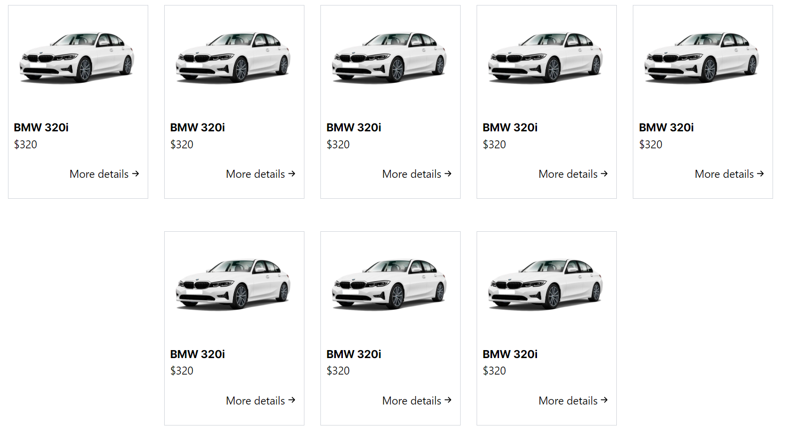
Is there a way to make them look like this?
[x] [y] [z] [a] [b]I’m using Tailwind and my code is
function Services() {

    return (
        <section className="py-4 px-16 flex flex-col" id="services">
            <div className='flex flex-col'>
                <h2 className="font-inter-bold text-xl self-center">Services</h2>
                <p className="font-robotoMono-lightitalic indent-2 text-justify text-sm mt-3 w-5/6 self-center">
                    Our luxury and premium car rental services offer customers an exceptional experience, ensuring high-quality and reliable vehicles. With a meticulously maintained and regularly inspected fleet, we provide maximum performance and safety to drivers. Moreover, we take pride in maintaining a policy of fair and transparent pricing, ensuring our clients enjoy top-notch service without compromising their budgets. Whether for special occasions, business trips, or leisure moments, our services are designed to meet everyone's needs with excellence and competitiveness. Check out some of our cars below!
                </p>
            </div>
            <div className='mt-8 flex justify-center gap-6 flex-wrap'>
                <Car carImage={BMW} carName={'BMW 320i'} carPrice={320} />
                <Car carImage={BMW} carName={'BMW 320i'} carPrice={320} />
                <Car carImage={BMW} carName={'BMW 320i'} carPrice={320} />
                <Car carImage={BMW} carName={'BMW 320i'} carPrice={320} />
                <Car carImage={BMW} carName={'BMW 320i'} carPrice={320} />
                <Car carImage={BMW} carName={'BMW 320i'} carPrice={320} />
                <Car carImage={BMW} carName={'BMW 320i'} carPrice={320} />
                <Car carImage={BMW} carName={'BMW 320i'} carPrice={320} />
            </div>
        </section>
    )
}
and the car component
function Car({ carImage, carName, carPrice }: CarProps) {
    return (
        <div className='border w-52 h-72 p-2 border-gray-300 flex flex-col mt-6 gap-5'>
            <img src={carImage} alt={`${carName}`} />
            <div>
                <h3 className='font-inter-bold'>{carName}</h3>
                <p>{`$${carPrice}`}</p>
            </div>
            <a href="" className='flex items-center self-end'>More details {<BsArrowRightShort size={20} />}</a>
        </div>
    )
}
2
Answers
Remove
justify-centerfrom the div that wraps the Cars and they will flow from left to right.Since you want both ‘start’ from the beginning and ‘centering’ items, I suggest using
gridin this situation and setting the column numbers for different screens, here’s an example: