skip to Main Content

I’m a beginner in front-end web development. I was trying a simple responsive page. In this project, I have a problem with that candle holder image, this image is size-responsive; it will resize when the browser window resizes but, the position of the image will change when the browser window gets smaller and the candle holder will move respect to its full-screen position.

<!DOCTYPE html>
<html lang="en">
<head>
    <meta charset="UTF-8">
    <meta http-equiv="X-UA-Compatible" content="IE=edge">
    <meta name="viewport" content="width=device-width, initial-scale=1.0">
    <title>form</title>
    <style>
        body{margin: 0px;}
        #main{
            background-color: hsl(308, 62%, 39%);
            width: 100vw;
            height: 100vh;
            position: relative;
        }
        #blendaText{
            color: white;
            position: absolute;
            font-size: 3.5vw;
            top:50px;
            left: 25px;
        }

        #form-container{
            background-color: white;
            height: 100vh;
            width: 70vw;
            float: right;
            border-radius: 20px 0px 0px 20px;
        }
        #candleImage{
            position: relative;
            top:200px;
            left: 200px;
            width:30%;
            height: auto;
        }
        #form{
            margin-left: 100px;
            margin-top: 100px;
        }
        input{width: 90%;}
        input[type="submit"]{margin-left: 5px;}
    </style>
</head>
<body>
        <div id="main">
            <p id="blendaText"> Blenda allows <br> you to imagine 3D </p>
            <img id="candleImage" src="candle.png" alt="candle holder">
            <div id="form-container">
                <form id="form">
                    <label for="fname">First name:</label><br>
                    <input type="text" id="fname" name="fname" value=""><br>
                    <label for="lname">Last name:</label><br>
                    <input type="text" id="lname" name="lname" value=""><br><br>
                    <input type="submit" value="Submit">
                  </form> 
            </div>
        </div>
</body>
</html>

full screen browser window
smaller browser window

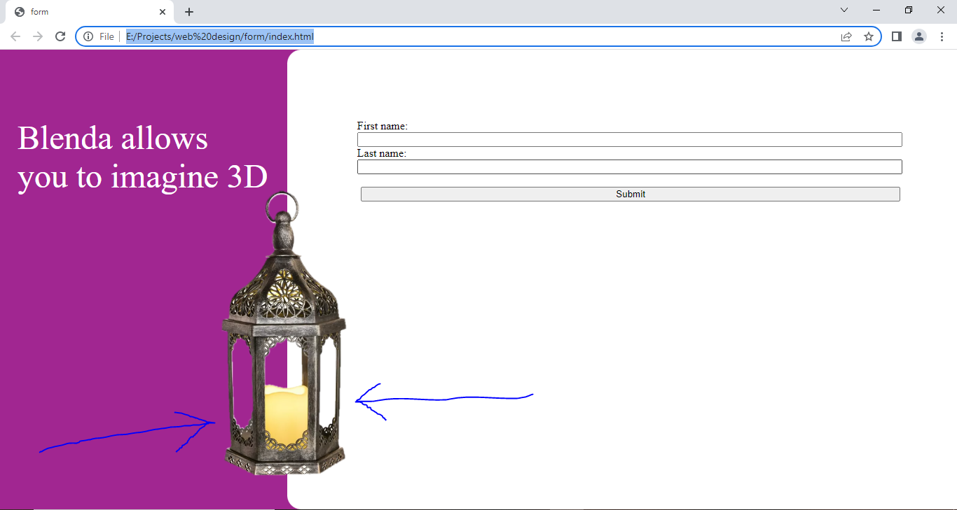
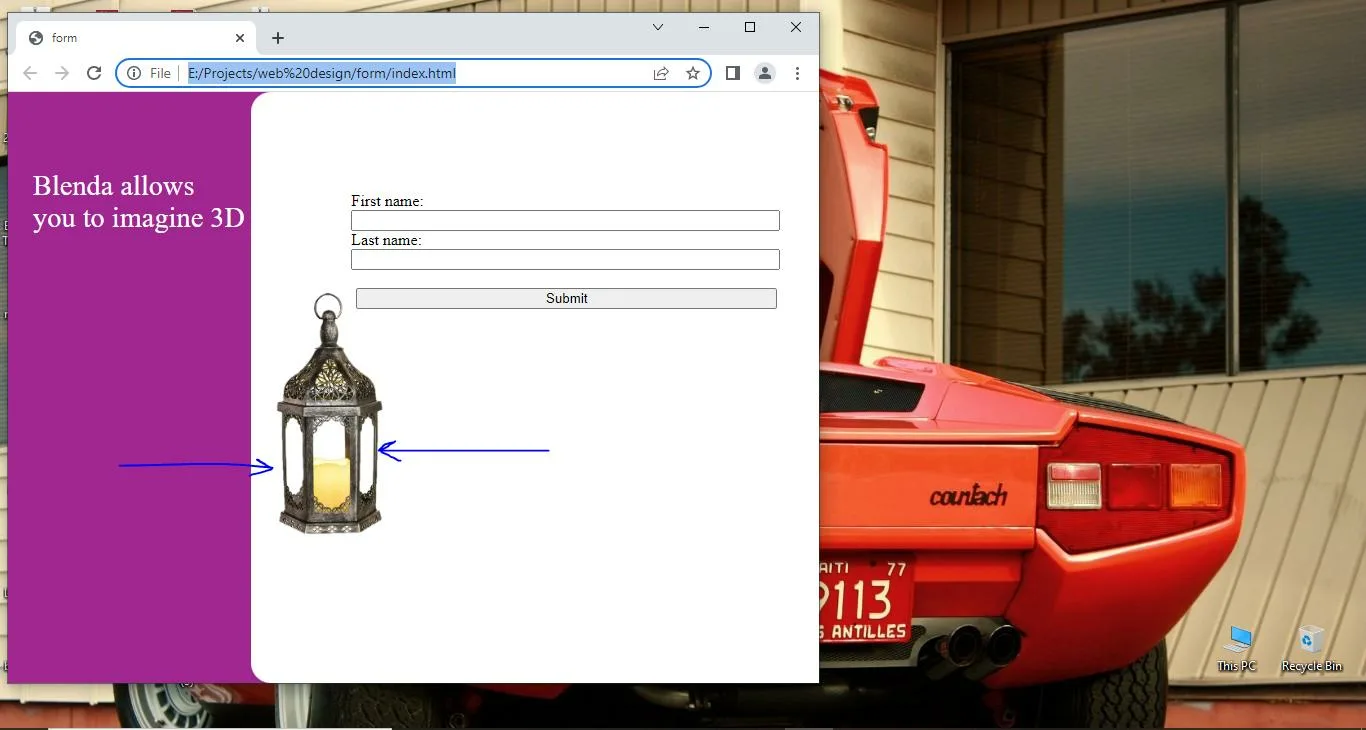
So I tried a search in Stackoverflow and found these 1 and 2 similar questions but their answers didn’t work for me. I also tried different positioning; absolute, relative, fixed, and sticky but also didn’t work.
here’s the candle image.

3

Answers


  1. You can make use of relative units / same ways you did for your left purple sidebar, refer to the changes to the new CSS for #candleImage selector below:

    <!DOCTYPE html>
    <html lang="en">
      <head>
        <meta charset="UTF-8" />
        <meta http-equiv="X-UA-Compatible" content="IE=edge" />
        <meta name="viewport" content="width=device-width, initial-scale=1.0" />
        <title>form</title>
        <style>
          body {
            margin: 0px;
          }
          #main {
            background-color: hsl(308, 62%, 39%);
            width: 100vw;
            height: 100vh;
            position: relative;
          }
          #blendaText {
            color: white;
            position: absolute;
            font-size: 3.5vw;
            top: 50px;
            left: 25px;
          }
          #form-container {
            background-color: white;
            height: 100vh;
            width: 70vw;
            float: right;
            border-radius: 20px 0px 0px 20px;
          }
          #candleImage {
            position: absolute;
            bottom: 10vh;
            left: 30vw;
            width: 30%;
            height: auto;
            transform: translateX(-50%);
          }
          #form {
            margin-left: 100px;
            margin-top: 100px;
          }
          input {
            width: 90%;
          }
          input[type='submit'] {
            margin-left: 5px;
          }
        </style>
      </head>
      <body>
        <div id="main">
          <p id="blendaText">
            Blenda allows <br />
            you to imagine 3D
          </p>
          <img
            id="candleImage"
            src="https://i.ibb.co/ZxJcXP5/candle.png"
            alt="candle holder"
          />
          <div id="form-container">
            <form id="form">
              <label for="fname">First name:</label><br />
              <input type="text" id="fname" name="fname" value="" /><br />
              <label for="lname">Last name:</label><br />
              <input type="text" id="lname" name="lname" value="" /><br /><br />
              <input type="submit" value="Submit" />
            </form>
          </div>
        </div>
      </body>
    </html>
    Login or Signup to reply.
  2. You have a similar issue on the zoom-in zoom-out of the page.
    The best solution is to use Flexbox: https://css-tricks.com/snippets/css/a-guide-to-flexbox/

    Flexbox will save your life in many future scenarios.
    Otherwise, you can just create a table and fix your website structure with it.

    Here is a first step with Flexbox that should work fine:

    <!DOCTYPE html>
        <html lang="en">
        <head>
            <meta charset="UTF-8">
            <meta http-equiv="X-UA-Compatible" content="IE=edge">
            <meta name="viewport" content="width=device-width, initial-scale=1.0">
            <title>form</title>
            <style>
                body{margin: 0px;}
                #main{
                    display: flex; 
                    flex-direction: row;
                    align-items:stretch ;
                    align-content:stretch;
                    background-color: hsl(308, 62%, 39%);
                    width: 100vw;
                    height: 100vh;
                }
                #blendaText{
                    color: white;
                    font-size: 3.5vw;
                    top:50px;
                    left: 25px;
                }
                #form-container{
                    flex-shrink: 3;
                    background-color: white;
                    height: 100vh;
                    width: 70%;
                    border-radius: 20px 0px 0px 20px;
                }
                #column{
                    width: 30%;
                 flex-shrink: 3;
                }
                #candleImage{
                    position: relative;
                          margin-left:1vmin;
                    height: 25vw;
                }
                #form{
                    margin-left: 100px;
                    margin-top: 100px;
                }
                input{width: 90%;}
                input[type="submit"]{margin-left: 5px;}
            </style>
        </head>
        <body>
                <div id="main">
                    <div id="column">  
                        <p id="blendaText"> Blenda allows <br> you to imagine 3D </p>
                        <img id="candleImage" src="https://i.ibb.co/ZxJcXP5/candle.png" alt="candle holder">
                    </div>  
                    <div id="form-container">
                        <form id="form">
                            <label for="fname">First name:</label><br>
                            <input type="text" id="fname" name="fname" value=""><br>
                            <label for="lname">Last name:</label><br>
                            <input type="text" id="lname" name="lname" value=""><br><br>
                            <input type="submit" value="Submit">
                          </form> 
                    </div>
                </div>
        </body>
        </html>
    Login or Signup to reply.
  3. All you need to do is to use dynamic units for placing the image in your #candleImage styles.

    Here’s the updated styles:

    #candleImage {
                    position: relative;
                    top: 20vh;
                    left: 15vw;
                    width: 30%;
                    height: auto;
                }
    Login or Signup to reply.
Please signup or login to give your own answer.
Back To Top
Search