skip to Main Content

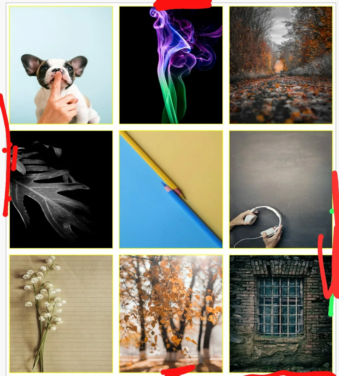
i have one div inside , some images i give margin for image 10px that apply all sides , i want remove which image near by the div side remove the space , if you not understand see the image

i mark some red area i want reove space

      <div class="imgbox">
                <div class="show">
                    <img class="soot soot1" src="img/p1.jpg" alt="">
                    <img class="soot soot2" src="img/p2.jpg" alt="">
                    <img class="soot soot3" src="img/p3.jpg" alt="">
                </div>
                <div class="show">
                    <img class="soot soot4" src="img/p4.jpg" alt="">
                    <img class="soot soot5" src="img/p5.jpg" alt="">
                    <img class="soot soot6" src="img/p6.jpg" alt="">
                </div>
                <div class="show">
                    <img class="soot soot7" src="img/p7.jpg" alt="">
                    <img class="soot soot8" src="img/p8.jpg" alt="">
                    <img class="soot soot9" src="img/p9.jpg" alt="">
                </div>
            </div> 

css code

.soot
{
    width: 33.3%;
    height: 400px;
    margin: 10px;
    border: 2px solid yellow;
}
.imgbox
{``
    width: 100%;
    background-color: white;
    padding: 0;
    margin-top: 10px;
    border: 1px solid gray;
}
.show
{
    display: flex;
}

Remove space around the dive the image must be set with outer div no space inside the images i want space

3

Answers


  1. if i understand well

      .imgbox .show:first-child .soot {
        margin-top: 0 !important;
      }
      .imgbox .show:last-child .soot {
        margin-bottom: 0 !important;
      }
      .imgbox .show .soot:first-child {
        margin-left: 0 !important;
      }
      .imgbox .show .soot:last-child {
        margin-right: 0 !important;
      }
    
    Login or Signup to reply.
  2. Don’t use margins for the images. Use the gap property instead!

    However, the easiest way is not to use flexbox here. What you want here is CSS-Grid. CSS-Grid can also make usage of the gap property:

    .soot {
      border: 2px solid yellow;
      width: 100%;
      display: block;
      box-sizing: border-box;
    }
    
    .imgbox {
      background-color: white;
      margin-top: 10px;
      border: 1px solid gray;
      display: grid;
      grid-template-columns: repeat(3, 1fr);
      grid-gap: 20px;
    }
    <div class="imgbox">
      <img class="soot soot1" src="https://via.placeholder.com/200x300.jpg" alt="">
      <img class="soot soot2" src="https://via.placeholder.com/200x300.jpg" alt="">
      <img class="soot soot3" src="https://via.placeholder.com/200x300.jpg" alt="">
      <img class="soot soot4" src="https://via.placeholder.com/200x300.jpg" alt="">
      <img class="soot soot5" src="https://via.placeholder.com/200x300.jpg" alt="">
      <img class="soot soot6" src="https://via.placeholder.com/200x300.jpg" alt="">
      <img class="soot soot7" src="https://via.placeholder.com/200x300.jpg" alt="">
      <img class="soot soot8" src="https://via.placeholder.com/200x300.jpg" alt="">
      <img class="soot soot9" src="https://via.placeholder.com/200x300.jpg" alt="">
    </div>

    If you insist on using Flexbox, then still remove the margin from the images and apply the gap property correctly. The issue or difficulty here is, that you manually need to calculate the correct width of the images:

    :root {
      --gap: 20px;
      --columns: 3;
    }
    
    .imgbox {
      background-color: white;
      margin-top: 10px;
      border: 1px solid gray;
      display: flex;
      flex-direction: column;
      gap: var(--gap);
    }
    
    .show {
      display: flex;
      gap: var(--gap);
    }
    
    .soot {
      border: 2px solid yellow;
      width: calc((100% - (var(--gap) * (var(--columns) - 1))) / var(--columns));
      display: block;
      box-sizing: border-box;
    }
    <div class="imgbox">
      <div class="show">
        <img class="soot soot1" src="https://via.placeholder.com/200x300.jpg" alt="">
        <img class="soot soot2" src="https://via.placeholder.com/200x300.jpg" alt="">
        <img class="soot soot3" src="https://via.placeholder.com/200x300.jpg" alt="">
      </div>
      <div class="show">
        <img class="soot soot4" src="https://via.placeholder.com/200x300.jpg" alt="">
        <img class="soot soot5" src="https://via.placeholder.com/200x300.jpg" alt="">
        <img class="soot soot6" src="https://via.placeholder.com/200x300.jpg" alt="">
      </div>
      <div class="show">
        <img class="soot soot7" src="https://via.placeholder.com/200x300.jpg" alt="">
        <img class="soot soot8" src="https://via.placeholder.com/200x300.jpg" alt="">
        <img class="soot soot9" src="https://via.placeholder.com/200x300.jpg" alt="">
      </div>
    </div>
    Login or Signup to reply.
  3. To remove the white spaces on the sides and add top/bottom margin you can use {margin: 20px 0;} on the row container i.e. .show.
    For removing the top and bottom spaces you have to remove the top margin from the first row and bottom margin from last row. I’ve used .show:first-Child{} and .show:last-Child{} for this. Use * { box-sizing: border-box; } so that the margin and padding don’t mess up the image-size which is set to 33.3% (avoiding overflow and useless calculations for proper sizing). Also, the first and second image will have padding-right, use .soot:nth-Child(1), .soot:nth-Child(2) {padding-right:20px}

    * {
      box-sizing: border-box;
    }
    
    .imgbox {
      background-color: rgb(255, 255, 255);
      padding: 0;
      margin-top: 10px;
      border: 2px solid gray;
    }
    
    .show {
      display: flex;
      margin: 20px 0;
    }
    
    .show:first-child {
      margin-top: 0;
    }
    
    .show:last-child {
      margin-bottom: 0;
    }
    
    .soot {
      width: 33.3%;
      height: 400px;
    }
    
    .soot:nth-child(1),
    .soot:nth-child(2) {
      padding-right: 20px;
    }
    <div class="imgbox">
      <div class="show">
        <img class="soot soot1" src="https://picsum.photos/seed/coding/600" alt="">
        <img class="soot soot2" src="https://picsum.photos/seed/coding/600" alt="">
        <img class="soot soot3" src="https://picsum.photos/seed/coding/600" alt="">
      </div>
      <div class="show">
        <img class="soot soot4" src="https://picsum.photos/seed/coding/600" alt="">
        <img class="soot soot5" src="https://picsum.photos/seed/coding/600" alt="">
        <img class="soot soot6" src="https://picsum.photos/seed/coding/600" alt="">
      </div>
      <div class="show">
        <img class="soot soot7" src="https://picsum.photos/seed/coding/600" alt="">
        <img class="soot soot8" src="https://picsum.photos/seed/coding/600" alt="">
        <img class="soot soot9" src="https://picsum.photos/seed/coding/600" alt="">
      </div>
    </div>
    Login or Signup to reply.
Please signup or login to give your own answer.
Back To Top
Search