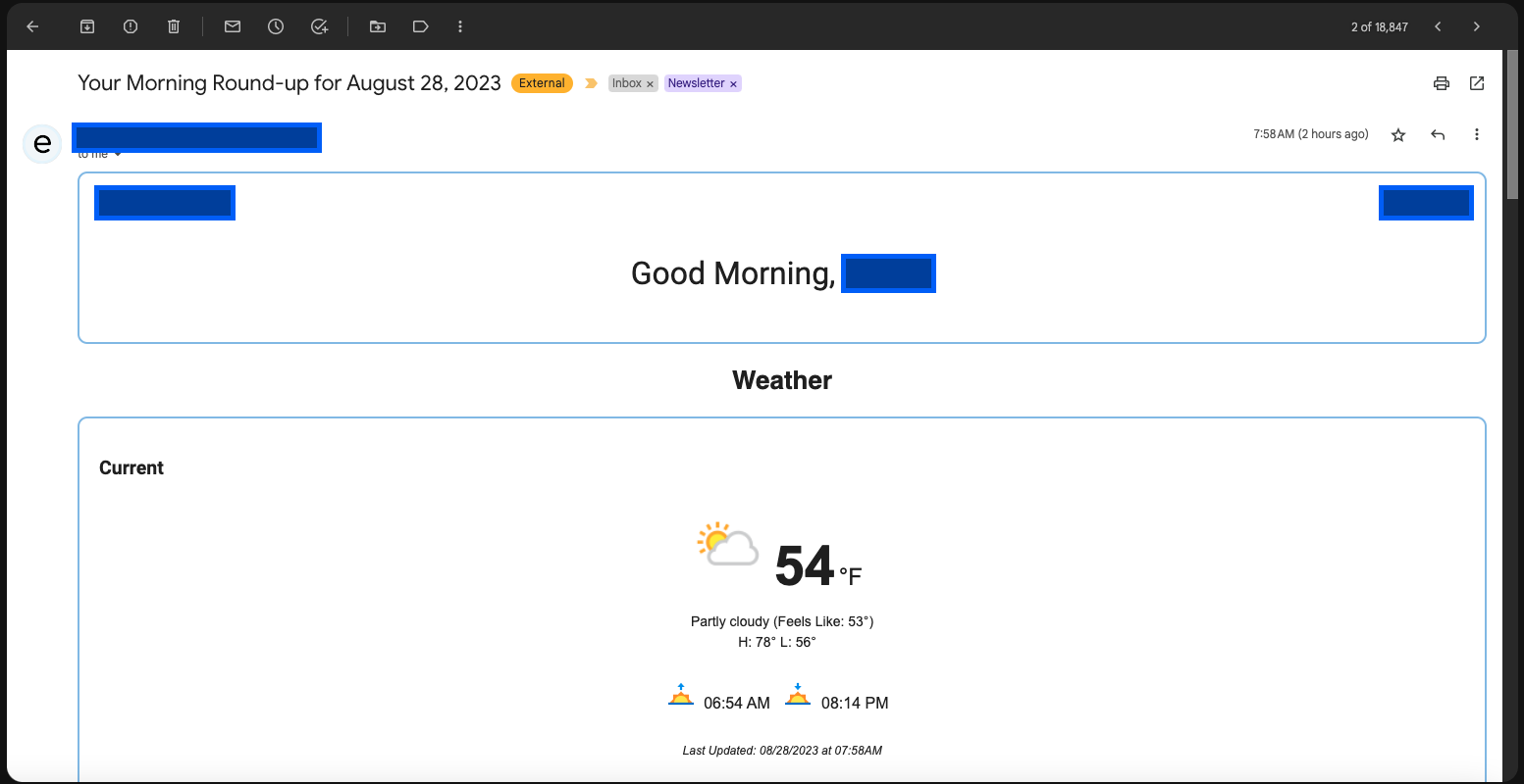
I am creating an email template in HTML and, while it displays properly on mobile, it is too wide on desktop. Currently it looks like this on my PC:
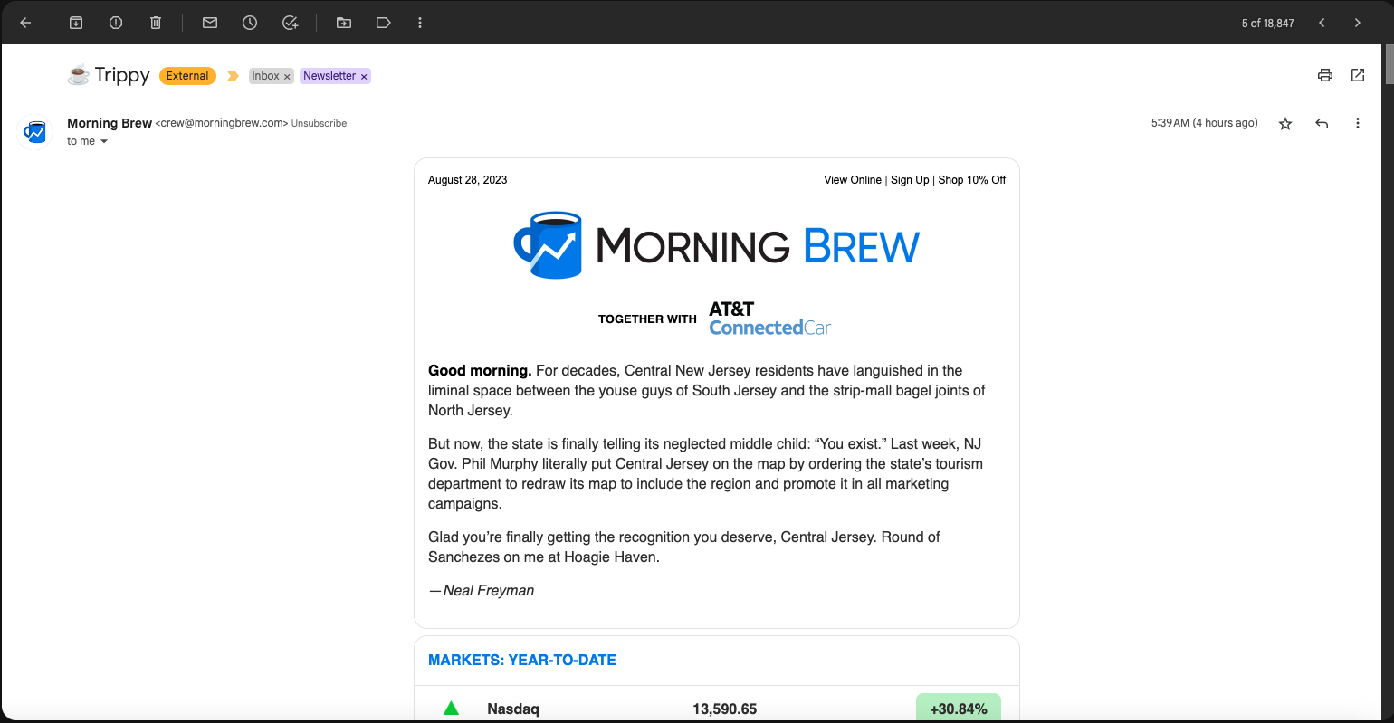
Here is an example that I would like to mimic. Notice how the width is the same on dekstop as it is on mobile:
How can I accomplish this in HTML/CSS?
I tried changing the attributes of my div class, but it did not work thus far.


2
Answers
It would be good to see some code.
Still, one solution is to wrap all of the content, except the header and footer, in one big container, that is a flexbox with a style of
flex-flow: column; align-items: center;and give each child to have a maximum width.Another solution is each section to be wrapped by two blocks (for semantics – wrap a over a ), and have the inner div to have a maximum width and margins to the left and right of
auto. All of this also wrapped in one big or (for semantics) with a style offlex-flow: column; align-items: center;.Second solution can be redundant in many cases, but helpful in others. While setting up side margins to be auto is often a quick way to center a block element inside its parent.