


I have four cards of same with and their height can vary based upon the content inside it. I want to align the cards with respect to the circle at the center of the container, whose height and width is 138px. Here is the picture layout that I want to achieve :-
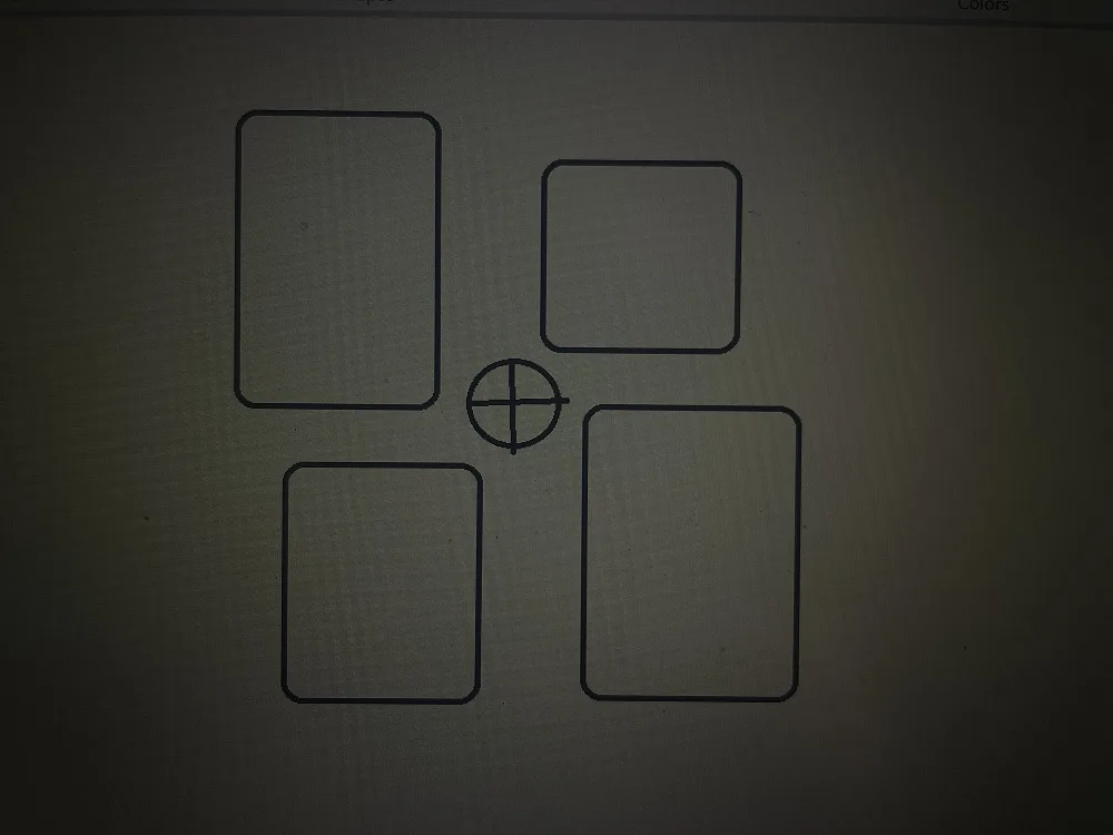
I want to achieve the given layout. Currently I am using the absolute positioning and giving the fixed value to the top, right, bottom, left values of the respective four cards. But the content inside the card can be increased or decreased from the backend. So if the card content is increased the said layout is breaking, I want this layout to be same irrespective of the card content and height but the position near the circle should be same. Here is what I have implemented. Is there any way to achieve the said layout which is dynamic and positioned with respect to the circle.
HTML and css:
    .testi {
        max-width: 1280px;
        margin: 0 auto;
    }

    .container {
        position: relative;
        height: 1500px;
        display: flex;
        flex-wrap: wrap;
        justify-content: center;
        align-items: center;

    }

    .circle {
        position: absolute;
        top: 50%;
        left: 50%;
        transform: translate(-50%, -50%);
        width: 138px;
        height: 138px;
        border-radius: 50%;
        background-image: linear-gradient(to bottom, #00aeef 0%, #0095da 25%, #0071b4 50%, #0061af 75%, #293996 100%);
    }

    .inner-circle {
        position: absolute;
        top: 50%;
        left: 50%;
        transform: translate(-50%, -50%);
        width: 80px;
        height: 80px;
        border-radius: 50%;
        background-color: #fff;
    }

    /* testimonial card style */

    .testimonial-card {
        position: absolute;
        width: 406px;
        max-height: 888px;
        display: flex;
        flex-direction: column;
        justify-content: flex-start;
        align-items: stretch;
        gap: 32px;
        padding: 48px;
        border-radius: 16px;
        box-shadow: 0 4px 10px 0 rgba(0, 0, 0, 0.08);
        background-color: #fff;
    }


    .testimonial-card {
        width: 406px;
        max-height: 888px;
        flex-grow: 0;
        display: flex;
        flex-direction: column;
        justify-content: flex-start;
        align-items: stretch;
        gap: 32px;
        padding: 48px;
        border-radius: 16px;
        box-shadow: 0 4px 10px 0 rgba(0, 0, 0, 0.08);
        background-color: #fff;
    }

    .testimonial-card-title {
        font-family: Gotham;
        font-size: 18px;
        font-weight: normal;
        font-stretch: normal;
        font-style: normal;
        line-height: 1.44;
        letter-spacing: normal;
        text-align: left;
        color: #757584;
    }

    .testimonial-person-wrapper {
        display: flex;
        justify-content: space-between;
        align-items: center;
    }

    .testimonial-card-image {
        width: 120px;
        height: 120px;
        border-radius: 50%;
        overflow: hidden;
    }

    .person-detail {
        width: 250px;
    }

    .person-name {
        height: 20px;
        font-family: Gotham;
        font-size: 14px;
        font-weight: 500;
        font-stretch: normal;
        font-style: normal;
        line-height: 1.43;
        letter-spacing: normal;
        text-align: left;
        color: #263746;
    }

    .person-des {
        font-family: Gotham;
        font-size: 14px;
        font-weight: normal;
        font-stretch: normal;
        font-style: normal;
        line-height: 1.43;
        letter-spacing: normal;
        text-align: left;
        color: #263746;
    }

    .location-container {
        display: flex;
        justify-content: space-between;
    }

    .Location {
    width: 24px;
       height: 24px;
       flex-grow: 0;
       object-fit: contain;
    }

    .office-title {
        width: 106px;
        font-family: Gotham;
        font-size: 14px;
        font-weight: normal;
        font-stretch: normal;
        font-style: italic;
        line-height: 1.43;
        letter-spacing: normal;
        text-align: left;
        color: #263746;
    }

    /* End of testimonial-card style */

    .card1 {
        top: 115px;
        left: 0;
    }

    .card2 {
        top: 115px;
        right: 145px;
    }

    .card3 {
        bottom: 165px;
        left: 115px;
    }

    .card4 {
        bottom: 165px;
        right: 0;
    }
<div class="container">
<div class="circle">
<div class="inner-circle"></div>
</div>
<div class="testimonial-wrapper">
<div class="testimonial-card card1">
<div class="testimonial-card-title">
“This will be my third year at HUB working on the Human Resources team. As a military spouse, it can be hard to find a role that allows you to advance in your career, but also be there for your service member and family. HUB has granted me that, and so much more. My supervisor understands my situation and continuously supports me through it. When my husband deployed, my team rallied around me and celebrated with us when he returned. The Military Veterans & Military Family Voices group is a special place where anyone who is in the military community has instant comradery and support. What I am impressed with most is this group’s ability to actively listen to each other’s experiences and draw lessons on how to be a better advocate from it.”
</div>
<div class="testimonial-person-wrapper">
<img class="testimonial-card-image" alt="100%x280" src="https://images.unsplash.com/photo-1532712938310-34cb3982ef74?ixlib=rb-0.3.5&q=80&fm=jpg&crop=entropy&cs=tinysrgb&w=1080&fit=max&ixid=eyJhcHBfaWQiOjMyMDc0fQ&s=3d2e8a2039c06dd26db977fe6ac6186a">
<div class="person-detail">
<div class="person-name">
Glenn Agoncillo
</div>
<div class="person-des">
Vice President of Constituent Experience and Co-chair of HUB Pride (LGBT) Voices
</div>
<div class="location-container">
<img src="Location.png" class="Location" alt="location-icon">
<div class="office-title">Office Location</div>
</div>
</div>
</div>
</div>
<div class="testimonial-card card2">
<div class="testimonial-card-title">
“My passion is to give a voice to those who are underrepresented. As someone who fits into that category, I’m passionate about bringing awareness and opportunities to those who look like me and making allies out of those who don’t. HUB Black Inclusion Network does just that; it provides a safe and collaborative space for this while enhancing HUB’s inclusive culture and expanding our diversity footprint.”
</div>
<div class="testimonial-person-wrapper">
<img class="testimonial-card-image" alt="100%x280" src="https://images.unsplash.com/photo-1532712938310-34cb3982ef74?ixlib=rb-0.3.5&q=80&fm=jpg&crop=entropy&cs=tinysrgb&w=1080&fit=max&ixid=eyJhcHBfaWQiOjMyMDc0fQ&s=3d2e8a2039c06dd26db977fe6ac6186a">
<div class="person-detail">
<div class="person-name">
Glenn Agoncillo
</div>
<div class="person-des">
Vice President of Constituent Experience and Co-chair of HUB Pride (LGBT) Voices
</div>
<div class="location-container">
<img src="Location.png" class="Location" alt="location-icon">
<div class="office-title">Office Location</div>
</div>
</div>
</div>
</div>
<div class="testimonial-card card3">
<div class="testimonial-card-title">
“In order for HUB to thrive, we must embrace diversity and inclusion so we can continue to serve all our clients from all walks of life. HUB Women Network (HWN) provides a forum to help women of all levels and diversity at HUB be able to Engage, Empower, and Excel in all aspects of their lives. Through monthly calls, webinars, and panel discussions, we create a safe space for women to speak freely, engage with others and exchange insights.”
</div>
<div class="testimonial-person-wrapper">
<img class="testimonial-card-image" alt="100%x280" src="https://images.unsplash.com/photo-1532712938310-34cb3982ef74?ixlib=rb-0.3.5&q=80&fm=jpg&crop=entropy&cs=tinysrgb&w=1080&fit=max&ixid=eyJhcHBfaWQiOjMyMDc0fQ&s=3d2e8a2039c06dd26db977fe6ac6186a">
<div class="person-detail">
<div class="person-name">
Glenn Agoncillo
</div>
<div class="person-des">
Vice President of Constituent Experience and Co-chair of HUB Pride (LGBT) Voices
</div>
<div class="location-container">
<img src="Location.png" class="Location" alt="location-icon">
<div class="office-title">Office Location</div>
</div>
</div>
</div>
</div>
<div class="testimonial-card card4">
<div class="testimonial-card-title">
“This year I’ll be celebrating 6 years working at HUB in the Risk Services Division and I am very proud to be involved in all the different opportunities to create a culture of diversity, equity, and inclusion in all regions. Now there are several ways to get involved as a leader, a participant, and an ambassador to do our part here at HUB. The Asian American/Pacific Islander community is a special place for me, to feel the genuine connection I have with other colleagues because of our similar cultural background. I am Chinese and Filipino, and this community provides me a natural way to support, connect and identify with other peers all while working at HUB.”
</div>
<div class="testimonial-person-wrapper">
<img class="testimonial-card-image" alt="100%x280" src="https://images.unsplash.com/photo-1532712938310-34cb3982ef74?ixlib=rb-0.3.5&q=80&fm=jpg&crop=entropy&cs=tinysrgb&w=1080&fit=max&ixid=eyJhcHBfaWQiOjMyMDc0fQ&s=3d2e8a2039c06dd26db977fe6ac6186a">
<div class="person-detail">
<div class="person-name">
Glenn Agoncillo
</div>
<div class="person-des">
Vice President of Constituent Experience and Co-chair of HUB Pride (LGBT) Voices
</div>
<div class="location-container">
<img src="Location.png" class="Location" alt="location-icon">
<div class="office-title">Office Location</div>
</div>
</div>
</div>
</div>
</div>
</div>Attaching the original UI here :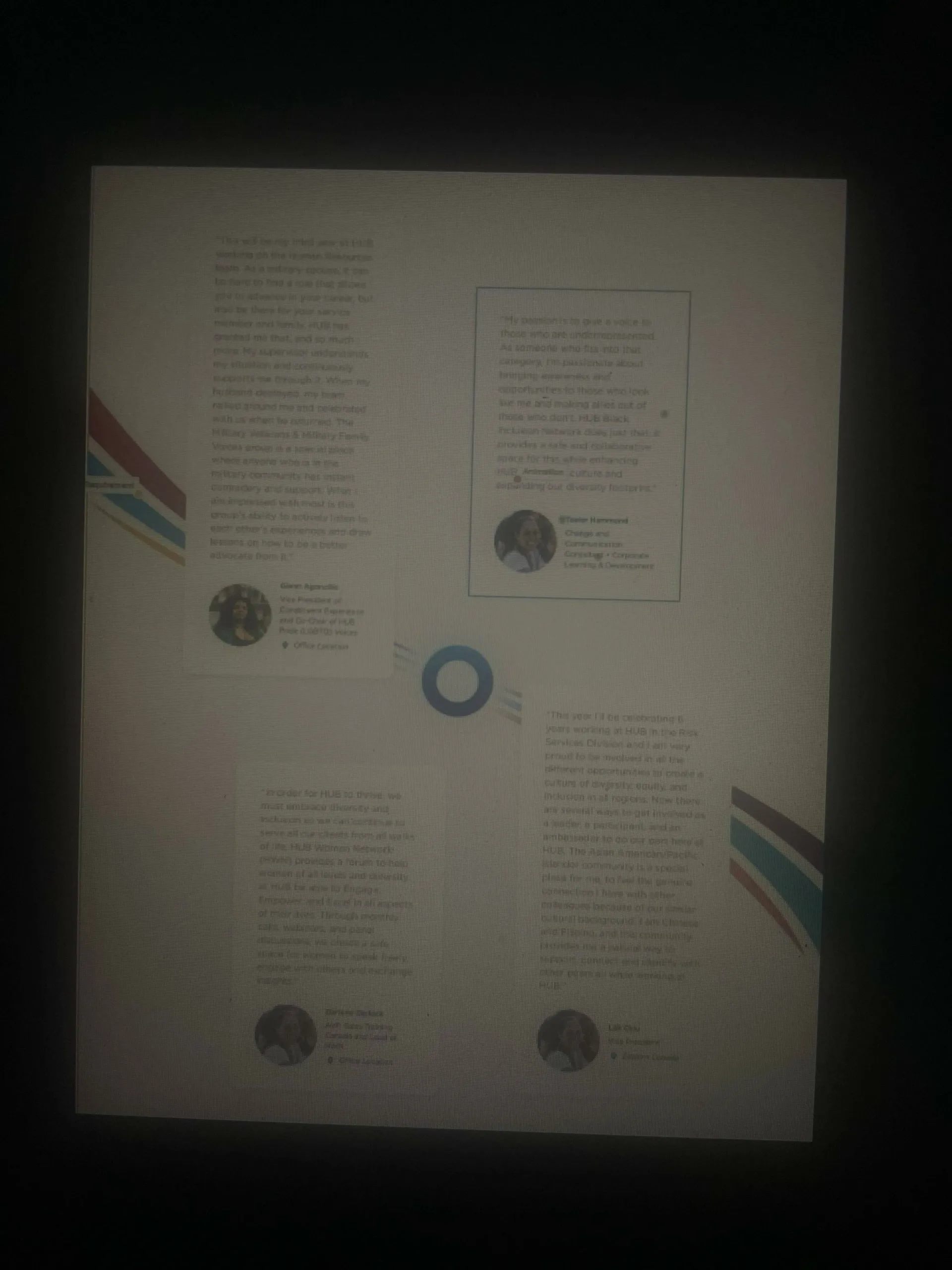
2
Answers
I believe that your issue come from the
absolutepositioning.By using grid, you should be able to position each card relative to the center of the grid. Then, you just need to center the circle.
Note that you still have to translate the card to have this shift you’re looking for, a simple
transform: translate(x, y);will do.Let me know if that answer your question:
Your layout is breaking probably because top 2 has to be possitioned based on
bottomand bottom 2 based ontop, since content is added to the end of container.Absolute positioning should be more then enough for this.