skip to Main Content

I have an input field and a button that says click me, also a mic icon and a span that is inside a div, and the span text is triggered when the icon is clicked, I want to align (span and mic icon) next to the input field, without changing the width of input field, so I want input field and button to have the same width, and the mic icon and text (id=action) next to the input field. How do I do that?

Without the mic and span, they have same width.

enter image description here

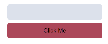
But with mic and span, the width of the text input field becomes ugly, I don’t want that.

enter image description here

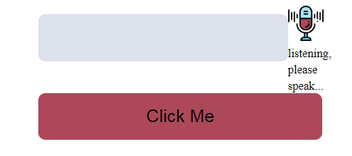
I removed many things, just to clarify to you what I mean, and for the code to understand easier, don’t worry about the JS code, just when you click the mic icon, it triggers the span text.

input {
  background-color: #dce1eb;
  border: 0;
  padding: 15px;
  border-radius: 8px;
  font-size: 20px;
  margin: 10px 0;
}

button {
  background-color: #ac485a;
  border: 0;
  padding: 15px;
  border-radius: 8px;
  font-size: 20px;
}

.container {
  display: flex;
  flex-direction: column;
  margin: 30px auto;
  max-width: 320px;
}

#voice{
    width: 40px;
}
<!DOCTYPE html>
<html lang="en">
<head>
  <meta name="viewport" content="width=device-width, initial-scale=1.0" />
  <link rel="stylesheet" href="index.css" />
</head>
<body>
  <div class="container">
    <div style="display: flex">
      <div>
        <input type="text" name="" placeholder="" id="input-field" />
      </div>

      <div>
        <img
          src="assets/microphone.png"
          id="voice"
          onclick="SpeechRecog()"
          alt=""
        />
        <span id="action"></span>
      </div>
    </div>

    <button id="add-button">Click Me</button>
  </div>

  <script src="index2.js"></script>
</body>
</html>

2

Answers


  1. Here is the solution with position: absolute. All the necessary comments are included and changes are marked inside the codes.

    input {
        background-color: #dce1eb;
        border: 0;
        padding: 15px;
        border-radius: 8px;
        font-size: 20px;
        margin: 10px 0;
        /* added codes */
        width: 100%;
        box-sizing: border-box;
        /* added codes */
    }
    
    button {
        background-color: #ac485a;
        border: 0;
        padding: 15px;
        border-radius: 8px;
        font-size: 20px;
    }
    
    .container {
        display: flex;
        flex-direction: column;
        margin: 30px auto;
        max-width: 320px;
    }
    
    #voice{
        width: 40px;
    }
    
    /* added code */
    .input-container{
        width: 100%;
    }
    <!DOCTYPE html>
    <html lang="en">
      <head>
        <meta name="viewport" content="width=device-width, initial-scale=1.0" />
        <link rel="stylesheet" href="index.css" />
      </head>
      <body>
        <div class="container">
          <div style="display: flex; position: relative; align-items: center;"><!-- added code -->
            <div class="input-container">
              <input type="text" name="" placeholder="" id="input-field" />
            </div>
    
            <!-- Adjust the right property as required -->
            <div style="position: absolute; right: -90px; display: flex; align-items: center;"><!-- added code -->
              <img
                src="https://img.icons8.com/nolan/64/microphone.png"
                id="voice"
                onclick="SpeechRecog()"
                alt="microphone"
              />
              <span id="action">action</span>
            </div>
          </div>
    
          <button id="add-button">Click Me</button>
        </div>
    
        <script src="index2.js"></script>
      </body>
    </html>
    Login or Signup to reply.
  2. There are several ways to do this.

    You can change your outer container .container to a grid with two rows and two columns. Put your two buttons in the left-hand column and the mic image in the top right cell. For example:

    .container {
      margin: 30px auto;
      max-width: 320px;
    /* grid CSS related attributes */
      grid-template-columns: 1fr 1fr;
      grid-template-rows: 1fr 1fr;
      grid-template-areas:
        "aa ab"
        "ba bb";  
    }
    
    .aa {
      width: 100%;
      height: 100%;
      grid-area: aa;
    }
    
    .ab {
      width: 100%;
      height: 100%;
      grid-area: ab;
    }
    
    .ba {
      width: 100%;
      height: 100%;
      grid-area: ba;
    }
    
    .bb {
      width: 100%;
      height: 100%;
      grid-area: bb;
    }
    

    Alternatively, you can use a table with two rows and two columns to do the same thing. It is simpler to style but probably considered a bad practice, as we ought not use tables to do layouts.

    Login or Signup to reply.
Please signup or login to give your own answer.
Back To Top
Search