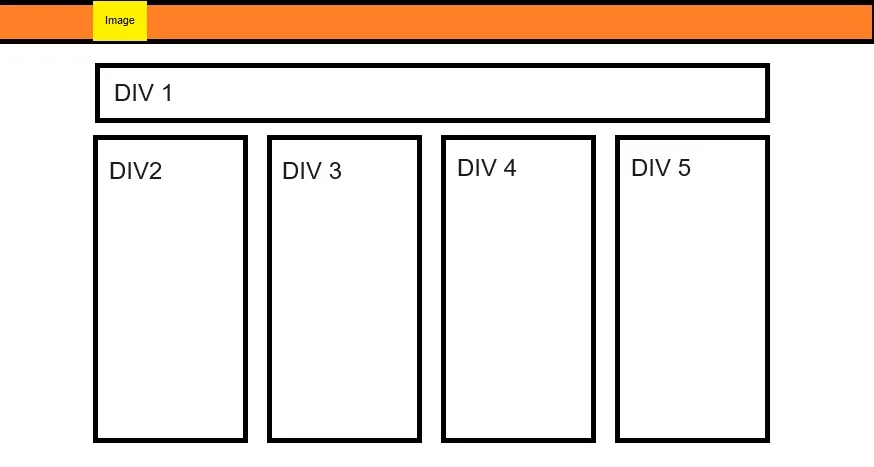
Can anyone help with the CSS?
I can get the three columnar divs pretty easily, but can’t figure out how to align a div above them the width of the three below.
I’d also like to align an image in a header row to the left most div below.
I am not at all a web developer; this is a landing page for something else I am working on.
Thanks!
  .container {
    display: flex;
    flex-direction: column;
    align-items: center;
    margin-top: 20px;
  }

  .inner-container {
    display: flex;
    justify-content: center;
    margin-top: 20px; /* Add margin for spacing between the two rows */
  }

  .box {
    width: 300px; /* Adjust width as needed */
    margin: 20px;
    background-color: #ccc;
    padding: 20px;
    border-radius: 10px;
  }

  p {
    margin-bottom: 10px;
  }
<div class="container">
<div class="box">
<p>This is the first div.</p>
</div>
<div class="inner-container">
<div class="box"></div>
<div class="box"></div>
<div class="box"></div>
</div>
</div>


3
Answers
set the container to flex direction column to stack your top box and bottom container (holding the 3 boxes) vertically
the top box naturally takes up the full width of its container
the bottom container uses display flex to lay out the boxes and uses space between to evenly distribute them.
run the code snippet
The reason that the boxes below are the same size as the box above is that they are all declared the same. So, for a solution, I’ve created a new class called topbox and another called boxes.
.boxes has all the shared attributes that you would want between the elements, but doesn’t have the width. That is because the top box needs to have a different width to be the same size as the three below.
The CSS
The HTML
For what it is worth, things like Bootstrap and TailwindCSS will make this sort of thing a lot easier in the future. Of course its good to know basic HTML and CSS but these frameworks really take a lot of the hard work out of it.
A single flexbox with it’s items each set to
flex: 1 1 autoseems to work.