I have a DIV container that would act as a log container in practice. This has overflow: auto and has the flex-direction: column-reverse to display the log entries from bottom to top in chronological order.
I have these log entries as a JSON structure and extract the text line.text of the message itself and if available another JSON structure with line.JSON. If a JSON structure is present, a button is displayed, with which one can show or hide a corresponding <pre> element in which one sees the formatted JSON code.
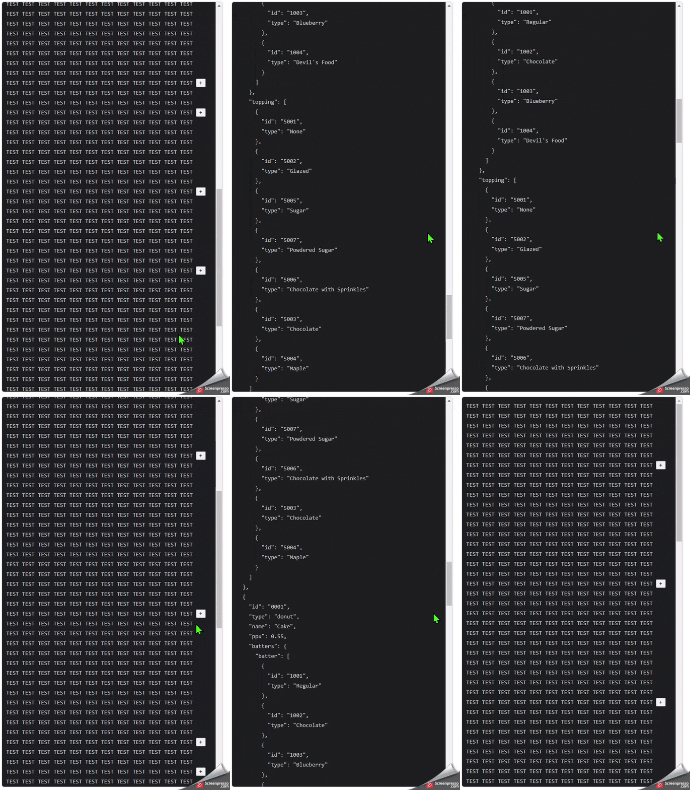
Now I have the problem that when I use the button to expand a log entry, the text moves upwards so that you end up at the bottom of the <pre> element. For useablilty reasons this is bad. This is probably due to the CSS property column-reverse.
The intended behavior would be that the scrollbar expands downwards and you don’t lose the view on the button. So that visually nothing changes for the user, except that this very element unfolds towards the bottom.
I have already tried that I set the ‘scrollTop’ position to the height of the button but this is also a rather annoying behavior.
if(logContainer && button) {
    logContainer.scrollTop = button.offsetTop - logContainer.offsetTop;
}
So my question is: How can i manipulate the scrollbar behavior to fullfill these requirements?
I have created a minimal reproduced example on Stackblitz: here


2
Answers
To ensure the button will remain at the same point relative to the container even if the content grows/shrinks, you need to grab its
offsetTopbefore the change gets rendered and later find the difference with itsoffsetTopafter the content changed.setTimeout()will make sure the UI will be redrawn before running the passed callback.That way you will have a correct difference to apply to the container
scrollTop.Just change this function in your code and you’ll see the new behaviour with the mouse still hovering the button in both cases when you expand/collapse a node:
Plus if you add the following styling it will be easier to understand what’s going on because each button will have an index on top that you can see to understand the scrolling is working correctly:
As per my comment, you can achieve exactly the same behavior by reversing the order of the items in the array and using
flex-direction: column.You can achieve this by reversing the order of the lines after you initialize them:
And then simply changing your styling in
.log-containerto:I’ve forked your stackblitz here and added both solutions, you can switch them clicking the button at the top. I’ve added index to each line for easier following of what happens.