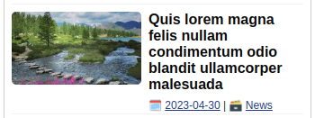
More exactly, I’d like the date and category to always be at the bottom, but no lower than the thumbnail, regardless of the height of the title. When the title is too long, the "surplus" should not be visible.
When on mobile devices, some of my posts look as this:
some as this:
What I want to achieve is this:
article {
  display: grid;
  grid-auto-flow: column;
  grid-column-gap: 0.5rem;
  grid-template-areas: "A B";
  grid-template-columns: 1fr 2fr;
}

img.thumbnail {
  min-width: 144px;
}

.entry-header * {
  line-height: 18px;
}

.entry-title {
  font-size: 16px;
}

.entry-meta {
  font-size: 12px;
}
<article class="post">
<div class="post-thumbnail">
<a class="post-link" href="example.com/post_title">
<img src="https://via.placeholder.com/300.jpg" class="thumbnail">
</a>
</div>
<header class="entry-header">
<h2 class="entry-title">
<a class="post-link" href="#">Post Title</a>
</h2>
<div class="entry-meta">
<span class="posted-on">2023.05.05</span> |
<span class="posted-in">Category</span>
</div>
</header>
</article>
 Question posted in


2
Answers
The following javascript will get the height of the image and entrymeta, then the height of the title to image height minus entrymeta height so that the title will never be longer than the image height. I think it is a better solution. Hope it helps.
Convert the container
.entry-headerto a flexbox container withdisplay: flex;. Then you can push the.entry-metaelement to the bottom of the container by addingmargin-top: auto