skip to Main Content

I have this screen currently:

enter image description here

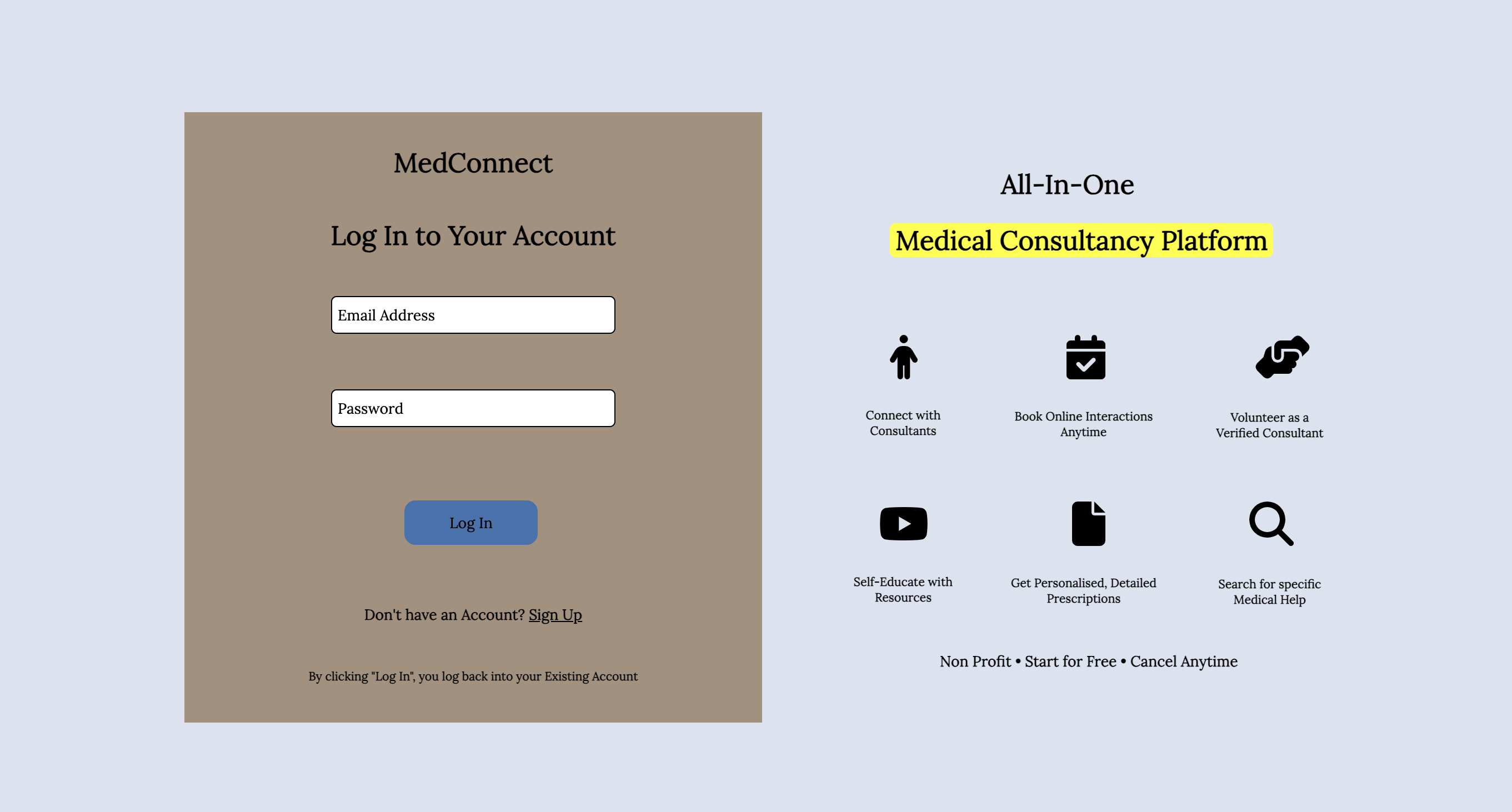
I want to add a background-colour of blue to the div class="information" (the entire div element on the right), the same way how there is a background-colour of brown to the div class="login" (the div on the left). However, when I try to use the same approach as I did for the right div as I did for the left div, it isn’t working. How can I achieve the expected?

@import url('https://fonts.googleapis.com/css2?family=Lora&display=swap');
body {
  background-color: #DBE2EF;
  font-family: Lora;
}

.login {
  padding: 10px;
  background-color: #A4907C;
  width: 500px;
  text-align: center;
  margin-top: 130px;
  margin-left: 180px;
}

.logintxt {
  padding-top: 15px;
}

.loginemailtxt {
  border: 1px solid black;
  width: 250px;
  height: 30px;
  margin-top: 20px;
  outline: none;
  border-radius: 5px;
  font-family: Lora;
}

.loginemailtxt::placeholder {
  color: black;
  padding-left: 3px;
}

.loginemailtxt:focus {
  border: 1px solid #3F72AF;
}

.loginpwdtxt {
  border: 1px solid black;
  width: 250px;
  height: 30px;
  margin-top: 50px;
  outline: none;
  border-radius: 5px;
  font-family: Lora;
}

.loginpwdtxt::placeholder {
  color: black;
  padding-left: 3px;
}

.loginpwdtxt:focus {
  border: 1px solid #3F72AF;
}

.loginbtn {
  width: 120px;
  height: 40px;
  border-radius: 10px;
  margin-top: 150px;
  margin-left: -190px;
  background-color: #3F72AF;
  border: none;
  cursor: pointer;
  position: fixed;
  font-family: Lora;
}

.loginbtn:hover {
  background-color: #068FFF;
}

#loginNoEmail {
  position: fixed;
  background-color: #F24C3D;
  margin-left: 140px;
  margin-top: 15px;
  width: 215px;
  border-radius: 5px;
  visibility: hidden;
}

#loginNoPassword {
  position: fixed;
  background-color: #F24C3D;
  margin-left: 145px;
  margin-top: 105px;
  width: 205px;
  border-radius: 5px;
  visibility: hidden;
}

#loginIncorrectCreds {
  position: fixed;
  background-color: #F24C3D;
  margin-left: 145px;
  margin-top: 105px;
  width: 205px;
  border-radius: 5px;
  visibility: hidden;
}

.infoHead1 {
  margin-top: -500px;
  margin-left: 915px;
}

.infoHead2 {
  margin-left: 815px;
  background-color: yellow;
  width: 340px;
  padding-left: 5px;
  border-radius: 5px;
}
<script defer src="https://use.fontawesome.com/releases/v6.4.0/js/all.js"></script>


<div class="container">
  <div class="login">
    <h2 class="textHead">MedConnect</h2>
    <h2 class="logintxt">Log In to Your Account</h2>
    <input type="text" class="loginemailtxt" name="email" placeholder="Email Address">
    <h5 id="loginNoEmail">Please enter your email address.</h5>
    <h5 id="loginNoPassword">Please enter your password.</h5>
    <h5 id="loginIncorrectCreds">Incorrect Email or Password</h5>
    <input type="password" class="loginpwdtxt" name="password" placeholder="Password">
    <button class="loginbtn" type="button" name="button">Log In</button>
    <h5 style="margin-top: 160px; font-family: Lora;">Don't have an Account? <u style="cursor: pointer;">Sign Up</u></h5>
    <h6 style="margin-top: 40px; font-family: Lora;">By clicking "Log In", you log back into your Existing Account</h6>
  </div>

  <div class="information">
    <h2 class="infoHead1">All-In-One</h2>
    <h2 class="infoHead2">Medical Consultancy Platform</h2>
    <div class="infoIcons1">
      <i class="fa-solid fa-person" style="font-size: 40px; margin-left: 815px; margin-top: 50px;"></i>
      <i class="fa-solid fa-calendar-check" style="font-size: 40px; margin-left: 130px;"></i>
      <i class="fa-solid fa-handshake-angle" style="font-size: 40px; margin-left: 130px;"></i>
      <h6 style="margin-left: 230px; text-align: center;">Connect with <br>Consultants</h6>
      <h6 style="margin-left: 555px; text-align: center; margin-top: -52px;">Book Online Interactions <br>Anytime</h6>
      <h6 style="margin-left: 890px; margin-top: -52px; text-align: center;">Volunteer as a <br>Verified Consultant</h6>
    </div>
    <div class="infoIcons2" style="margin-top: -20px;">
      <i class="fa-brands fa-youtube" style="font-size: 40px; margin-left: 805px; margin-top: 50px;"></i>
      <i class="fa-solid fa-file" style="font-size: 40px; margin-left: 125px;"></i>
      <i class="fa-solid fa-magnifying-glass" style="font-size: 40px; margin-left: 125px;"></i>
      <h6 style="margin-left: 230px; text-align: center;">Self-Educate with <br>Resources</h6>
      <h6 style="margin-left: 555px; text-align: center; margin-top: -52px;">Get Personalised, Detailed <br>Prescriptions</h6>
      <h6 style="margin-left: 890px; margin-top: -52px; text-align: center;">Search for specific <br>Medical Help</h6>
    </div>
    <h5 style="margin-left: 860px; margin-top: 40px;">Non Profit • Start for Free • Cancel Anytime</h5>
  </div>
</div>

2

Answers


  1. Your layout is misconfigured, you shouldn’t place all items with position: fixed. Your design is broken when the window size changes. Use relative positioning and also i suggest you to learn flexbox.

    When you succeed creating a well layout you won’t need to specify height and width for container it should auto-scale with its content.

    I will provide a code snippet with a well designed flexbox you may try similar things:

    /*
    * BEGIN
    * UTILITY CLASSES
    * (YOU MAY USE PRIMEFLEX, TAILWIND OR BOOTSTRAP FOR UTILITY CLASSES)
    * /BEGIN
    */
    
    .flex-col {
      display: flex;
      flex-direction: column;
    }
    
    .flex-row {
      display: flex;
      flex-direction: row;
    }
    
    .flex-wrap {
      flex-wrap: wrap;
    }
    
    .center-content {
      justify-content: center;
      align-items: center;
    }
    
    .gap-2 {
      gap: 2rem;
    }
    
    .h-full {
      height: 100%;
    }
    
    /*
    * END
    * UTILITY CLASSES
    * /END
    * 
    */
    
    .box {
      width: 500px;
      height: 500px;
      box-sizing: border-box;
      padding: 1rem;
    }
    
    .bg-brown {
      background-color: burlywood;
    }
    
    .bg-blue {
      background-color: skyblue;
    }
    
    .bg-red {
      background-color: red;
    }
    
    .icon {
      width: 50px;
      height: 50px;
    }
    <!DOCTYPE html>
    <html lang="en" dir="ltr">
    
    <head>
      <meta charset="utf-8">
      <title>MedConnect | Log In or Sign Up</title>
      <script defer src="https://use.fontawesome.com/releases/v6.4.0/js/all.js"></script>
      <link rel="stylesheet" href="main.css">
    </head>
    
    <body>
    
      <div class="flex-row gap-2 center-content">
        <div class="box bg-brown">
          <div class="flex-col center-content gap-2 h-full">
            <div class="flex-row center-content">
              <div class="icon">icon1</div>
              <div class="icon">icon2</div>
              <div class="icon">icon3</div>
              <div class="icon">icon4</div>
            </div>
            <div class="flex-row center-content">
              <div class="icon">icon1</div>
              <div class="icon">icon2</div>
              <div class="icon">icon3</div>
              <div class="icon">icon4</div>
            </div>
          </div>
        </div>
        <div class="box bg-blue">
          <div class="flex-col bg-red">
            <div>This red container scales with its content</div>
            <div>row 2</div>
            <div>row 3</div>
          </div>
        </div>
      </div>
    
    </body>
    
    </html>
    Login or Signup to reply.
  2. your layout is a… mess!
    I would suggest you to learn a little about css grid, check here :
    https://www.quackit.com/css/grid/tutorial/css_grid_introduction.cfm

    I made a snippet with grid, and simplify a lot your layout. Functional, but could still be more simplify

    *,
    *:before,
    *:after {
      box-sizing: border-box;
    }
    
    body {
      margin: 0;
      padding: 0;
      background-color: #DBE2EF;
      font-family: Lora, sans-serif;
      width: 100vw;
      height: 100vh;
      display: flex;
      align-items: center;
      justify-content: center;
    }
    
    .container {
      display: grid;
      grid-template-columns: repeat(2, 1fr);
      grid-template-rows: 1fr;
      gap: 2em;
      max-width: 80%;
      max-height: 80%;
    }
    
    .container h2 {
      margin: 1em 0;
    }
    
    .login {
      display: grid;
      grid-template-columns: 1fr;
      grid-template-rows: repeat(8, auto);
      padding: 1em 3em;
      background-color: #A4907C;
    }
    
    .login>* {
      text-align: center;
    }
    
    .login input {
      font-size: 1.25em;
      padding: 0 0.5em;
    }
    
    .loginemailtxt {
      border: 1px solid black;
      outline: none;
      border-radius: 5px;
      margin: 1em 0 2em 0;
    }
    
    .loginemailtxt::placeholder {
      color: black;
      padding-left: 3px;
    }
    
    .loginemailtxt:focus {
      border: 1px solid #3F72AF;
    }
    
    .loginpwdtxt {
      border: 1px solid black;
      outline: none;
      border-radius: 5px;
    }
    
    .loginpwdtxt::placeholder {
      color: black;
      padding-left: 3px;
    }
    
    .loginpwdtxt:focus {
      border: 1px solid #3F72AF;
    }
    
    .loginbtn {
      border-radius: 10px;
      background-color: #3F72AF;
      border: none;
      cursor: pointer;
    }
    
    .loginbtn:hover {
      background-color: #068FFF;
    }
    
    #errorMsg {
      opacity: 0;
    }
    
    #loginNoEmail {
      position: fixed;
      background-color: #F24C3D;
      border-radius: 5px;
      visibility: hidden;
    }
    
    #loginNoPassword {
      background-color: #F24C3D;
      border-radius: 5px;
      display: none;
    }
    
    #loginIncorrectCreds {
      background-color: #F24C3D;
      border-radius: 5px;
      display: none;
    }
    
    .information {
      display: grid;
      grid-template-columns: 1fr;
      grid-template-rows: repeat(5, auto);
      padding: 1em 3em;
      background-color: lightblue;
      text-align: center;
    }
    
    .information h6 {
      margin: 0;
    }
    
    .infoHead2 {
      background-color: yellow;
      padding-left: 5px;
      border-radius: 5px;
    }
    
    .infoIcons {
      display: grid;
      grid-template-columns: repeat(3, 1fr);
      grid-template-rows: repeat(2, 1fr);
      align-items: center;
      justify-items: center;
    }
    
    .infoIcons svg {
      font-size: 40px;
    }
    <div class="container">
      <div class="login">
        <h2 class="textHead">MedConnect</h2>
        <h2 class="logintxt">Log In to Your Account</h2>
        <input type="text" class="loginemailtxt" name="email" placeholder="Email Address">
        <input type="password" class="loginpwdtxt" name="password" placeholder="Password">
        <h5>Don't have an Account? <u style="cursor: pointer;">Sign Up</u></h5>
        <h6>By clicking "Log In", you log back into your Existing Account</h6>
        <button class="loginbtn" type="button" name="button">Log In</button>
        <div id="errorMsg">
          <h5 id="loginNoEmail">Please enter your email address.</h5>
          <h5 id="loginNoPassword">Please enter your password.</h5>
          <h5 id="loginIncorrectCreds">Incorrect Email or Password</h5>
        </div>
      </div>
    
      <div class="information">
        <h2 class="infoHead1">All-In-One</h2>
        <h2 class="infoHead2">Medical Consultancy Platform</h2>
        <div class="infoIcons">
          <i class="fa-solid fa-person"></i>
          <i class="fa-solid fa-calendar-check"></i>
          <i class="fa-solid fa-handshake-angle"></i>
          <h6 style="text-align: center;">Connect with <br>Consultants</h6>
          <h6 style="text-align: center;;">Book Online Interactions <br>Anytime</h6>
          <h6 style="text-align: center;">Volunteer as a <br>Verified Consultant</h6>
        </div>
        <div class="infoIcons">
          <i class="fa-brands fa-youtube"></i>
          <i class="fa-solid fa-file"></i>
          <i class="fa-solid fa-magnifying-glass"></i>
          <h6 style="text-align: center;">Self-Educate with <br>Resources</h6>
          <h6 style="text-align: center;">Get Personalised, Detailed <br>Prescriptions</h6>
          <h6 style="text-align: center;">Search for specific <br>Medical Help</h6>
        </div>
        <h5>Non Profit • Start for Free • Cancel Anytime</h5>
      </div>
    </div>
    
    <script defer src="https://use.fontawesome.com/releases/v6.4.0/js/all.js"></script>
    Login or Signup to reply.
Please signup or login to give your own answer.
Back To Top
Search