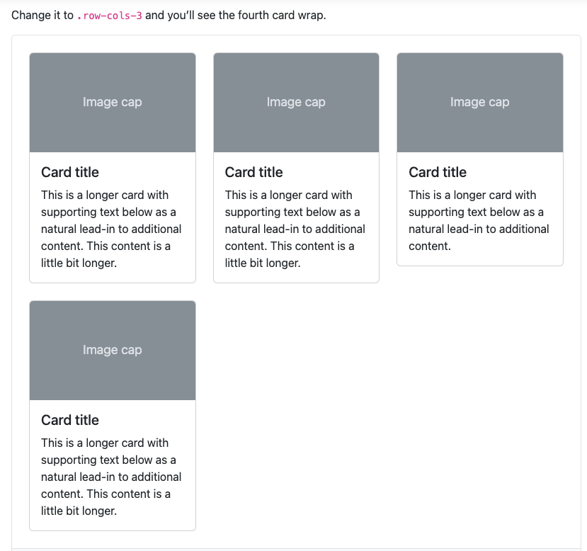
I am trying to recreate Bootstrap’s Cards example in my project. But I noticed that each Card’s top margin extends outside the parent element, a border div.
Bootstrap docs on Card usage here, picture below for visual reference:
I’ve copied the code but my Cards get generated as follows:
I want that "gap" between the border & the Cards but in my code example, the border is hugging the Cards. I know the CSS styling on the Cards will make each Card have a top margin, but I can’t seem to get the border div to fit that margin.
I have tried implementing a margin & padding on the parent element but I still get the same results.
Anyone knows how I can fix this?
Codepen attached here: link.
<h1>Your Cards</h1>

<div class="border border-1">
  <div class="row row-cols-1 row-cols-md-3 g-4">
    <div class="col">
      <div class="card">
        <div class="card-body">
          <h5 class="card-title">Card title</h5>
          <p class="card-text">This is a longer card with supporting text below as a natural lead-in to additional content. This content is a little bit longer.</p>
        </div>
      </div>
    </div>
    <div class="col">
      <div class="card">
        <div class="card-body">
          <h5 class="card-title">Card title</h5>
          <p class="card-text">This is a longer card with supporting text below as a natural lead-in to additional content. This content is a little bit longer.</p>
        </div>
      </div>
    </div>
    <div class="col">
      <div class="card">
        <div class="card-body">
          <h5 class="card-title">Card title</h5>
          <p class="card-text">This is a longer card with supporting text below as a natural lead-in to additional content.</p>
        </div>
      </div>
    </div>
    <div class="col">
      <div class="card">
        <div class="card-body">
          <h5 class="card-title">Card title</h5>
          <p class="card-text">This is a longer card with supporting text below as a natural lead-in to additional content. This content is a little bit longer.</p>
        </div>
      </div>
    </div>
  </div>
</div>


2
Answers
the problem was trying to use Bootstrap's
borderclass to wrap theCards & addingpaddingormarginto this class. I'm not sure why theborderclass doesn't work.what i did instead was to create my own custom
CSSclass.card-containerto wrap theCards & add themargini wanted, code below:Experiment with margin and padding settings on both the parent element and the individual Cards. You may need to adjust these values to control the spacing and alignment of your Cards within the parent container.