skip to Main Content

I’m trying to do a single webpage. I have a problem that Bootstrap navbar collapse list appears under other elements.

I tried to set the list position to relative and also the following elements position.

Also changed opacity and put background but it didn’t work.
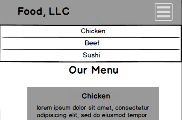
I have an assignment and the navbar shouldn’t be fixed to the top.
It should be like in the following pic, not to cover other elements:

enter image description here

here’s the page

and the code repository

* {
  box-sizing: border-box;
  font-family: Bradley Hand, cursive;
  font-size: 24px; 
}

p {margin:0}
/*  Header */
#header-nav {
  background-color: rgb(125, 125, 125);
  border-radius: 0;
  border:#000000 solid 3px;
  height: 100px;
  position: relative;
}

.navbar-brand {
  padding-top: 25px;
}
.navbar-brand h1 {
  color: #000000;
  font-size: 2em;
  font-weight: bold;
  text-shadow: 1px 2px 1px #515151;
  margin-top: 0;
  margin-bottom: 0;
  margin-left: 15px;
}
.navbar-brand a:hover, .navbar-brand a:focus {
  text-decoration: none;
  background: #acacac;
}
#nav-list {
  margin-top: 10px;
}

#nav-list a {
  background-color: #fff;
  border: 4px #000;
  font: #000;
  text-align: center;
}
#navbar-collapse > #nav-list > li > a:hover {
  background: #acacac;
}
.navbar-header button.navbar-toggle, .navbar-header .icon-bar {
  border: 2px solid #000000;
}
.navbar-header button.navbar-toggle {
  clear: both;
  margin-top: -53px;
}
.nav>li>a {
  display:none;
}
/* end Header */

#Menu{
  font-size:3em;
  font-weight: bold;
  background-color: #fff;
  color:#000000;
  margin-top: 30px;
  margin-bottom: 30px;
}

div > .row{
margin: 15px;
color: #000000;
}
.itm, .cntnt{
  background-color: #acacac;
  margin-right: 15px;
  margin-left: 15px;
  padding: 15px;
}

.itm{
  font-weight: bold;
  font-size: 1.5em;
}
.cntnt {
  font-size: 1.1em;
  margin-bottom: 15px;
}
/* Medium devices */
@media (min-width: 992px) and (max-width: 1199px) {


}

/* Small devices */
@media (min-width: 768px) and (max-width: 991px) {
 

}

/* Extra small devices */
@media (max-width: 767px) {
  /* Header */
  .navbar-brand {
    padding-top: 10px;
    height: 80px;
  }
  .navbar-brand h1 { 
    padding-top: 10px;
    font-size: 7vw;
  }
  .navbar .navbar-nav {
    margin-top: 40px;
    height: 100vh;
  }

 div > .navbar-collapse{
  border: hidden;
  max-height: 175px;  
 }

  #navbar-collapse > #nav-list > li{
    border: #000 solid 2px;
  }
  #navbar-collapse > #nav-list > li > a {
    color: #000;
    display:block;
    font-size: 4vw;
  }

  /* End Header */
  #Menu{
    font-size:5vw;
  }
  div > .row{
    margin: 2%;
  }
  .itm{
    font-size: 3vw;
  }
  .cntnt {
    font-size: 2vw;
  }

}
<link rel="stylesheet" href="https://cdn.jsdelivr.net/npm/[email protected]/dist/css/bootstrap.min.css" integrity="sha384-BVYiiSIFeK1dGmJRAkycuHAHRg32OmUcww7on3RYdg4Va+PmSTsz/K68vbdEjh4u" crossorigin="anonymous">

<header>
  <nav id="header-nav" class="navbar navbar-default">
    <div class="container-fluid">
      <div class="navbar-header">
        <div class="navbar-brand">
          <a href="index.html">
            <h1>Food, LLC</h1>
          </a>
        </div>
        
        <button type="button" class="navbar-toggle collapsed" data-toggle="collapse" data-target="#navbar-collapse" aria-expanded="false">
          <span class="sr-only">Toggle navigation</span>
          <span class="icon-bar"></span>
          <span class="icon-bar"></span>
          <span class="icon-bar"></span>
        </button>
      </div>
      
      <div id="navbar-collapse" class="collapse navbar-collapse opacity-100">
        <ul id="nav-list" class="nav navbar-nav">
          <li><a href="#Chicken">Chicken</a></li>
          <li><a href="#Beef">Beef</a></li>
          <li><a href="#Sushi">Sushi</a></li>
        </ul>
      </div>
    </div>
  </nav>
</header>

<div id="Menu" class="container-fluid text-center">Our Menu</div>

<div class="container-fluid text-center">
  <div class="row">
    <div class="col-md-4 col-sm-6 col-xs-12">
      <p class="itm" id="Chicken">Chicken</p>
      <p class="cntnt">
      
      
<script src="https://cdnjs.cloudflare.com/ajax/libs/jquery/3.6.1/jquery.min.js"></script>
<script src="https://cdn.jsdelivr.net/npm/[email protected]/dist/js/bootstrap.min.js" integrity="sha384-Tc5IQib027qvyjSMfHjOMaLkfuWVxZxUPnCJA7l2mCWNIpG9mGCD8wGNIcPD7Txa" crossorigin="anonymous"></script>

2

Answers


  1. Try to add this style values to the respective class

    .navbar-default .navbar-collapse, .navbar-default .navbar-form {
        border-color: #e7e7e7;
        z-index: 999999;
        position: relative;
        overflow-y: hidden;
    }
    
    Login or Signup to reply.
  2. The main problem is this:

    #header-nav {
        height: 100px;
    }
    

    It restricts the navbar’s ability to expand as needed.

    When in doubt, strip out your custom stuff. 99% of the time that’s where the problem lies when using a library.

    * {
      box-sizing: border-box;
      font-family: Bradley Hand, cursive;
      font-size: 24px;
    }
    
    p {
      margin: 0
    }
    
    #header-nav {
      background-color: rgb(125, 125, 125);
      border-radius: 0;
      border: #000000 solid 3px;
      /* height: 100px; ----------------------------- NO! */
      position: relative;
    }
    
    .navbar-brand {
      padding-top: 25px;
    }
    
    .navbar-brand h1 {
      color: #000000;
      font-size: 2em;
      font-weight: bold;
      text-shadow: 1px 2px 1px #515151;
      margin-top: 0;
      margin-bottom: 0;
      margin-left: 15px;
    }
    
    .navbar-brand a:hover,
    .navbar-brand a:focus {
      text-decoration: none;
      background: #acacac;
    }
    
    #nav-list {
      margin-top: 10px;
    }
    
    #nav-list a {
      background-color: #fff;
      border: 4px #000;
      font: #000;
      text-align: center;
    }
    
    #navbar-collapse>#nav-list>li>a:hover {
      background: #acacac;
    }
    
    .navbar-header button.navbar-toggle,
    .navbar-header .icon-bar {
      border: 2px solid #000000;
    }
    
    .navbar-header button.navbar-toggle {
      clear: both;
      margin-top: -53px;
    }
    
    .nav>li>a {
      display: none;
    }
    
    
    /* end Header */
    
    #Menu {
      font-size: 3em;
      font-weight: bold;
      background-color: #fff;
      color: #000000;
      margin-top: 30px;
      margin-bottom: 30px;
    }
    
    div>.row {
      margin: 15px;
      color: #000000;
    }
    
    .itm,
    .cntnt {
      background-color: #acacac;
      margin-right: 15px;
      margin-left: 15px;
      padding: 15px;
    }
    
    .itm {
      font-weight: bold;
      font-size: 1.5em;
    }
    
    .cntnt {
      font-size: 1.1em;
      margin-bottom: 15px;
    }
    
    
    /* Medium devices */
    
    @media (min-width: 992px) and (max-width: 1199px) {}
    
    
    /* Small devices */
    
    @media (min-width: 768px) and (max-width: 991px) {}
    
    
    /* Extra small devices */
    
    @media (max-width: 767px) {
      /* Header */
      .navbar-brand {
        padding-top: 10px;
        height: 80px;
      }
      .navbar-brand h1 {
        padding-top: 10px;
        font-size: 7vw;
      }
      .navbar .navbar-nav {
        margin-top: 40px;
        height: 100vh;
      }
      div>.navbar-collapse {
        border: hidden;
        max-height: 175px;
      }
      #navbar-collapse>#nav-list>li {
        border: #000 solid 2px;
      }
      #navbar-collapse>#nav-list>li>a {
        color: #000;
        display: block;
        font-size: 4vw;
      }
      /* End Header */
      #Menu {
        font-size: 5vw;
      }
      div>.row {
        margin: 2%;
      }
      .itm {
        font-size: 3vw;
      }
      .cntnt {
        font-size: 2vw;
      }
    }
    <link rel="stylesheet" href="https://cdn.jsdelivr.net/npm/[email protected]/dist/css/bootstrap.min.css" integrity="sha384-BVYiiSIFeK1dGmJRAkycuHAHRg32OmUcww7on3RYdg4Va+PmSTsz/K68vbdEjh4u" crossorigin="anonymous">
    
    <header>
      <nav id="header-nav" class="navbar navbar-default">
        <div class="container-fluid">
          <div class="navbar-header">
            <div class="navbar-brand">
              <a href="index.html">
                <h1>Food, LLC</h1>
              </a>
            </div>
    
            <button type="button" class="navbar-toggle collapsed" data-toggle="collapse" data-target="#navbar-collapse" aria-expanded="false">
              <span class="sr-only">Toggle navigation</span>
              <span class="icon-bar"></span>
              <span class="icon-bar"></span>
              <span class="icon-bar"></span>
            </button>
          </div>
    
          <div id="navbar-collapse" class="collapse navbar-collapse opacity-100">
            <ul id="nav-list" class="nav navbar-nav">
              <li><a href="#Chicken">Chicken</a></li>
              <li><a href="#Beef">Beef</a></li>
              <li><a href="#Sushi">Sushi</a></li>
            </ul>
          </div>
        </div>
      </nav>
    </header>
    
    <div id="Menu" class="container-fluid text-center">Our Menu</div>
    
    <div class="container-fluid text-center">
      <div class="row">
        <div class="col-md-4 col-sm-6 col-xs-12">
          <p class="itm" id="Chicken">Chicken</p>
          <p class="cntnt">
    
    
            <script src="https://cdnjs.cloudflare.com/ajax/libs/jquery/3.6.1/jquery.min.js"></script>
            <script src="https://cdn.jsdelivr.net/npm/[email protected]/dist/js/bootstrap.min.js" integrity="sha384-Tc5IQib027qvyjSMfHjOMaLkfuWVxZxUPnCJA7l2mCWNIpG9mGCD8wGNIcPD7Txa" crossorigin="anonymous"></script>
    Login or Signup to reply.
Please signup or login to give your own answer.
Back To Top
Search