skip to Main Content

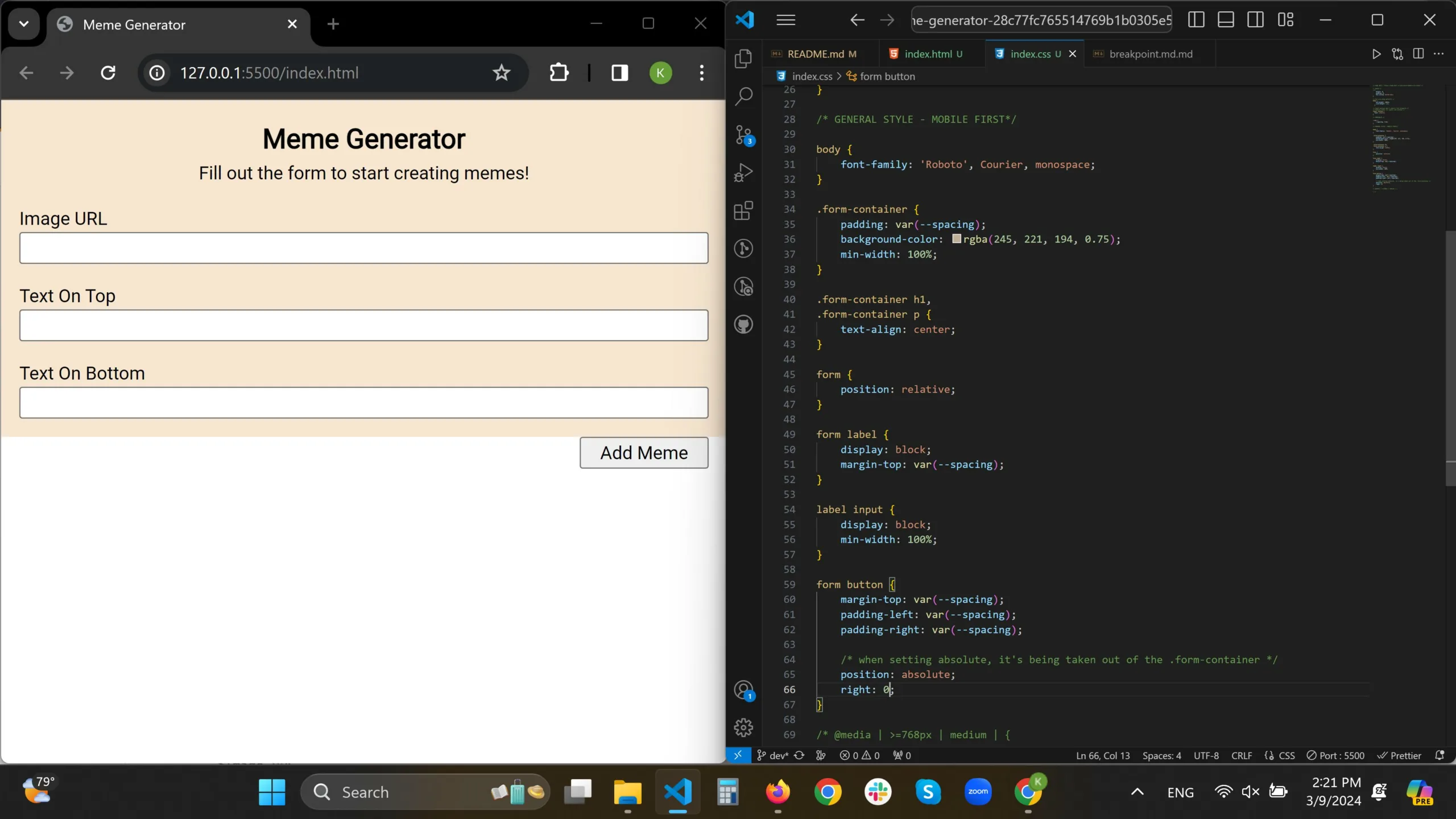
Hi I am a beginner and trying to position a button that sits inside a form element on the bottom right of a container, but not able to do so. Please advise. Thank you.

Whether using the float:right; or position: absolute;, the button is being taken out of the container(from my understanding from the dev tool on Google Chrome).
meme generator page

HTML code

<section class="form-container">
      <h1>Meme Generator</h1>
      <p>Fill out the form to start creating memes!</p>
      <form action="#">
        <label for="img-url"
          >Image URL
          <input type="text" id="img-url" />
        </label>
        <label for="top-txt"
          >Text On Top
          <input type="text" id="top-txt" />
        </label>
        <label for="bottom-txt"
          >Text On Bottom
          <input type="text" id="bottom-txt" />
        </label>
        <button>Add Meme</button>
      </form>
    </section>

CSS code

/* Reset */
* {
    margin: 0;
    padding: 0;
    box-sizing: border-box;
}

/* Set core body defaults */
body {
    min-height: 100vh;
    line-height: 1.5;
  }

/* Input buttons don't inherit font property */
/* Inherit fonts for inputs and buttons */
input, button {
  font: inherit;
}

/* VARIABLES */

:root {
    --spacing: 1rem;
}

/* GENERAL STYLE - MOBILE FIRST*/

body {
    font-family: 'Roboto', Courier, monospace;
}

.form-container {
    padding: var(--spacing);
    background-color: rgba(245, 221, 194, 0.75);
    min-width: 100%;
}

.form-container h1,
.form-container p {
    text-align: center;
}

form {
    position: relative;
}

form label {
    display: block;
    margin-top: var(--spacing);
}

label input {
    display: block;
    min-width: 100%;
}

form button {
    margin-top: var(--spacing);
    padding-left: var(--spacing);
    padding-right: var(--spacing);

    /* when setting absolute, it's being taken out of the .form-container */
    /* position: absolute; */
}

2

Answers


  1. You can set the form to display: flex and align vertically using flex-direction: column, then set the button to align-self: flex-end to be moved at the right side of the flex container.

    Here are the changes:

    form {
      position: relative;
      display: flex; /* <= set form display to flexbox */
      flex-direction: column; /* <= set direction to vertical */
    }
    form button {
      margin-top: var(--spacing);
      padding-left: var(--spacing);
      padding-right: var(--spacing);
      align-self: flex-end; /* <= set the alignment of the button to flex-end so that it is moved at the end of the last row */
    }
    

    Now, to understand why float and position: aboslute do not have the effect that you would expect, let’s take a look a what these two actually do:

    • float: "The element is removed from the normal flow of the page" MDN Docs

    • position: absolute "The element is removed from the normal document flow, and no space is created for the element in the page layout." MDN Docs

    /* Reset */
    * {
        margin: 0;
        padding: 0;
        box-sizing: border-box;
    }
    
    /* Set core body defaults */
    body {
        min-height: 100vh;
        line-height: 1.5;
      }
    
    /* Input buttons don't inherit font property */
    /* Inherit fonts for inputs and buttons */
    input, button {
      font: inherit;
    }
    
    /* VARIABLES */
    
    :root {
        --spacing: 1rem;
    }
    
    /* GENERAL STYLE - MOBILE FIRST*/
    
    body {
        font-family: 'Roboto', Courier, monospace;
    }
    
    .form-container {
        padding: var(--spacing);
        background-color: rgba(245, 221, 194, 0.75);
        min-width: 100%;
    }
    
    .form-container h1,
    .form-container p {
        text-align: center;
    }
    
    form {
        position: relative;
      display: flex;
      flex-direction: column;
    }
    
    form label {
        display: block;
        margin-top: var(--spacing);
    }
    
    label input {
        display: block;
        min-width: 100%;
    }
    
    form button {
        margin-top: var(--spacing);
        padding-left: var(--spacing);
        padding-right: var(--spacing);
        align-self: flex-end;
        /* when setting absolute, it's being taken out of the .form-container */
        /* position: absolute; */
    }

    <section class="form-container">
          <h1>Meme Generator</h1>
          <p>Fill out the form to start creating memes!</p>
          <form action="#">
            <label for="img-url"
              >Image URL
              <input type="text" id="img-url" />
            </label>
            <label for="top-txt"
              >Text On Top
              <input type="text" id="top-txt" />
            </label>
            <label for="bottom-txt"
              >Text On Bottom
              <input type="text" id="bottom-txt" />
            </label>
            <button>Add Meme</button>
          </form>
        </section>

    Solution #2: Clearing the float:

    You can clear the float by appending an empty div that has the clear property set to both which clears the "floating" and produces the result that you are looking for. Check this MDN article to understand how clear works.

    /* Reset */
    * {
        margin: 0;
        padding: 0;
        box-sizing: border-box;
    }
    
    /* Set core body defaults */
    body {
        min-height: 100vh;
        line-height: 1.5;
      }
    
    /* Input buttons don't inherit font property */
    /* Inherit fonts for inputs and buttons */
    input, button {
      font: inherit;
    }
    
    /* VARIABLES */
    
    :root {
        --spacing: 1rem;
    }
    
    /* GENERAL STYLE - MOBILE FIRST*/
    
    body {
        font-family: 'Roboto', Courier, monospace;
    }
    
    .form-container {
        padding: var(--spacing);
        background-color: rgba(245, 221, 194, 0.75);
        min-width: 100%;
    }
    
    .form-container h1,
    .form-container p {
        text-align: center;
    }
    
    form {
        position: relative;
    }
    
    form label {
        display: block;
        margin-top: var(--spacing);
    }
    
    label input {
        display: block;
        min-width: 100%;
    }
    
    form button {
        margin-top: var(--spacing);
        padding-left: var(--spacing);
        padding-right: var(--spacing);
      float: right;
    }
    .clear {
      clear: both;
    }
    <section class="form-container">
          <h1>Meme Generator</h1>
          <p>Fill out the form to start creating memes!</p>
          <form action="#">
            <label for="img-url"
              >Image URL
              <input type="text" id="img-url" />
            </label>
            <label for="top-txt"
              >Text On Top
              <input type="text" id="top-txt" />
            </label>
            <label for="bottom-txt"
              >Text On Bottom
              <input type="text" id="bottom-txt" />
            </label>
            <button>Add Meme</button>
            <div class="clear"></div>
          </form>
        </section>

    Solution #3: Using position:absolute

    You can use position: absolute on the button, but you will have to tweak the code a bit. You will need to (1) remove the position:relative from the form and move it to the form-container, add a bit of padding at the bottom and they play around with the bottom and right values of the absolutely positioned button to get the layout that you want:

    /* Reset */
    * {
        margin: 0;
        padding: 0;
        box-sizing: border-box;
    }
    
    /* Set core body defaults */
    body {
        min-height: 100vh;
        line-height: 1.5;
      }
    
    /* Input buttons don't inherit font property */
    /* Inherit fonts for inputs and buttons */
    input, button {
      font: inherit;
    }
    
    /* VARIABLES */
    
    :root {
        --spacing: 1rem;
    }
    
    /* GENERAL STYLE - MOBILE FIRST*/
    
    body {
        font-family: 'Roboto', Courier, monospace;
    }
    
    .form-container {
        padding: var(--spacing);
        background-color: rgba(245, 221, 194, 0.75);
        min-width: 100%;
      position: relative;
      padding-bottom: 4rem;
    }
    
    .form-container h1,
    .form-container p {
        text-align: center;
    }
    
    form label {
        display: block;
        margin-top: var(--spacing);
    }
    
    label input {
        display: block;
        min-width: 100%;
    }
    
    form button {
        margin-top: var(--spacing);
        padding-left: var(--spacing);
        padding-right: var(--spacing);
      position: absolute;
      bottom: 1rem;
      right: 1rem;
    }
    <section class="form-container">
          <h1>Meme Generator</h1>
          <p>Fill out the form to start creating memes!</p>
          <form action="#">
            <label for="img-url"
              >Image URL
              <input type="text" id="img-url" />
            </label>
            <label for="top-txt"
              >Text On Top
              <input type="text" id="top-txt" />
            </label>
            <label for="bottom-txt"
              >Text On Bottom
              <input type="text" id="bottom-txt" />
            </label>
            <button>Add Meme</button>
          </form>
        </section>
    Login or Signup to reply.
  2. You could also set the height of the form container to lets say 50% and the form button float to left.

    This is the code;

    /* Reset */
    * {
        margin: 0;
        padding: 0;
        box-sizing: border-box;
    }
    
    /* Set core body defaults */
    body {
        min-height: 100vh;
        line-height: 1.5;
      }
    
    /* Input buttons don't inherit font property */
    /* Inherit fonts for inputs and buttons */
    input, button {
      font: inherit;
    }
    
    /* VARIABLES */
    
    :root {
        --spacing: 1rem;
    }
    
    /* GENERAL STYLE - MOBILE FIRST*/
    
    body {
        font-family: 'Roboto', Courier, monospace;
    }
    
    .form-container {
        padding: var(--spacing);
        background-color: rgba(245, 221, 194, 0.75);
        min-width: 100%;
        height:50%;
    }
    
    .form-container h1,
    .form-container p {
        text-align: center;
    }
    
    form {
        position: relative;
    }
    
    form label {
        display: block;
        margin-top: var(--spacing);
    }
    
    label input {
        display: block;
        min-width: 100%;
    }
    
    form button {
        margin-top: var(--spacing);
        padding-left: var(--spacing);
        padding-right: var(--spacing);
        float:right;
    
        /* when setting absolute, it's being taken out of the .form-container */
        /* position: absolute; */
    }
    Login or Signup to reply.
Please signup or login to give your own answer.
Back To Top
Search