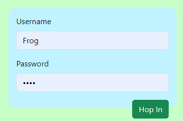
I have a form that looks like this:
Removing the mb-3 class does nothing to help, it just removes the spaces between the inputs. How am I supposed to ensure the button stays within the blue box?
<!-- Bootstrap-5 -->
<link href="https://cdn.jsdelivr.net/npm/[email protected]/dist/css/bootstrap.min.css" rel="stylesheet" integrity="sha384-rbsA2VBKQhggwzxH7pPCaAqO46MgnOM80zW1RWuH61DGLwZJEdK2Kadq2F9CUG65" crossorigin="anonymous">


<!-- Body -->
<form action="/user/loginattempt" class="p-3 rounded-4" style="background-color:rgb(192, 242, 255);" method="POST">
  <div class="mb-3">
    <label for="username" class="form-label">Username</label>
    <input type="text" class="form-control" id="username" name="username" placeholder="Username" />
  </div>
  <div class="mb-3">
    <label for="password" class="form-label">Password</label>
    <input type="password" class="form-control" id="password" name="password" placeholder="Password" />
  </div>
  <button type="submit" class="btn btn-success float-end">Hop In</button>
</form>


5
Answers
The issue is caused by using
float-endon the button which will move the button out of the normal flow and float it.Simply use Flexbox with
flex-direction: columnon the container by adding the classesd-flexandflex-column.After that you can push the button to the right side by adding the class
ms-autoto the button:You need to clear the float using
clearfixafter float. Then it works.Or you can write it in CSS:
The ‘float-end’ class makes the button float to the right, so we need to add
'overflow: hidden;'to the form container to keep it within the blue boxIf you want to use float and solve it the bootstrap way, you should give the parent element the class "clearfix". This fixes the "clearfix bug" when you have bootstrap loaded.
I wrapped a container around the form and gave it the class "clearfix".
Since I think it’s unusual to put css styles on the form-tag, I moved the styles from the form-tag to the outer container.
(Usually only the parameters needed for sending are used in a form-tag. Probably to create a more precise separation between styling and functionality. An "official rule" is not known to me at least.)
One (Bootstrap) way would be to remove the
fload-endclass from the button and wrap it inside an element withd-flexandjustify-content-end.Another (Bootstrap) way would be to remove the
fload-endclass and addd-blockandms-autoclasses to your button to force adisplay: block;with an automatic left-margin (margin-left: auto;).Both methods achieve the exact same results.