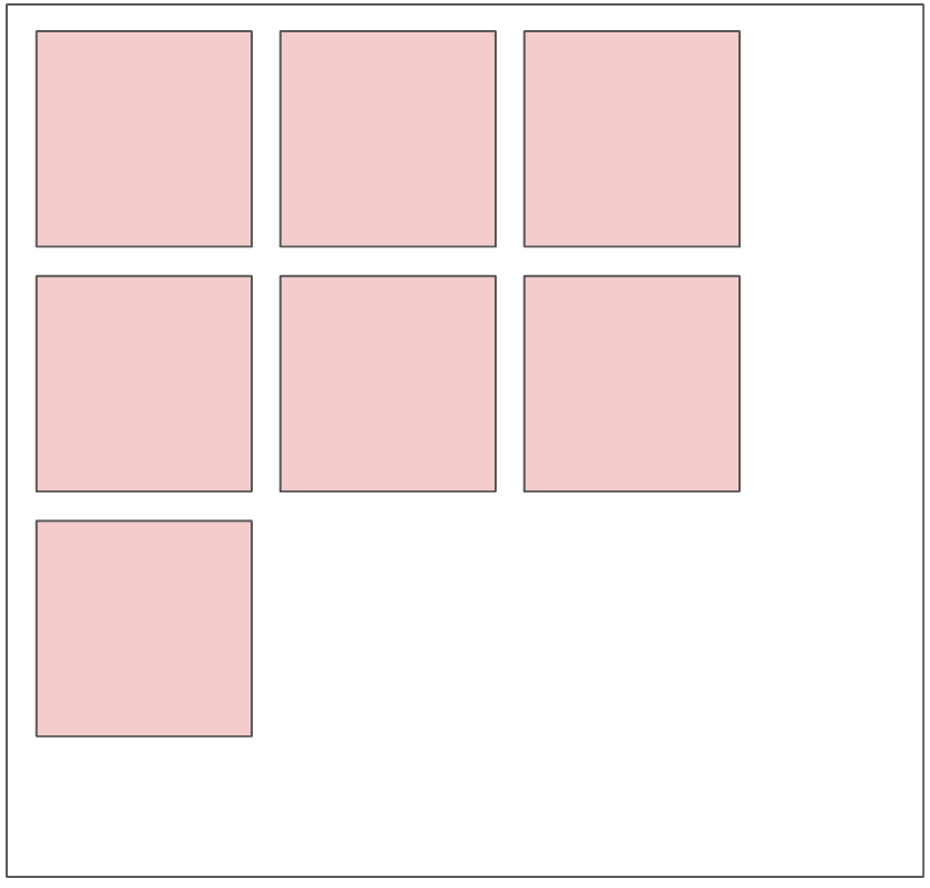
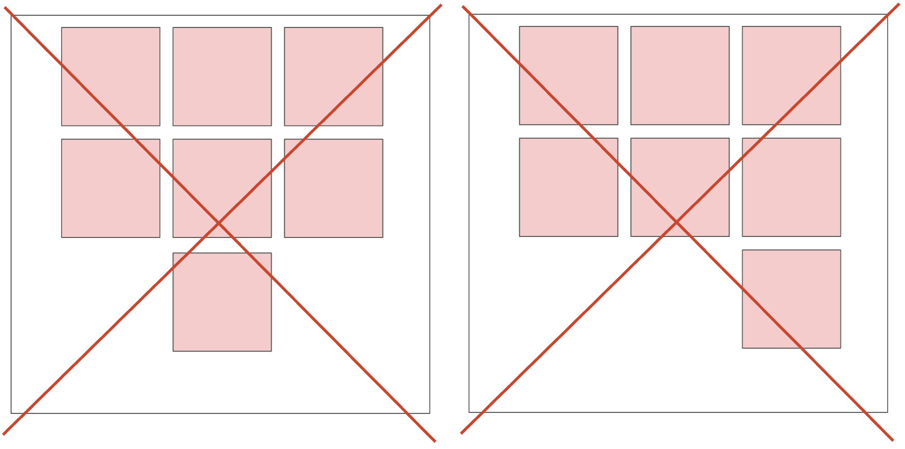
I would like to have a list of squares with justify-start aligned to left but they whole should be centered in the parent div.
So instead of this:
I would like this:
I would like to have a list of elements that should be wrapped by the containers, the space between items should be fixed (no justify between), all the items should be centered respect to the parent div.
Is that possible with flex?
Here my code:
.container {
  width: 80%;
  display: flex;
  justify-content: center;
  margin: 0 auto;
  border: 5px solid black;
}
.container-squares {
  display: flex;
  flex-wrap: wrap;
  gap: 10px;
  justify-content: start;
  border: 5px solid gold;
}
.item {
  width: 150px;
  height: 150px;
  background-color: tomato;
  border: 1px solid black;
}
<div class="container">
<div class="container-squares">
<div class="item"></div>
<div class="item"></div>
<div class="item"></div>
<div class="item"></div>
<div class="item"></div>
<div class="item"></div>
<div class="item"></div>
<div class="item"></div>
<div class="item"></div>
<div class="item"></div>
<div class="item"></div>
<div class="item"></div>
</div>
</div>Is that possibile maybe using grid? But how? I tried but it doesn’t. work as I’m expecting…
.container-grid {
  width: 80%;
  margin: 0 auto;
  border: 5px solid black;
}
.container-squares-grid {
  display: grid;
  grid-template-columns: repeat(3, minmax(0, 1fr));
  gap: 10px;
  border: 5px solid gold;
}
.item-grid {
  width: 150px;
  height: 150px;
  background-color: teal;
  border: 1px solid black;
}
<div class="container-grid">
<div class="container-squares-grid">
<div class="item-grid"></div>
<div class="item-grid"></div>
<div class="item-grid"></div>
<div class="item-grid"></div>
<div class="item-grid"></div>
<div class="item-grid"></div>
<div class="item-grid"></div>
<div class="item-grid"></div>
<div class="item-grid"></div>
<div class="item-grid"></div>
<div class="item-grid"></div>
<div class="item-grid"></div>
</div>
</div>Thank you!


3
Answers
with flex: you can just change justify content from start to center in container-squares
ie:
.container-squares { justify-content: center; }I think you can’t. The
gridandflexparents should contain awidthproperty. if you don’t specify the width, your flex container fill 100% of the parent’s widthin grid you can use
repeat(auto-fit, 150px)in your parent container andaspect-ratio: 1;in your child but still you have same problemEven if you set the width, your parent will always have empty space on its right side
check this code :
This happens because you did not specify the width of
container-squaresand hence, by default it takes the full width of the parent, which iscontainer. Include width incontainer-squaresclass and you can see that the group of squares will get centered. Maybe give the container some 80% of the width.