 Question posted in


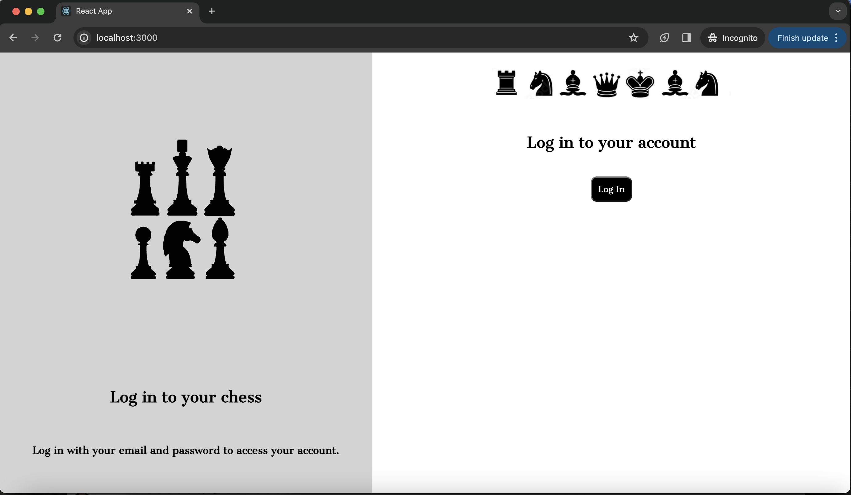
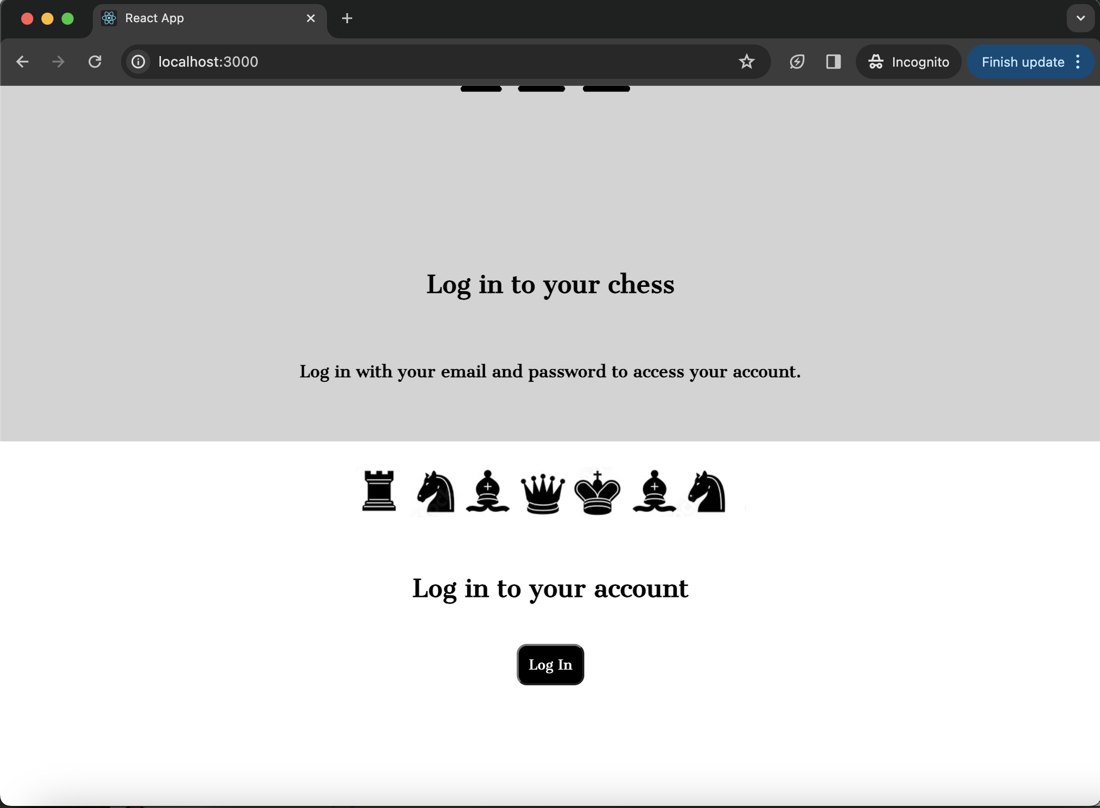
I am trying to build a landing page that is split into two columns (currently unfinished). Each column contains an image and text. It displays perfectly fine when the window is full size, but any smaller than that and the page stops displaying as two columns. I want the page to display as two columns regardless of window size, and for the images to shrink and grow with the window so that they remain proportional. I have tried using max-height and max-width but neither have helped with this issue. However, when I remove the images, or try it with perfectly square images, this problem does not occur and the columns correctly resize themselves as the window resizes. Please see screenshots and code below.
.center-img-half {
  display: flex;
  align-items: center;
  justify-content: center;
  scale: 50%;
}

.center-div {
  display: flex;
  align-items: center;
  justify-content: center;
  padding: 10px;
  text-align: center;
}

.black-white-button {
  background-color: black;
  color: white;
  border-radius: 10px;
  font-family: 'Cantata One', serif;
  padding: 10px;
}

.wrapper {
  background-color: white;
}

.login-column1 {
  background-color: lightgray;
  display: flex;
  flex-direction: column;
  flex-basis: 100%;
  flex: 1;
  height: 100vh;
}

.login-column2 {
  background-color: white;
  display: flex;
  flex-direction: column;
  flex-basis: 100%;
  flex: 1;
  height: 100vh;
}

.row {
  display: flex;
  flex-direction: row;
  flex-wrap: wrap;
  width: 100%;
}
<div class="wrapper">
<div class="row">
<div class="login-column1">
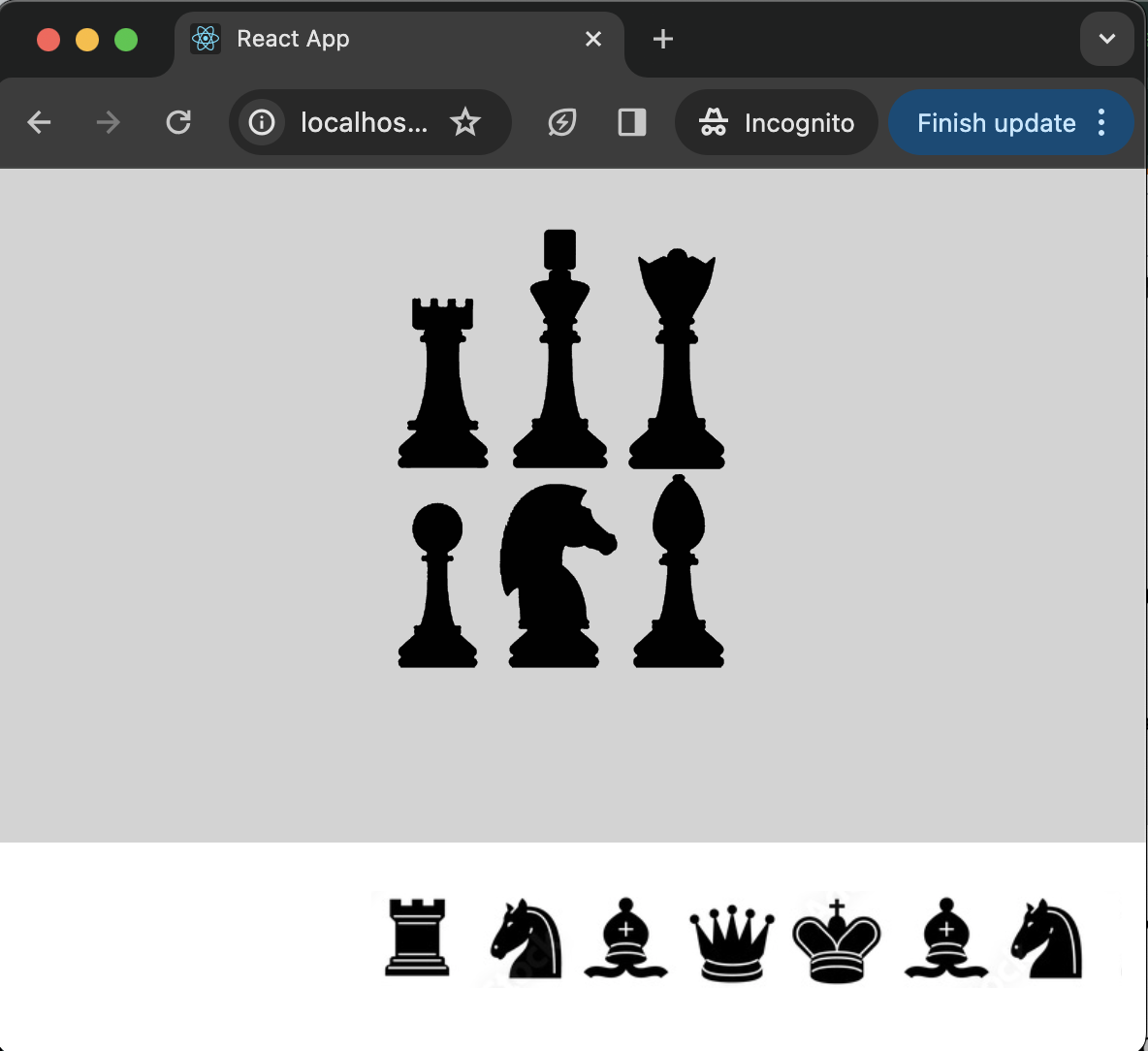
<div class="center-img-half">
<img src="https://via.placeholder.com/300x300" />
</div>
<div class="center-div">
<h2>Log in to your chess </h2>
</div>
<div class="center-div">
<h4>Log in with your email and password to access your account.</h4>
</div>
</div>
<div class="login-column2">
<div class="center-img-half">
<img src="https://via.placeholder.com/600x200" alt="Chess Pal Logo" />
</div>
<div class="center-div">
<h2> Log in to your account </h2>
</div>
<div class="center-div">
<Button class="black-white-button">Log In</Button>
</div>
</div>
</div>
</div>
2
Answers
Use dynamic width to your columns
To always maintain the two columns display, you can set the width of both to 0, this property with the flex-grow: 1 to each (already applied when you used flex: 1) will ensure that the screen will be divided in two columns of the same width value! So, basically apply this to your columns:
For the images, you can put them inside a div container and set a width based on a percentage value, so it will maintain the proportion.
Edit: For the image you can use something as width: 100% to your center-img-half class (or another value that you desire)
Is this desired outcome?
Focus is on the following selectors: