 Question posted in


tl;dr
How can I create an inner square that fills a flex item as much as it can while maintaining a 1/1 aspect ratio and not forcing the flex item to expand beyond its allocated size?
Goal
I’m trying to create a layout with a flexbox header and footer each taking their auto-calculated height and a content area filling the rest and the entire flexbox exactly fills the body without causing any scroll or overflow. Inside the content area I need a square div that is 100% of the width OR 100% of the height, whichever is smaller.
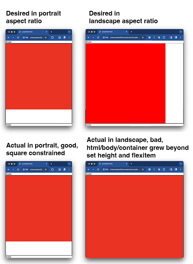
Problem
The problem I’m running into is if I base the size of the box on the width and the viewport is wider than it is tall, then the square forces the flex item it’s in to expand and the entire flexbox/body/html to expand beyond the 100vh it’s explicitly set to. The same is true if the square size is based on the height–it works if the viewport is wider than it is tall but not otherwise.
Question
How can I create an inner square that fills the flex item as much as it can while maintaining a 1/1 aspect ratio and not forcing the flex item to expand beyond its allocated size?
What I’ve tried
Here’s the code I have along with several variations I’ve tried.
<html>
<body>
<div class="container">

  <div class="header">Header</div>

  <div class="content">
    <div class="should-be-constrained-square"></div>
  </div>

  <div class="footer">Footer</div>
</div>

<style>
  * {
    box-sizing: border-box;
  }

  html,
  body {
    height: 100vh;
    margin: 0;
  }

  .container {
    display: flex;
    flex-direction: column;
    height: 100vh;
  }

  .header {
    flex: 0 0 auto;
  }

  .content {
    flex: 1 0;
    border: 2px solid black;
  }

  .footer {
    flex: 0 0 auto;
  }

  .should-be-constrained-square {
    width: 100%;
    aspect-ratio: 1/1;
    background-color: red;

    /*
        Also tried:
        https://tylerduprey-52451.medium.com/a-perfect-square-with-css-964499440998

        width: 100%;
        height: 0;
        padding-top: 100%;
    */

    /*
        And tried:
        https://dev.to/tchaflich/a-width-responsive-perfect-square-in-pure-css-3dao

        width: 100%;
        padding-bottom: 100%;
        position: relative;
    */

    /*
        And tried:
        How to Create a Responsive Square with CSS

        width: 100%;

        .should-be-constrained-square:after {
          content: "";
          display: block;
          padding-top: 100%;
        }
    */
  }
</style>
</body>
</html>
2
Answers
I found a crazy simple solution using the newly introduced CSS unit
qcmin. Credit goes to @psdpainter. Their comment about usingvminandvmaxled me to research all the many new CSS units which landed me on Container Queries andqcmin.By setting the parent's
container-typeproperty and then setting both the child (square) element'swidthandheightproperties toqcmin. That's all it took.Interestingly this is using the Container Query functionality but there is no actual container query involved. It's only taking advantage of some of what was introduced to support container queries.
Fully working code.
The issue is that you need a relationship from the child’s width, to the parents height.
A few Key Points
clamp(300px, 100%, var(--parent-height))position: absolute;&aspect-ratio: 1 / 1ResizeObserverIn this example below
(Note it doesn’t work in StackOverFlows demo because I’m using
lvh)I’m setting the
.box‘s width toclamp(300px, 100%, var(--parent-height))which will ensure the.box‘s width is:300pxvar(--parent-height)100%This allows the
.boxto take up 100% of the width on Mobile, and devices that have more vertical room than horizontal room. Although, the.boxwill NEVER be wider then the parents height.[position: absolute][2];&aspect-ratio: 1 / 1What this does, it allows the
#parentto grow to the full width, without consideration for the height of the child box. Theaspect-ratioensures that the.boxwill always be a perfect square relative to it’s width or height.Finally
ResizeObserverThe
ResizeObserverallows us to feed additional information into CSS, and all theclamp()to actually work by referencing the height of the parent.Unless you know the height’s of the Header & Footer, there’s no way to get this relationship solely in CSS. If you did know the heights, then you could run a CSS
calc(100lvh - <HEADER_HEIGHT> - <FOOTER_HEIGHT>)to set themax-widthof the child box.