skip to Main Content

I try to create a grid system with configurable items to set position and size.
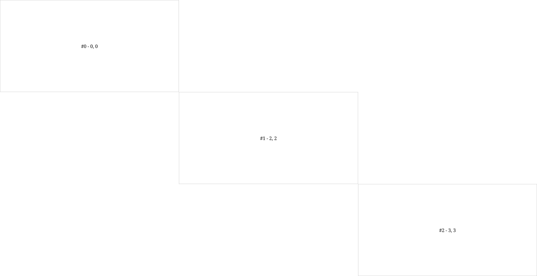
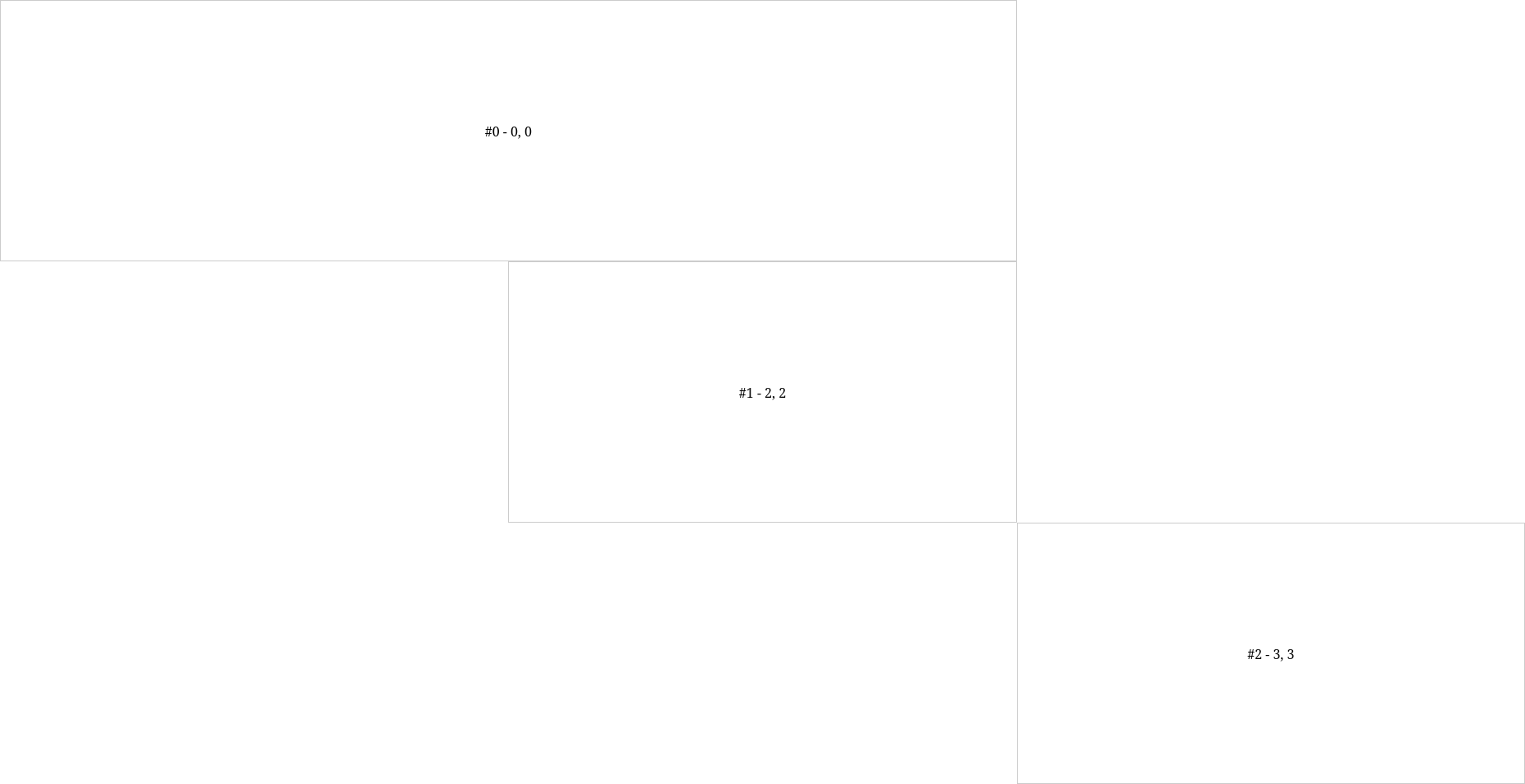
The problem is, the height/width setting has no affect on the gird items. They remain all the same size as 1×1, and the first item does not take up 2×1:

const items = [{
    x: 0,
    y: 0,
    w: 2,
    h: 1
}, {
    x: 2,
    y: 2,
    w: 1,
    h: 1
}, {
    x: 3,
    y: 3,
    w: 1,
    h: 1
}];


document.addEventListener("DOMContentLoaded", () => {

    let numCols = 3;
    let numRows = 3;

    let gridContainer = document.getElementById("grid-container");


    gridContainer.style.gridTemplateColumns = `repeat(${numCols}, 1fr)`;
    gridContainer.style.gridTemplateRows = `repeat(${numRows}, 1fr)`;


    items.forEach((obj, i) => {

        let elem = document.createElement("div");

        elem.classList.add("grid-item");
        elem.textContent = `#${i} - ${obj.x}, ${obj.y}`;

        // Set the position dynamically
        elem.style.gridRow = `${obj.x} / span ${obj.w}`;
        elem.style.gridColumn = `${obj.y} / span ${obj.h}`;

        gridContainer.appendChild(elem);

    });

});
body, html {
  height: 100%;
  margin: 0;
  overflow: hidden;
}

#grid-container {
  display: grid;
  height: 100vh;
  /*gap: 1px; /* Optional: Add gap between grid items */
}

.grid-item {
  border: 1px solid #ccc;
  display: flex;
  align-items: center;
  justify-content: center;
}
<!DOCTYPE html>
<html lang="en">
<head>

  <meta charset="UTF-8">
  <meta name="viewport" content="width=device-width, initial-scale=1.0">
  <link rel="stylesheet" href="style.css">
  <title>Full-Height Grid System</title>
  
</head>
<body>

  <div id="grid-container"></div>
  <script src="script.js"></script>

</body>
</html>

Why is the width setting for the first element ignored?

Actual result:
enter image description here

Wanted result:
enter image description here

2

Answers


  1. const items = [{
        x: 0,
        y: 0,
        w: 2,
        h: 1
      },
      {
        x: 2,
        y: 2,
        w: 1,
        h: 1
      },
      {
        x: 3,
        y: 3,
        w: 1,
        h: 1
      }
    ];
    
    document.addEventListener("DOMContentLoaded", () => {
    
      let numCols = 4; // Adjusted for item spanning 2 columns
      let numRows = 4; // Adjusted for item spanning 1 row
    
      let gridContainer = document.getElementById("grid-container");
    
      gridContainer.style.gridTemplateColumns = `repeat(${numCols}, 1fr)`;
      gridContainer.style.gridTemplateRows = `repeat(${numRows}, 1fr)`;
    
      items.forEach((obj, i) => {
        let elem = document.createElement("div");
        elem.classList.add("grid-item");
        elem.textContent = `#${i} - ${obj.x}, ${obj.y}`;
    
        // Set position and size dynamically
        elem.style.gridColumn = `${obj.x}`;
        elem.style.gridRow = `${obj.y}`;
        elem.style.gridColumnEnd = `span ${obj.w}`;
        elem.style.gridRowEnd = `span ${obj.h}`;
    
        gridContainer.appendChild(elem);
      });
    });
    body,
    html {
      height: 100%;
      margin: 0;
      overflow: hidden;
    }
    
    #grid-container {
      display: grid;
      height: 100vh;
      /*gap: 1px; /* Optional: Add gap between grid items */
    }
    
    .grid-item {
      border: 1px solid #ccc;
      display: flex;
      align-items: center;
      justify-content: center;
    }
    <!DOCTYPE html>
    <html lang="en">
    
    <head>
    
      <meta charset="UTF-8">
      <meta name="viewport" content="width=device-width, initial-scale=1.0">
      <link rel="stylesheet" href="style.css">
      <title>Full-Height Grid System</title>
    
    </head>
    
    <body>
    
      <div id="grid-container"></div>
      <script src="script.js"></script>
    
    </body>
    
    </html>

    use grid-column-end and grid-row-end to set item dimensions and
    adjust numCols and numRows to match the maximum spans in the items array

    Login or Signup to reply.
  2. You made two mistakes.

    First mistake:

    First off, you cannot set grid-row-start: 0; (same for column), which is why the inline styles are not even being applied to your first div. The numbers must be non-zero integers.

    So for your first item, instead of

    { x: 0, y: 0; w: 2, h: 1 }
    

    it has to be

    { x: 1, y: 1; w: 2, h: 1 }
    

    Second mistake:

    You’re using the wrong parameters for row and column, you need to exchange those:

    elem.style.gridRow = `${obj.x} / span ${obj.w}`;
    elem.style.gridColumn = `${obj.y} / span ${obj.h}`;
    

    should be

    elem.style.gridRow = `${obj.x} / span ${obj.h}`;
    elem.style.gridColumn = `${obj.y} / span ${obj.w}`;
    
    const items = [{
        x: 1,
        y: 1,
        w: 2,
        h: 1
    }, {
        x: 2,
        y: 2,
        w: 1,
        h: 1
    }, {
        x: 3,
        y: 3,
        w: 1,
        h: 1
    }];


    document.addEventListener("DOMContentLoaded", () => {
    
        let numCols = 3;
        let numRows = 3;
    
        let gridContainer = document.getElementById("grid-container");
    
    
        gridContainer.style.gridTemplateColumns = `repeat(${numCols}, 1fr)`;
        gridContainer.style.gridTemplateRows = `repeat(${numRows}, 1fr)`;
    
    
        items.forEach(({x,y,w,h}, i) => {
    
            let elem = document.createElement("div");
    
            elem.classList.add("grid-item");
            elem.textContent = `#${i} - x:${x}, y:${y}, w:${w}, h:${h}`;
    
            // Set the position dynamically
            elem.style.gridRow = `${x} / span ${h}`;
            elem.style.gridColumn = `${y} / span ${w}`;
    
            gridContainer.appendChild(elem);
    
        });
    
    });
    body, html {
      height: 100%;
      margin: 0;
      overflow: hidden;
    }
    
    #grid-container {
      display: grid;
      height: 100vh;
      /*gap: 1px; /* Optional: Add gap between grid items */
    }
    
    .grid-item {
      border: 1px solid #ccc;
      display: flex;
      align-items: center;
      justify-content: center;
    }
    <div id="grid-container"></div>
    Login or Signup to reply.
Please signup or login to give your own answer.
Back To Top
Search