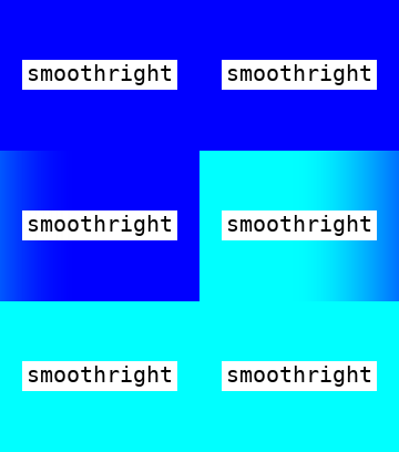
I am trying to achieve the same kind of animation using html and css.
Below gif is my expected output to achieve
This is what i tried but unable to meet the same expected output… Can you please suggest how to implement the similar animation? or solition for that?
.container {
  position: relative;
  width: 800px;
  /* Adjust this to match your image width */
  height: 400px;
  /* Adjust this to match your image height */
  overflow: hidden;
}

.overlay {
  position: absolute;
  top: 0;
  left: 100%;
  /* Start the overlay off-screen to the right */
  width: 100%;
  height: 100%;
  background: linear-gradient(to right, rgba(0, 0, 0, 0), rgba(0, 0, 0, 1));
  animation: slide 5s linear forwards;
}

@keyframes slide {
  0% {
    left: 100%;
    /* Start off-screen to the right */
  }
  100% {
    left: -100%;
    /* Slide to the left */
  }
}

img {
  position: absolute;
  top: 0;
  left: 0;
  width: 100%;
  height: auto;
  /* Adjust as needed */
  object-fit: cover;
  /* Adjust as needed */
}
<div class="container">
<div class="overlay"></div>
<img src="test.png" alt="Input 1">
</div>


2
Answers
The commended way to do this is by making use of background-size and background-position.
Here’s a fun tool that allows you to create snippets and get a sense of what’s happening under the hood: https://www.gradient-animator.com/
I figured out how to get the desired result by extending the
.overlaybox and only applying the gradient to the first part. Your updated.overlayCSS should look like this:No other code should need to be changed.
This works because your animation only moves the gradient 100% to the left, so if you make the overlay twice that, it will move the gradient off the screen and still have only the dark background left over.
Your final code should look like this: