I’d like to update our website to better support viewers who will be viewing it on larger screens as they’re becoming increasingly more common.
Our structure at the moment is based on flexbox and the current layout is as follows:
<body>
 <nav> Nav bar is here</nav>
 <main>Site content here</main>
 <footer>Footer here</footer>
</body
Associated CSS:
body {
    display: flex;
    flex-direction: column;

    font-family: sans-serif;
    font-size: 1em;

    padding: 0;
    margin: 0;

    height: 100%;

}


nav {
    display: flex;
    flex-direction: row;
    align-items: center;

    padding: 0.3em;
}


main {
    display: flex;
    flex: 1 0 auto;
    flex-direction: column;
    justify-content: center;
    padding-left: 0.1em;
    padding-right: 0.1em;
}


footer {
    display: flex;
    flex-shrink: 0;
    flex-direction: row;
    justify-content: space-between;
    padding: 1em 1.2em;
}
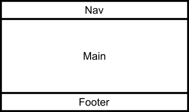
This gets us the following layout:
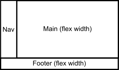
What I’d like to do, without restructuring the HTML, is to have the nav and main content side by side, with the nav content fitting to the content size plus some padding (or, alternatively, to a fixed size) and the main panel filling out the rest of the horizontal space and the footer behaving as is (i.e. sticking to the bottom of the screen if there is insufficient vertical content or being at the the bottom of the content if there is).
After a day and half following tutorials and guides; playing with re-ordering and with pseudo elements and eventually throwing them all away, this is as far as I’ve got!
@media only screen and (min-width: 1800px) {
    main {
    }

    nav {
    }
}


2
Answers
You could wrap the
navand themaintags around with acontainer, then useflex-growas shown below:Put your nav and main inside one div and give it css
HTML
Css