


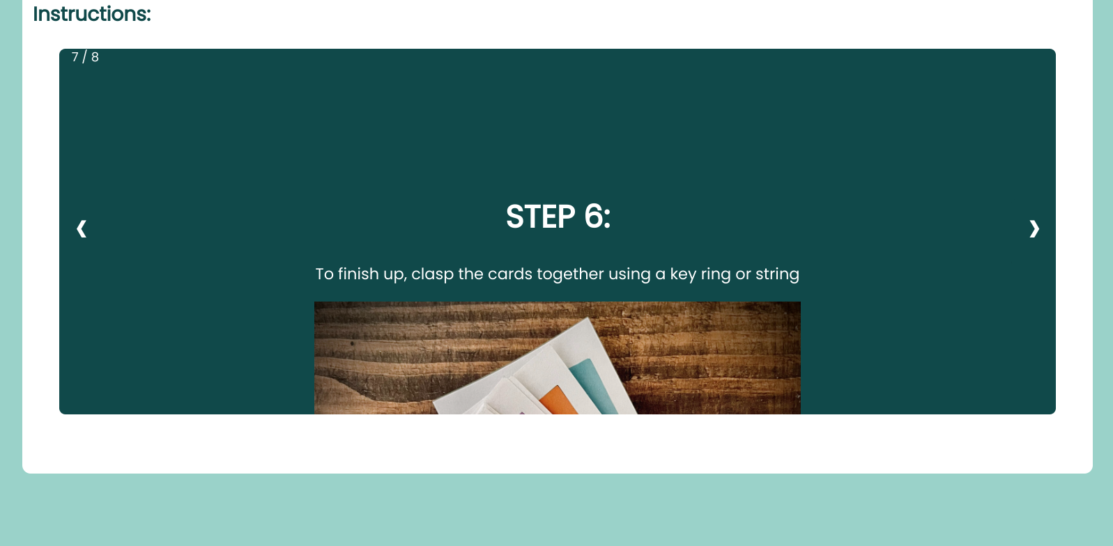
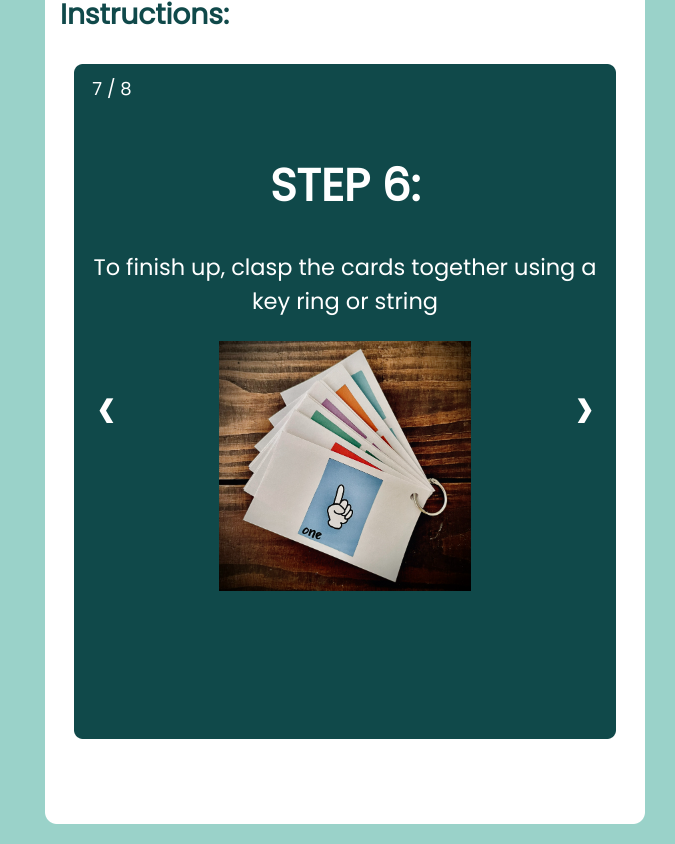
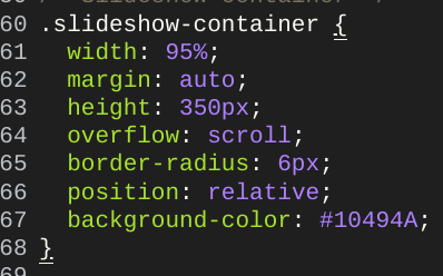
I would really appreciate your help if you are able to solve my issue. I have created a div and turned it into a slideshow for instructions on my page. The issue with the slide show div is that it looks fine on a small screen but not on a computer screen. The size of the div is too small, so there is some overflow. Do you know how I could get it to cover all of the content, regardless of the device size?
I have tried playing with the hieght and width elements as well as the margins. I have also temporarily set the overflow to scroll.
here are some pictures to help you visualize the issue:
(https://phpout.com/wp-content/uploads/2023/09/eFQZR.png)(https://phpout.com/wp-content/uploads/2023/09/Vn2tK.png)(https://phpout.com/wp-content/uploads/2023/09/nG4tp.png)
2
Answers
I found that the issue was resolved when I applied max-width properties to the images that were giving me overflow issues.
I think you should try giving
heightto the picturedivsinstead of the container. You can givepaddingsto container. And try giving sizes withpercentagesinstead ofpx. It should help when screen size changes. Also if you gave your whole page,heightproperty , remove that and try again. This is all i can think of based on the css you provided.