skip to Main Content

I’m trying to creating a typing animation effect for a portfolio website. I have two issues, which are:

  1. The text jitters horizontally as the typing animation progresses, i’m assuming this is due to the fact that my typing animation is causing the width of the animated the text being "typed" to change dynamically, but none of the fixes I have tried have resolved the issue.

  2. I’m trying to get the typing animation to be justified to the center instead of the left. The problem with this is, each string is different in length and so If I correctly position one string, the others following it will look out of place. When typing centrally justified text in any document editor, both the start of the string and the typing cursor move away from each other equal amounts as the string gets longer. But i’m not sure how to achieve this.

Text typing animation

* {
    box-sizing: border-box;
    padding: 0;
    margin: 0;
}


.main {
    overflow:hidden
}


.home__container {
    row-gap:4rem;
    padding-top:2rem
}

.home__data {
    row-gap:1.5rem
}

.home__title {
    text-align:center;
    font-size:var(--biggest-font-size);
    letter-spacing:.3px;
    margin-bottom:.5rem
}

.section__border {
    border-bottom:1px solid var(--title-color);
    padding-bottom:3.5rem
}

.container {
    max-width:1024px;
    margin-inline:1.5rem
}

.grid {
    display:grid;
    gap:1.5rem
}

.type {
  display: inline-block;
}

.type>span {
  display: grid;
  overflow: hidden;
  height: 1.2em;
}

.type span span {
  width: 0%;
  max-width: max-content;
  overflow: hidden;
  height: inherit;
  word-break: break-all;
  animation: c 0.5s infinite steps(1), t 2s linear infinite alternate, m 12s steps(3) infinite;
}

.type span span:before {
  content: " ";
  display: inline-block;
}

@keyframes t {
  90%,
  100% {
    width: 100%
  }
}

@keyframes c {
  0%,
  100% {
    box-shadow: 5px 0 0 #0000
  }
  50% {
    box-shadow: 5px 0 0 rgb(255, 255, 255)
  }
}

@keyframes m {
  100% {
    transform: translateY(-300%)
  }
}
<main class="main">
  <section class="home section" id="home">
    <div class="home__container container grid section__border" id="maincard">
      <div class="home__data grid">
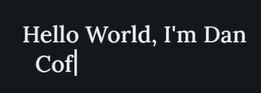
        <h1 class="home__title">Hello World, I'm Dan <br /><span class="type">
                        <span>
                          <span>Software Engineer</span>
          <span>Computer geek</span>
          <span>Coffee lover</span>
          </span>
          </span><br />
        </h1>

2

Answers


  1. If you close the h1 tag after your name and change the outer container of the rotating text to a div the jitters go away:

    <h1 class="home__title">Hello World, I'm Dan</h1>
    <div class="type">
     <span>
       <span>Software Engineer</span>
       <span>Computer geek</span>
       <span>Coffee lover</span>
      </span>
    </div>
    

    for the spacing, you can use flexbox on the parent div:

    <div class=parent>
    <h1 class="home__title">Hello World, I'm Dan</h1>
    <div class="type">
     <span>
       <span>Software Engineer</span>
       <span>Computer geek</span>
       <span>Coffee lover</span>
      </span>
    </div>
    </div>
    
    .parent {
    display: flex;
      justify-content: center;
      align-items: center;
      flex-direction: column;
    }
    You use the justify-content and align-items to center elements vertically and horizontally, and flex direction will put the typing text below the h1.
    
    Login or Signup to reply.
  2. I suggest for animation using a combination of transform and clip-path.
    Below is an example if you have three lines + with your permission, added the cursor 🙂:

    * {
      box-sizing: border-box;
      padding: 0;
      margin: 0;
    }
    
    .home-title {
      --line-height: 20px;
      --animation-duration: 8s;
      --lines: 3;
      --type-steps: 12;
      display: grid;
      justify-content: center;
      font-family: monospace;
      font-size: 16px;
      line-height: var(--line-height);
    }
    
    .type-wrapp {
      height: var(--line-height);
      display: grid;
      overflow: hidden;
    }
    
    .type {
      display: flex;
      flex-direction: column;
      align-items: center;
      animation: type-translate var(--animation-duration) steps( var(--lines) ) infinite;
    }
    
    .type span {
      white-space: nowrap;
      animation: type var(--animation-duration) steps( var(--type-steps) ) infinite;
      position: relative;
      padding-right: 2px;
    }
    
    /* cursor */
    
    .type span:after {
      content: '';
      border-left: solid 2px currentColor;
      inset: 0;
      position: absolute;
      animation:
        cursor var(--animation-duration) steps( var(--type-steps) ) infinite,
        cursor-blink calc( var(--animation-duration) / var(--type-steps) ) steps(2) infinite
      ;
    }
    
    @keyframes type-translate {
      100% {
        transform: translateY(-100%);
      }
    }
    
    /*
    Keyframes for three phrases, taking into account the pause.
    If there are more or fewer phrases, the keyframes will be different.
    */
    
    @keyframes type {
      11.111%,
      22.222%,
      44.444%,
      55.555%,
      77.777%,
      88.888% {
        transform: translateX(0);
        clip-path: polygon(0 0, 100% 0, 100% 100%, 0% 100%);
      }
      0%,
      33.333%,
      66.666%,
      99.999% {
        transform: translateX(50%);
        clip-path: polygon(0 0, 0 0, 0 100%, 0 100%);
      }
    }
    
    /* cursor animation */
    
    @keyframes cursor{
      11.111%,
      22.222%,
      44.444%,
      55.555%,
      77.777%,
      88.888% {
        transform: translateX( calc(100% - 2px) );
      }
      0%,
      33.333%,
      66.666%,
      99.999% {
        transform: translateX(-2px);
      }
    }
    
    @keyframes cursor-blink {
      0% {
        opacity: 0;
      }
      100% {
        opacity: 1;
      }
    }
    <h1 class="home-title">
      Hello World, I'm Dan
      <br>
      <span class="type-wrapp">
        <span class="type">
          <span>Software Engineer</span>
          <span>Computer geek</span>
          <span>Coffee lover</span>
        </span>
      </span>
    </h1>
    Login or Signup to reply.
Please signup or login to give your own answer.
Back To Top
Search