skip to Main Content

Just to start, I have to admit I’m pretty amateur to flexbox and CSS. So, sorry for any naive mistakes.

I have the following code:

@import url('https://fonts.googleapis.com/css2?family=Roboto:wght@400;700&display=swap');
html,
body {
  height: 100%;
}

body {
  font-family: Roboto, sans-serif;
  margin: 0;
  background: #aaa;
  color: #333;
  /* I'll give you this one for free lol */
  display: flex;
  align-items: center;
  justify-content: center;
}

.modal {
  background: white;
  width: 480px;
  border-radius: 10px;
  box-shadow: 2px 4px 16px rgba(0, 0, 0, .2);
  display: flex;
  padding: 16px;
  gap: 16px;
}

.icon-item {
  flex-shrink: 0;
}

.info-item {
  display: flex;
  flex-direction: column;
  gap: 8px;
  align-items: flex-start;
}

.header-item {
  display: flex;
  flex-direction: row;
  justify-content: space-between;
  align-items: center;
}

.header {
  font-weight: bold;
}

.icon {
  color: royalblue;
  font-size: 26px;
  font-weight: 700;
  background: lavender;
  width: 42px;
  height: 42px;
  border-radius: 50%;
  display: flex;
  align-items: center;
  justify-content: center;
}

.close-button {
  background: #eee;
  border-radius: 50%;
  color: #888;
  font-weight: 400;
  font-size: 16px;
  height: 24px;
  width: 24px;
  display: flex;
  align-items: center;
  justify-content: center;
  border: 1px solid #eee;
  padding: 0;
}

button {
  cursor: pointer;
  padding: 8px 16px;
  border-radius: 8px;
}

button.continue {
  background: royalblue;
  border: 1px solid royalblue;
  color: white;
}

button.cancel {
  background: white;
  border: 1px solid #ddd;
  color: royalblue;
}
<!DOCTYPE html>
<html lang="en">

<head>
  <meta charset="UTF-8">
  <meta http-equiv="X-UA-Compatible" content="IE=edge">
  <meta name="viewport" content="width=device-width, initial-scale=1.0">
  <link rel="stylesheet" href="style.css">
  <title>Modal</title>
</head>

<body>
  <div class="modal">
    <div class="icon-item">
      <div class="icon">!</div>
    </div>
    <div class="info-item">
      <div class="header-item">
        <div class="header">Are you sure you want to do that?</div>
        <button class="close-button">✖</button>
      </div>
      <div class="text">Lorem ipsum dolor sit amet consectetur adipisicing elit. Pariatur excepturi id soluta, numquam minima rerum doloremque eveniet aspernatur beatae commodi. Cupiditate recusandae ad repellendus quidem consectetur sequi amet aspernatur cumque!</div>
      <div>
        <button class="continue">Continue</button>
        <button class="cancel">Cancel</button>
      </div>
    </div>
  </div>
</body>

</html>

In my header-item class, I am trying to reach this desired outcomedesired outcome 
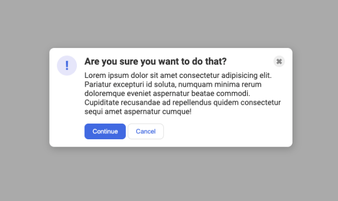
using flexbox and specifically the justify-content: space-between property. But it fails
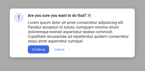
 fails

I mean, the space-between value probably speaks loudly here. There is no space to rearrange the items in the container, so I think thats the problem here, that’s my guess. If I am, then I would like to ask what could I do here to fix this in a smart way, not just hardcoding pixels and stuff… Is it possible? to .header-item class fill the entire parent width so its children have space to rearrange?

Thanks in advance!

2

Answers


  1. By adding width:100%; on the .header-item and setting margin-left: auto; on the .close-button can make the close-button align itself in the end of the row.

    body {
      font-family: Roboto, sans-serif;
      margin: 0;
      background: #aaa;
      color: #333;
      /* I'll give you this one for free lol */
      display: flex;
      align-items: center;
      justify-content: center;
    }
    
    .modal {
      background: white;
      width: 480px;
      border-radius: 10px;
      box-shadow: 2px 4px 16px rgba(0,0,0,.2);
      display: flex;
      padding: 16px;
      gap: 16px;
    }
    
    .icon-item {
      flex-shrink: 0;
    }
    
    .info-item {
      display: flex;
      flex-direction: column;
      gap: 8px;
      align-items: flex-start;
    }
    
    .header-item {
      display: flex;
      flex-direction: row;
      align-items: center;
      width:100%;
    }
    
    .header {
      font-weight: bold;
    }
    
    .icon {
      color: royalblue;
      font-size: 26px;
      font-weight: 700;
      background: lavender;
      width: 42px;
      height: 42px;
      border-radius: 50%;
      display: flex;
      align-items: center;
      justify-content: center;
    }
    
    .close-button {
      background: #eee;
      border-radius: 50%;
      color: #888;
      font-weight: 400;
      font-size: 16px;
      height: 24px;
      width: 24px;
      display: flex;
      align-items: center;
      justify-content: center;
      border: 1px solid #eee;
      padding: 0;
      margin-left: auto;
    }
    
    button {
      cursor: pointer;
      padding: 8px 16px;
      border-radius: 8px;
    }
    
    button.continue {
      background: royalblue;
      border: 1px solid royalblue;
      color: white;
    }
    
    button.cancel {
      background: white;
      border: 1px solid #ddd;
      color: royalblue;
    }
    <!DOCTYPE html>
    <html lang="en">
      <head>
        <meta charset="UTF-8">
        <meta http-equiv="X-UA-Compatible" content="IE=edge">
        <meta name="viewport" content="width=device-width, initial-scale=1.0">
        <link rel="stylesheet" href="style.css">
        <title>Modal</title>
      </head>
      <body>
        <div class="modal">
          <div class="icon-item">
            <div class="icon">!</div>
          </div>
          <div class="info-item">
            <div class="header-item">
              <div class="header">Are you sure you want to do that?</div>
              <button class="close-button">✖</button>
            </div>
            <div class="text">Lorem ipsum dolor sit amet consectetur adipisicing elit. Pariatur excepturi id soluta, numquam minima rerum doloremque eveniet aspernatur beatae commodi. Cupiditate recusandae ad repellendus quidem consectetur sequi amet aspernatur cumque!</div>
            <div>
              <button class="continue">Continue</button>
              <button class="cancel">Cancel</button>
            </div>
          </div>
        </div>
      </body>
    </html>
    Login or Signup to reply.
  2. You were very close, one line fixes it all:

    .header-item {
      display: flex;
      flex-direction: row;
      justify-content: space-between;
      align-items: center;
      width: 100%; /* Forcing flex to use full width */
    }
    

    Without it your flex structure just tries to fit all the elements inside the shortest possible space.

    Login or Signup to reply.
Please signup or login to give your own answer.
Back To Top
Search