How can I create the following behaviour using CSS or Javascript:
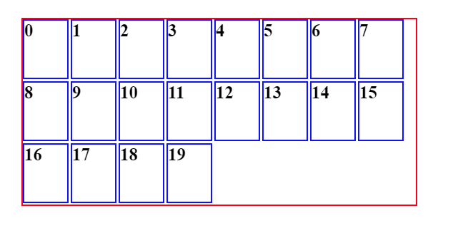
- I want to have container (probably flexgrid) that have children
- The container children should be the same size, distributed evenly and cover all the container space (as much as possible)
- The children must keep ratio of 3:4
- The container width, height and the amount of children are dynamic
- The children size should be dynamic based on the height width and the children amount
Partial solution: https://codepen.io/lerman01/pen/poGNmry
the problem with my solution is that each time you change the container width, height or amount of children you need to recalculate the value of the container’s grid-template-columns value
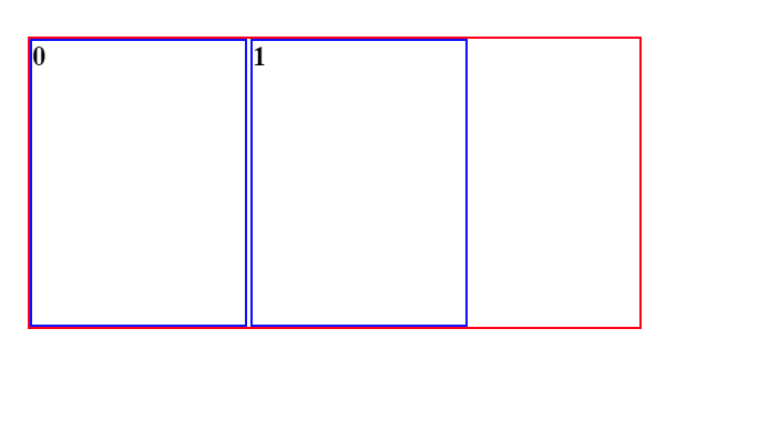
For example


2
Answers
To maintain aspect ratio, you can use
aspect-ratioproperty in css, we can ignore the height and width, or can use any eitherheightorwidthonly , incase we have used bothheightandwidththen theaspect-ratiowill not work properly. Can read more on MDN docs aspect-ratio , also all the major browser supports aspect-ratio property refer caniuse.com/aspect-ratioA possible approach is to start by setting the height of child div to its maximum available value (=parent_height – vertical_gap – 2*child_border) and then calculate the child div width by the aspect-ratio condition.
Then we can calculate total-width of divs and check if total-width and total-height are in parent-div bounds. Loop this check by decrementing div height until it fits.