I am trying to build out a banner element on a website, and am having an issue getting it to fulfil the criteria I am after. Ideally I would like to have a solution that is CSS only.
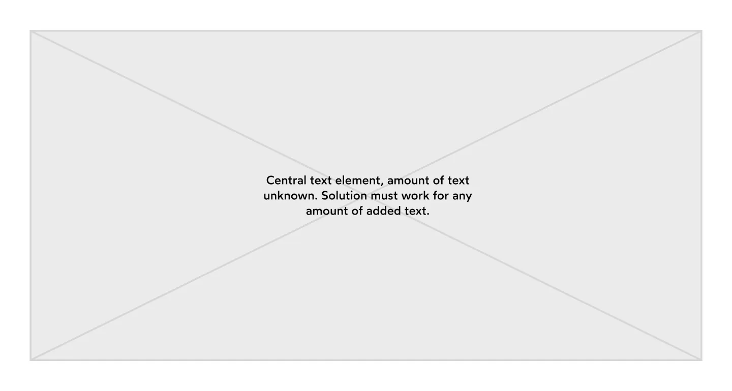
The layout is pretty simple – a background image, with centered text overlaid. Diagram below:
In order of priority, I need the element to do the following:
- The element must always be tall enough to accomodate the text within it. This comes from a CMS so could be of any length.
- As long as it does not break the first criteria, the element must not be taller than 80svh
- As long as it does not break the first and second criteria, the element must respect the aspect ratio of the background image. Again, this is from a CMS, so I have the image width and height available to me to use in any
aspect-ratioCSS.
My first attempt looked like this:
div.wrapper {
  display: grid;
  grid-template-rows: repeat(1, minmax(0, 1fr));
  grid-template-columns: repeat(1, minmax(0, 1fr));
}

div.image-holder {
  width: 100%;
  min-height: 80svh;
  grid-row-start: 1;
  grid-column-start: 1;
  position: relative;
}

div.text-holder {
  padding: 2rem;
  display: flex;
  justify-content: center;
  align-items: center;
  grid-row-start: 1;
  grid-column-start: 1;
  position: relative;
  z-index: 30;
}

p {
  max-width: 760px;
  font-size: 1.8rem;
  line-height: 2.3rem;
  font-weight: 700;
  text-align: center;
  font-family: sans-serif;
}

img {
  object-fit: cover;
  position: absolute;
  top: 0;
  left: 0;
  right: 0;
  bottom: 0;
  width: 100%;
  height: 100%;
  display: block;
  opacity: 0.5;
}
<div class="wrapper">
<div class="image-holder">
<img
src="https://placebear.com/1200/800" alt="Bears" />
</div>
<div class="text-holder">
<p>Central text element, amount of text unknown. Solution must work for any amount of added text.</p>
</div>
</div>This fulfilled criteria 1, but as long as the element was large enough to accomodate the text the overall height was always set to 80svh, and didn’t do anything with the aspect ratio of the image.
Then I tried the following:
div.wrapper {
      display: grid;
      grid-template-rows: repeat(1, minmax(0, 1fr));
      grid-template-columns: repeat(1, minmax(0, 1fr));
    }

    div.image-holder {
      width: 100%;
      grid-row-start: 1;
      grid-column-start: 1;
      position: relative;
    }

    div.text-holder {
      padding: 2rem;
      display: flex;
      justify-content: center;
      align-items: center;
      grid-row-start: 1;
      grid-column-start: 1;
      position: relative;
      z-index: 30;
    }

    p {
      max-width: 760px;
      font-size: 1.8rem;
      line-height: 2.3rem;
      font-weight: 700;
      text-align: center;
      font-family: sans-serif;
    }

    img {
      object-fit: cover;
      position: absolute;
      top: 0;
      left: 0;
      right: 0;
      bottom: 0;
      width: 100%;
      height: 100%;
      display: block;
      opacity: 0.5;
    }
<div class="wrapper">
<div class="image-holder">
<img
src="https://placebear.com/1200/800" alt="Bears" />
</div>
<div class="text-holder" style="aspect-ratio: 1200 / 800; // This is inlined as it is pulled from the image size from the CMS">
<p>Central text element, amount of text unknown. Solution must work for any amount of added text.</p>
</div>
</div>This was closer, and fulfilled criteria 1 and 3, but now I didn’t have the max height of the element set to 80svh. So the element would carry on scaling at the aspect ratio to any height.
I am stuck as to what to try next. I am hoping this isn’t an unusual layout aim, and that someone has managed this before. If I need to lean on javascript for this I will, but I am hoping to get it done with CSS if possible.


3
Answers
In your case, you need to add some tricks. For example, another image that will have
position: absolute;relative to.wrapperin case the height of.image-holderis too small.For example, something like this:
Assuming we’re allowed to change the HTML structure, we can add
max-height: 100%to the container of both text and image holder (in this example I usedboth-holder), then also addmax-height: 80svhto the mainwrapper: