skip to Main Content

I don’t think this is an everyday dropcap situation.

My dropcap, for an uppercase letter "S", is this image:

"S" dropcap with an overbar

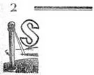
Note that the actual image extends as far as the overbar.

I would like the text to look like this (created using paint.net):

enter image description here

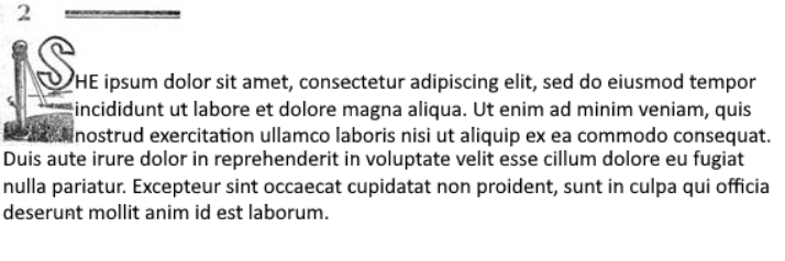
Note that the first line of text is aligned with the bottom of the dropcap "S"; the first three lines are sitting on top of the white area in the image, and the fourth through sixth lines are left-aligned with the page margin.

Note also that I cannot guarantee the total text width; this is going to be an EPUB, viewable on multiple devices. Therefore position:absolute should definitely be avoided.

Here is the HTML for what I have tried so far, shorn almost entirely of relevant CSS:

<p class="dropcap-para">
<img width=135 height=108 style="float:left" src="image002.jpg" alt="dropcap S"></img>
<span class="funky-text">HE ipsum dolor sit amet, consectetur adipiscing elit, sed do eiusmod tempor incididunt 
ut labore et dolore magna aliqua. Ut enim ad minim veniam, quis nostrud exercitation ullamco 
laboris nisi ut aliquip ex ea commodo consequat. Duis aute irure dolor in reprehenderit in 
voluptate velit esse cillum dolore eu fugiat nulla pariatur. Excepteur sint occaecat cupidatat 
non proident, sunt in culpa qui officia deserunt mollit anim id est laborum.</span>

Thanks.

2

Answers


  1. One of those auto S.O. suggested web links ("vertical-align-text-next-to-an-image") offers ideas (and another link (epub knowledge).
    This example we’ve posted uses transform translate.

    There are other factors to think about when it comes to eBooks….
    Bear in mind that an eBook user can change the font size in a ‘reflowable’ eBook (which we presume is your goal). Each eBook reader is likely going to set their preferred font size differently. You will need to consider that factor too. Perhaps a string of @media commands for various potential font sizes a reader is likely to choose. This example was tested in FF, Chrome, Edge.

    To prep this further to suit your project:

    1. add your background image URL.
    2. set the exact image width / height in CSS.
    3. set transform translate to attain level you desire.
    4. set margin-bottom so the text lines shift below the image to fill in the excess gap.
    5. build your upper ‘overbar’ into the CSS/Html to fit your needs.
    html, body {
      font-family: Arial, sans-serif;
      font-size: 1em;
      line-height: 1.4;
    }
    * {box-sizing: border-box;}
    
    .first {
      font-family: Arial, sans-serif;
      font-size: 1em;
      line-height: 1.4;
      margin: 0 0 0 0;
    }
    
    .dropcap {
      float: left;
      font-family: Arial, sans-serif;
      font-size: 5em;
      line-height: 1;
      margin-bottom: -0.4em; /*-- move margin after moving the image --*/
      margin-right: 0.1em;
      margin-top: -0.1em;
      
      position: relative;
      top: 40%;         /*-- move image up/down --*/
      transform: translateY(-40%); /*-- move image up/down --*/
    }
    
    .bgi {
      background-image: url("https://via.placeholder.com/50x80.gif");
      background-size: cover;
      background-repeat: no-repeat;
      background-position: center center;
      border: 1px solid #000;
      box-sizing: border-box;
      width: 60px; /*-- set image size --*/
      height: 90px; /*-- set image size --*/
    }
    <section>
    <p>&nbsp;</p><!--still need to factor in your overbar here-->
    <p>&nbsp;</p>
    <p class="first"><span class="dropcap bgi"></span>orem ipsum dolor sit amet, consectetur adipiscing elit. Nullam ultrices purus quis justo dictum, non varius lacus tempus. Cras id elementum elit. Quisque dolor arcu, venenatis ut fringilla ut, sodales in nulla. Nullam luctus dapibus nisl sit amet egestas. Ut ac lacus risus. Cras quis accumsan turpis. Duis cursus libero quis laoreet mollis.Lorem ipsum dolor sit amet, consectetur adipiscing elit. Nullam ultrices purus quis justo dictum, non varius lacus tempus. Cras id elementum elit. Quisque dolor arcu, venenatis ut fringilla ut, sodales in nulla. Nullam luctus dapibus nisl sit amet egestas. Ut ac lacus risus. Cras quis accumsan turpis. Duis cursus libero quis laoreet mollis. Nullam ultrices purus quis justo dictum, non varius lacus tempus. Cras id elementum elit. Quisque dolor arcu, venenatis ut fringilla ut, sodales in nulla. Nullam ultrices purus quis justo dictum, non varius lacus tempus. Cras id elementum elit. Quisque dolor arcu, venenatis ut fringilla ut, sodales in nulla. Nullam ultrices purus quis justo dictum, non varius lacus tempus. Cras id elementum elit. Quisque dolor arcu, venenatis ut fringilla ut, sodales in nulla. Quisque dolor arcu, venenatis ut fringilla ut, sodales in nulla.</p>
    <p>Lorem ipsum dolor sit amet, consectetur adipiscing elit. Nullam ultrices purus quis justo dictum, non varius lacus tempus. Cras id elementum elit. Quisque dolor arcu, venenatis ut fringilla ut, sodales in nulla. Nullam luctus dapibus nisl sit amet egestas. Ut ac lacus risus. Cras quis accumsan turpis. Duis cursus libero quis laoreet mollis.Lorem ipsum dolor sit amet, consectetur adipiscing elit. Nullam ultrices purus quis justo dictum, non varius lacus tempus. Cras id elementum elit. Quisque dolor arcu, venenatis ut fringilla ut, sodales in nulla. Nullam luctus dapibus nisl sit amet egestas. Ut ac lacus risus. Cras quis accumsan turpis. Duis cursus libero quis laoreet mollis.</p>
    </section>
    Login or Signup to reply.
  2. It’s impossible to give specific values since there’s no measurements of how the "S" is positioned within the actual image. The following image is used in the example.

    Width: 150px Height: 250px

    Width: 150px Height: 250px

    The important rulesets are commented in the example

    Note: position: absolute is applied to .page and should not be a problem for any browser or device.

    /*
    The font-size on html or :root will be default size for 1rem. 
    The values will vary with font-size (2ch) and dimensions of image.
    */
    
    html {
      font: 2ch/1.5 "Segoe UI" /* 1.5 line-height for line spacing */;
    }
    
    article {
      position: relative /* Allows easy positioning of .page */;
    }
    
    .page {
      position: absolute /* Not affected by floating tags */;
      top: 0 /* Positioned at top of <article> */;
      z-index: 1 /* Sits on top of everything */;
      width: 1.5rem;
      height: 0.75rem;
      padding: 3px;
      font-size: 2.25rem;
      font-weight: 900;
      line-height: 0.05;
      background: white;
    }
    
    header {
      border-bottom: 10px solid black;
    }
    
    img {
      float: left;
      margin-top: 10px;
    }
    
    p {
      margin-top: 3px;
      padding-top: 155px /* Aligns the first line with "S" in image */;
      border-top: 5px solid black;
    }
    <article>
      <div class="page">2</div>
      <header></header>
      <img src="https://i.ibb.co/Fs0xtNb/s.jpg">
      <p>HE ipsum dolor sit amet, consectetur adipiscing elit, sed do eiusmod tempor incididunt ut labore et dolore magna aliqua. Ut enim ad minim veniam, quis nostrud exercitation ullamco laboris nisi ut aliquip ex ea commodo consequat. Duis aute irure dolor in reprehenderit in voluptate velit esse cillum dolore eu fugiat nulla pariatur. Excepteur sint occaecat cupidatat non proident, sunt in culpa qui officia deserunt mollit anim id est laborum.</p>
    </article>
    Login or Signup to reply.
Please signup or login to give your own answer.
Back To Top
Search