


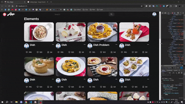
I have the grid, each element has an image and other divs underneath. Because it’s a grid, each element has responsive width and so it scales automatically as the screen shrinks. I would like the images (which can have different sizes and not be homogeneous) of the elements to have the same height while maintaining this responsive feature. If I set a specific height, as the screen shrinks the aspect ratio is not maintained. Basically I need a youtube style responsivness, that is a perfect example. How can I do it?
This is my grid:
JSX:
<div className="home-container">
  {elements.map((el) => (
    <Element el={el}></Element >
  ))}
</div>
CSS:
.home-container {
  display: grid;
  grid-template-columns: repeat(4, minmax(0, 1fr));
  gap: 20px;
  margin-left: 250px;
  grid-auto-rows: 1fr;
  grid-row-gap: 30px;
}
This is my elementcard:
JSX:
<div className="element-container">
   <div className="element-img">
      <img src={imageUrl} alt={title} />
   </div>
   <div>...</div>
   <div>...</div>
</div>
CSS:
.element-container {
  display: flex;
  flex-direction: column;
  box-sizing: border-box;
  height: fit-content;
  border-radius: 10px;
  overflow: hidden;
}

.element-img {
  display: flex;
  margin-bottom: 20px;
}

.element-img > img {
  width: 100%;
  height: 100%;
  border-radius: 20px;
  object-fit: cover;
}
PROBLEM:
As you can see, the dish problem is ok when the grid is not shrunk, but then that it does not maintain the same aspect-ratio as the other elements.
2
Answers
To Make equal-height columns with CSS grid, set all grid items in a row to the height of the tallest column with the grid-auto-rows: 1fr; rule. To make columns all the same width, use the grid-template-columns: 1fr 1fr 1fr; rule and use the same number of fractional values as the number of columns.
In HTML Code:
The CSS rules:
You can set a default height of the image container
element-imgas so: