skip to Main Content

Is there a way to do this through pure HTML/CSS? This is what I want to accomplish:

|---------------------------| <-- start of screen
|          header           |   fixed height
|---------------------------|
|                           |
|                           |
|          content          |   fill screen
|                           |
|                           |
|---------------------------| <-- end of screen
|          footer           |   auto
|---------------------------|

Some stuff I’ve seen but doesn’t answer my question:

CSS grid let an item take the rest of available screen space

How to make CSS Grid with fixed header and footer with remainder in middle

How to make CSS Grid items take up remaining space?

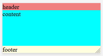
Here’s what I have so far (image)

body {
    width: 100%;
    min-height: 100%;
    margin: 0 0 0 0;
    background-color: gray;
}

.app-wrapper {
    display: grid;
    grid-template-columns: repeat(4, 1fr);
    grid-template-rows: auto 1fr auto;
    grid-template-areas: 
        "header header header header"
        "contnt contnt contnt contnt"
        "footer footer footer footer"
    ;

    height: 100vh;
    width: 100%;
}

.header {
    grid-area: header;
    background-color: lightcoral;
}

.content {
    grid-area: contnt;
    background-color: aqua;
}

.footer {
    grid-area: footer;
    background-color: lightyellow;
}
<body>
    <div class="app-wrapper">
        <div class="header">
            header
        </div>
        <div class="content">
            content
        </div>
        <div class="footer">
            footer
        </div>
    </div>
</body>

3

Answers


  1. Chosen as BEST ANSWER

    Solution: Wrap header and content then make it have 100vh.

    html, body {
        width: 100%;
        min-height: 100%;
        margin: 0 0 0 0;
        background-color: gray;
    }
    
    .facade-wrapper {
        display: grid;
        grid-template-columns: repeat(4, 1fr);
        grid-template-rows: auto 1fr auto;
        grid-template-areas: 
            "header header header header"
            "contnt contnt contnt contnt"
        ;
    
        height: 100vh;
        width: 100%;
    }
    
    .header {
        grid-area: header;
        background-color: lightcoral;
    }
    
    .content {
        grid-area: contnt;
        background-color: aqua;
    }
    
    .footer {
        grid-area: footer;
        background-color: lightyellow;
    }
    <body>
        <div class="app-wrapper">
            <div class="facade-wrapper">
                <div class="header">
                    header
                </div>
                <div class="content">
                    content
                </div>
            </div>
            <div class="footer">
                footer
            </div>
        </div>
    </body>


  2. Here’s a solution that does not require a structure change, but you need to make content and footer share the same grid area with some positioning:

    body {
        width: 100%;
        min-height: 100%;
        margin: 0 0 0 0;
        background-color: gray;
    }
    
    .app-wrapper {
        display: grid;
        grid-template-columns: repeat(4, 1fr);
        grid-template-rows: auto 1fr;
        grid-template-areas: 
            "header header header header"
            "contnt contnt contnt contnt"
        ;
        
    
        height: 100vh;
        width: 100%;
    }
    
    .header {
        grid-area: header;
        background-color: lightcoral;
    }
    
    .content {
        grid-area: contnt;
        background-color: aqua;
    }
    
    .footer {
        grid-area: contnt;
        background-color: lightyellow;
        align-self: end;
        transform: translateY(100%);
    }
    <body>
        <div class="app-wrapper">
            <div class="header">
                header
            </div>
            <div class="content">
                content
            </div>
            <div class="footer">
                footer
            </div>
        </div>
    </body>
    Login or Signup to reply.
  3. Make the last row equal to 0 and you can do it. Make sure you define a height on the footer to override the effect of 0

    body {
      margin: 0;
      background-color: gray;
    }
    
    .app-wrapper {
      display: grid;
      grid-template-rows: auto 1fr 0; /* 0for the last row */
      height: 100vh;
    }
    
    .header {
      background-color: lightcoral;
    }
    
    .content {
      background-color: aqua;
    }
    
    .footer {
      background-color: lightyellow;
      height: min-content; /* overide the 0 of the row */
    }
    <body>
      <div class="app-wrapper">
        <div class="header">
          header
        </div>
        <div class="content">
          content
        </div>
        <div class="footer">
          footer
        </div>
      </div>
    </body>
    Login or Signup to reply.
Please signup or login to give your own answer.
Back To Top
Search