skip to Main Content

I want to create this template using grid:

enter image description here

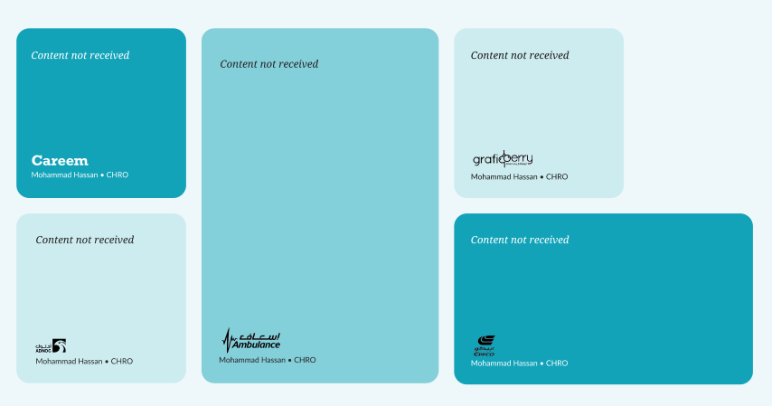
I am new to grid I don’t know the properties and how to use it wisely to create this template I am worked on flex properties but I am not getting how to achieve this using flex so I am trying this with grid.

I tried searching online about grid and I got some referral using that I modified for my requirement here is the code.

.co-sculpting-grid {
  display: grid;
  grid-template-columns: minmax(0, 264px) minmax(0, 369px) minmax(0, 465px);
  grid-template-rows: minmax(0, 264px) minmax(0, 264px);
  grid-gap: 24px;
}

.co-sculpting-grid>div {
  background-color: floralwhite;
  padding: 20px 0;
  font-size: 18px;
  border: 1px solid black;
  display: flex;
  justify-content: center;
  align-items: center;
}

.item1 {
  grid-row-start: 1;
  grid-row-end: 2;
}

.item2 {
  grid-row-start: 2;
  grid-row-end: 3;
}

.item3 {
  grid-row-start: 1;
  grid-row-end: 3;
}

.item4 {
  grid-row-start: 1;
  grid-row-end: 2;
  max-width: 264px;
}

.item5 {
  grid-row-start: 2;
  grid-row-end: 3;
}
<div className="co-sculpting-grid">
  <div className="item1"></div>
  <div className="item2"></div>
  <div className="item3"></div>
  <div className="item4"></div>
  <div className="item5"></div>
</div>

Here the item4 is occupying same width as item5 but it should be like 60% from item5 also need to be responsive in all the viewport 3rd column should have same like the attached image.

Thank you.

2

Answers


  1. You could try with grid-column and grid-row

    .grid {
      display: grid;
      grid-template-columns: repeat(8, 1fr);
      gap: 8px;
      width: 100%;
      min-height: 100vh;
    }
    
    .box {
      width: 100%;
      height: 100%;
      background: red;
      border-radius: 8px;
    }
    
    .box:nth-child(1), .box:nth-child(4) {
      grid-column: 1 / 3;
    }
    
    .box:nth-child(2) {
      grid-column: 3 / 6;
      grid-row: 1 / 3;
    }
    
    .box:nth-child(3) {
      grid-column: 6 / 8;
    }
    
    .box:nth-child(5) {
      grid-column: 6 / 9;
    }
    <div class="grid">
      <div class="box"></div>
      <div class="box"></div>
      <div class="box"></div>
      <div class="box"></div>
      <div class="box"></div>
    </div>
    Login or Signup to reply.
  2. Use grid-column and grid-row to position elements in a grid layout.

    .co-sculpting-grid {
      display: grid;
      grid-template-columns: repeat(8, 1fr);
      gap: 8px;
      width: 100%;
      min-height: 100vh;
    }
    
    .item {
      background-color: floralwhite;
      border-radius: 8px;
    }
    
    .item:nth-child(1), .item:nth-child(4) {
      grid-column: span 2;
    }
    
    .item:nth-child(2) {
      grid-column: span 3;
      grid-row: span 2;
    }
    
    .item:nth-child(3) {
      grid-column: span 2;
    }
    
    .item:nth-child(5) {
      grid-column: span 3;
    }
    <div class="co-sculpting-grid">
      <div class="item item1"></div>
      <div class="item item2"></div>
      <div class="item item3"></div>
      <div class="item item4"></div>
      <div class="item item5"></div>
    </div>
    Login or Signup to reply.
Please signup or login to give your own answer.
Back To Top
Search