


The instructions are when is screen < 600px I have the div’s order like this red, green, blue :

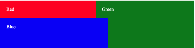
And when screen > 600px I want to achieve this result in the image below :
My code is :
body {
  background-color: white;
}

/* Add your CSS here */
[data-testid] {
  width: 100%;
  height: 100%;
  padding: 20px;
  color: white;
}

@media screen and (min-width: 600px) {
  .grid-container {
  display: grid;
  grid-template-columns: 1fr 1fr;
  }

  [data-testid="red"], [data-testid="blue"] {
  grid-column: 1;
}

  [data-testid="green"] {
  grid-column: 2;
  grid-row: span 2;
}
}
<body>
<div class="grid-container">
<div data-testid="red" style="background-color: red;">Red</div>
<div data-testid="green" style="background-color: green;">Green</div>
<div data-testid="blue" style="background-color: blue;">Blue</div>
</div>
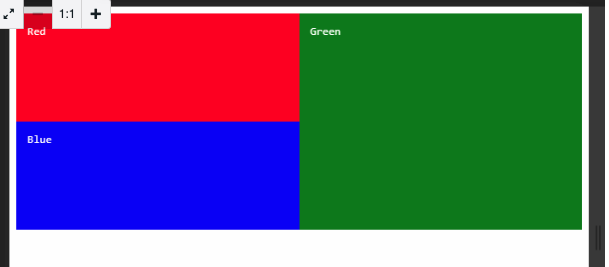
</body>but I’m getting this problem as in the image :
How can I fix it to achieve the result I want?
2
Answers
The problem is the padding.
This is creating items with width 100% (of the grid cell) plus 2*20px.
This snippet makes the padding part of the width by setting
box-sizing: border-box.Personally I would use classes to target your grid items rather than targeting your data-testid for best code practice.
It looks like you have wrapped both outcomes into the same @media query, and the padding is being forced.
It should look a little something like this: