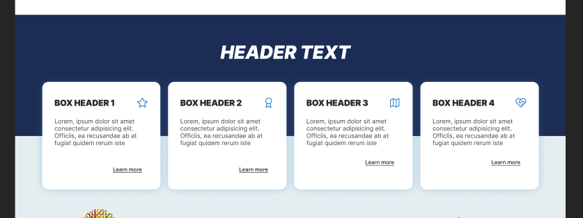
I am coding a very simple, standard landing page that has multiple sections, which look like this. It’s very trendy right now. It’s basically an oversized section header with lots of padding, big text, and an element that looks like it’s between two sections.
I am having conceptual difficulties in how to think about positioning the cards. The cards change size fluidly, depending on viewport size, amount of text inside of them, etc.
So far I have achieved something similar by guesstimating the size of the card (around 200px) and setting the top of the card to -200px. This works on my computer, but it will change in other screens, fonts, zoom level, etc. etc. I also have the problem that I get a lot of white space under the boxes, as the size of the container div is calculated without this offset.
How can I make it so that they are always perfectly centered? How can I make sure I do not have excessive white space under the cards? Thanks!!
<div className="bg-tertiary text-white text-center pb-10">
  <div className="bg-secondary pb-[100px] px-10">
    <h1 className="uppercase font-black text-2xl tracking-wider pt-10 pb-10 italic">HEADER TEXT</h1>
  </div>

  <div className="relative columns-4 top-[-100px] px-10">
    <MainSectionCard />
    <MainSectionCard />
    <MainSectionCard />
    <MainSectionCard />
  </div>
</div>
edit: Thanks to @wongjn for the answer!
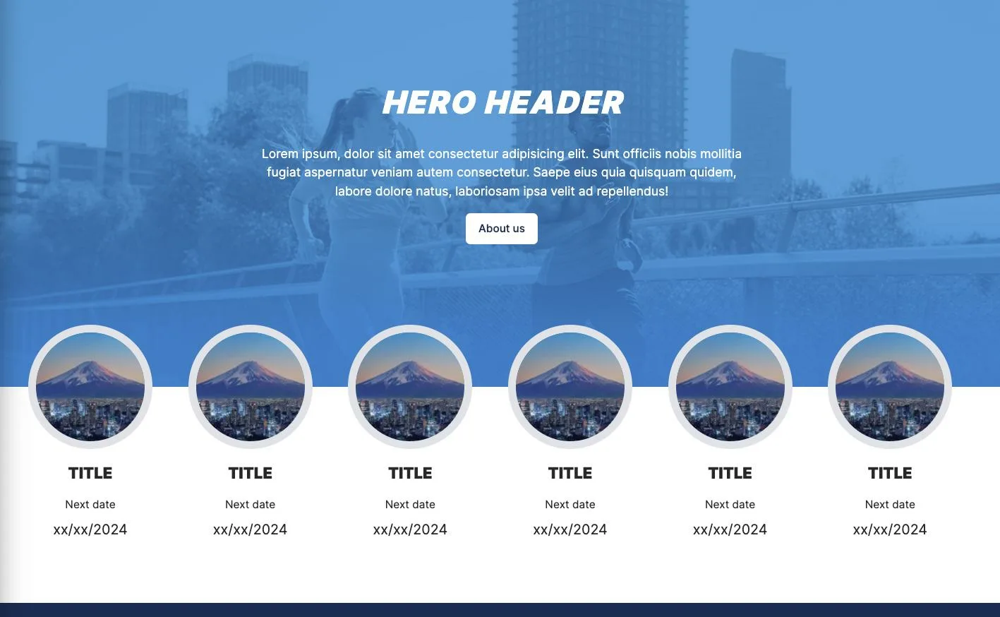
Second question: What if now, instead of a color, we have a picture on top?
So far what I have is
<section className="relative w-full bg-white text-white text-center">
  <div className="bg-header bg-no-repeat bg-cover h-[500px]">
    {/* First row with logo and menu icon */}
    <div className="w-full px-10 pt-6">
      <Image src={logo} alt={"logo"} className="w-[100px]" />
    </div>

    {/* Second box with text and button */}
    <div className="w-full grid place-items-center mt-20">
      <h2 className="text-center uppercase text-[40px] font-black italic tracking-wider">HERO HEADER</h2>
      <p className="text-center mt-6 w-1/2">Lorem ipsum, dolor sit amet consectetur adipisicing elit. Sunt officiis nobis mollitia fugiat aspernatur veniam autem consectetur. Saepe eius quia quisquam quidem, labore dolore natus, laboriosam ipsa velit ad repellendus!</p>
      <Button className="mt-4">About us</Button>
    </div>
  </div>
  {/* Icons */}
  <div className="relative w-full top-[-80px]">
    <div className="w-full columns-6 px-10">
      <MarathonBox />
      <MarathonBox />
      <MarathonBox />
      <MarathonBox />
      <MarathonBox />
      <MarathonBox />
    </div>
  </div>
</section>

 Question posted in


2
Answers
It seems like the top and background are both solid colors. If that is indeed the case, you could look at using a linear gradient as the background for the cards. This linear gradient can fill the colors exactly in half:
For second question, I think the better way is using
marginwith negative.the html looks like blow:
you can replace the margin value with yours, and elements before cards are not effected