skip to Main Content

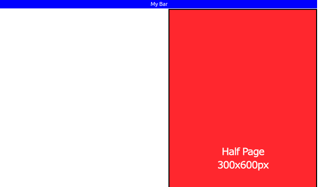
This is a piece that is in the sidebar I’m building. I move the image to the far right of the screen with style="text-align: right;". In the same div, above the image, there is also a red bar that I would like aligned exactly like the image. But I can’t align the red bar as well.

The alignment and position of the image is right, alright, now I would like to align that red bar as well as the image.
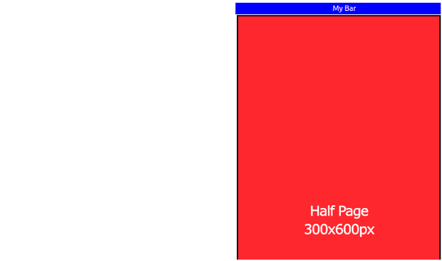
enter image description here

I need this:

(both blue bar and red image, both must be aligned on the extreme right side of the screen. As said, the red image is already ok, the blue one is not)

enter image description here

How can i get this?

.bar {
  background-color: blue;
  font-size: 11px;
  color: white;
  padding-left: 2px;
  width: auto;
}
<!doctype html>
<html lang="en">

<head>

  <!-- Boostrap Files -->
  <link href="https://cdn.jsdelivr.net/npm/[email protected]/dist/css/bootstrap.min.css" rel="stylesheet">
  <script src="https://cdn.jsdelivr.net/npm/[email protected]/dist/js/bootstrap.bundle.min.js"></script>

</head>

<body>

  <div class="col-md-4 col-lg-4 d-flex flex-column">

    <div id="pub" style="text-align: right;">
      <div style="text-align: center" class="bar">My Bar</div>
      <img src="https://i.postimg.cc/d32tkpdw/ddddddddfdfdfdf.png" alt="aaa">
    </div>
  </div>

</body>

</html>

2

Answers


  1. If you know the width of the image, you can set the blue div’s width as the same value and set the margin-left: auto which automatically adds margin as needed:

    .bar {
      background-color: blue;
      font-size: 11px;
      color: white;
      padding-left: 2px;
      width: 300px;
      margin-left: auto;
    }
    <!doctype html>
    <html lang="en">
    
    <head>
    
      <!-- Boostrap Files -->
      <link href="https://cdn.jsdelivr.net/npm/[email protected]/dist/css/bootstrap.min.css" rel="stylesheet">
      <script src="https://cdn.jsdelivr.net/npm/[email protected]/dist/js/bootstrap.bundle.min.js"></script>
    
    </head>
    
    <body>
    
      <div class="col-md-4 col-lg-4 d-flex flex-column">
    
        <div id="pub" style="text-align: right; width: 100%;">
          <div style="text-align: center" class="bar">My Bar</div>
          <img src="https://i.postimg.cc/d32tkpdw/ddddddddfdfdfdf.png" alt="aaa">
        </div>
      </div>
    
    </body>
    
    </html>
    Login or Signup to reply.
  2. Since you’re using Bootstrap and already have the bar and image in a flex container, just use the appropriate Bootstrap class. Replace flex-column with justify-content-end

    <div class="col-md-4 col-lg-4 d-flex flex-column">
    <div class="col-md-4 col-lg-4 d-flex justify-content-end">
    
    .bar {
      background-color: blue;
      font-size: 11px;
      color: white;
      padding-left: 2px;
      width: auto;
      text-align: center;
    }
    <link href="https://cdn.jsdelivr.net/npm/[email protected]/dist/css/bootstrap.min.css" rel="stylesheet" integrity="sha384-9ndCyUaIbzAi2FUVXJi0CjmCapSmO7SnpJef0486qhLnuZ2cdeRhO02iuK6FUUVM" crossorigin="anonymous">
    
    <div class="col-md-4 col-lg-4 d-flex justify-content-end">
    
      <div id="pub">
        <div class="bar">My Bar</div>
        <img src="https://i.postimg.cc/d32tkpdw/ddddddddfdfdfdf.png" alt="aaa">
      </div>
    
    </div>
    Login or Signup to reply.
Please signup or login to give your own answer.
Back To Top
Search