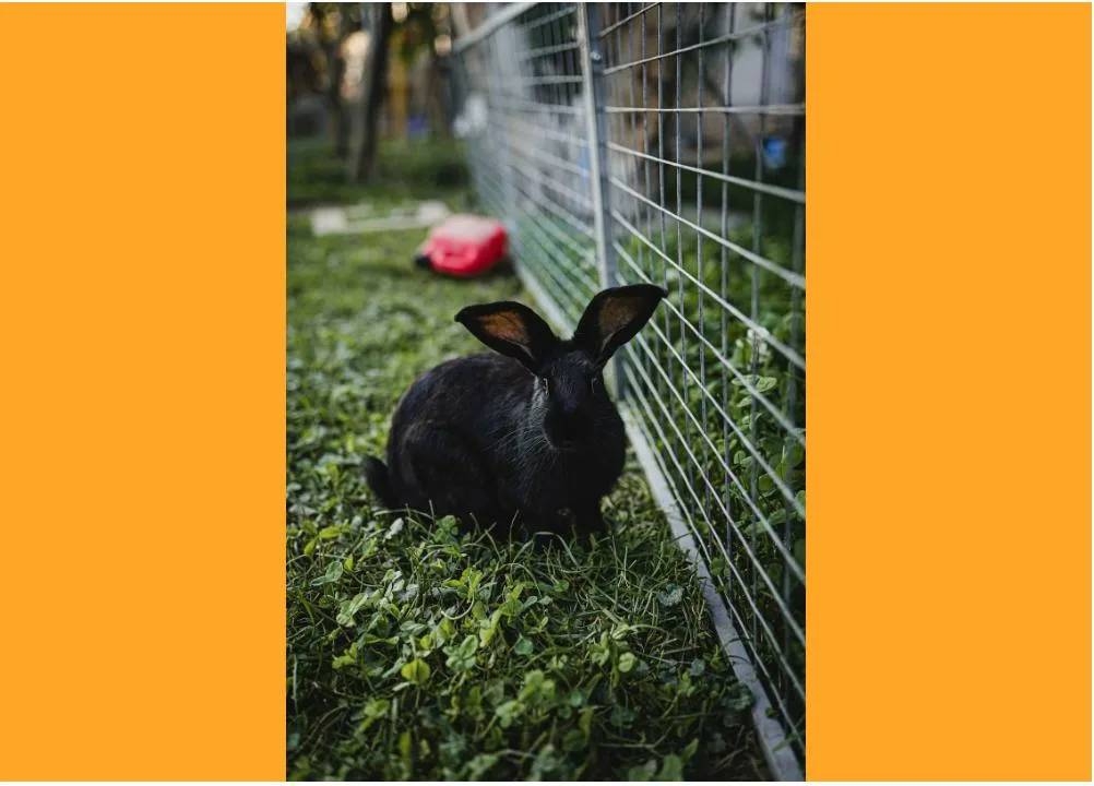
The following code:
<img
  width="500"
  style="object-fit: contain; aspect-ratio: 7/5; background-color: orange;"
  src="/images/GqZ8FEkFV-s.webp"
/>
Renders:
The width of the background is 500px. Due to the aspect-ratio scaling, the width of the actual image is less than this, so the background overflows the bounds of the image. If I surround this with a div with a style of display: inline-block or width: fit-content;, the surrounding div is 500px wide, rather than the width of the scaled image.
Is there a way to:
- Make the background conform to the size of the scaled image
- Make a surrounding
divconform to the size of the scaled image


2
Answers
Is this what you were looking for?
The
aspect-ratioproperty sets a preferred aspect ratio for the box using the specifiedwidth / height. If you declarewidth: 500px; aspect-ratio: 7/5;the preferred height is calculated to be 357 pixels.The
object-fitproperty sets how the content of a replaced element, such as an<img>or<video>, should be resized to fit its container. With a value ofcontain, the replaced content is scaled to maintain its intrinsic aspect ratio while fitting within the element’s content box. The object will be "letterboxed" if its aspect ratio does not match the aspect ratio of the box.My screen capture of this photo of a black bunny has an intrinsic width and height of 476×714 pixels. 476 divided by 714 (rounded up) is 0.67, the same as 2/3. Therefore, the intrinsic aspect ratio is 2 to 3.
Consequently, when
object-fit: containis added to the declarations for this image, the browser scales the rendered image using its intrinsic aspect ratio with a height of 357 pixels. Therefore, the actual replaced content is letterboxed with a width of 238 pixels; the remaining space of the 500px-wide box is filled with the background color.It’s not clear to me exactly what your intentions are other than your mention of wanting the image to resize dynamically to fit the viewport. If you throw in
max-width: 100%, the image width will be contained to its container, and the height will also scale to the specified aspect ratio.