


Context and Problem
I am working on this page here, focusing on the "Top Artists" bit.
-
Desired Outcome:
- From laptop: I want cards to be "vertical" rectangle (taller than wider) meaning that the ranking is at the top, then the image is in the middle, then the artist name is at the bottom. Cards share the same width and height, and they are aligned on a horizontal line with "#1" card on the left and "#5" card on the right.
- From mobile: I want the cards to be a "horizontal" rectangle (wider than taller) meaning that ranking is on the left, image is in the middle, and artist name is on the right. I want these cards to share the same width and height.
-
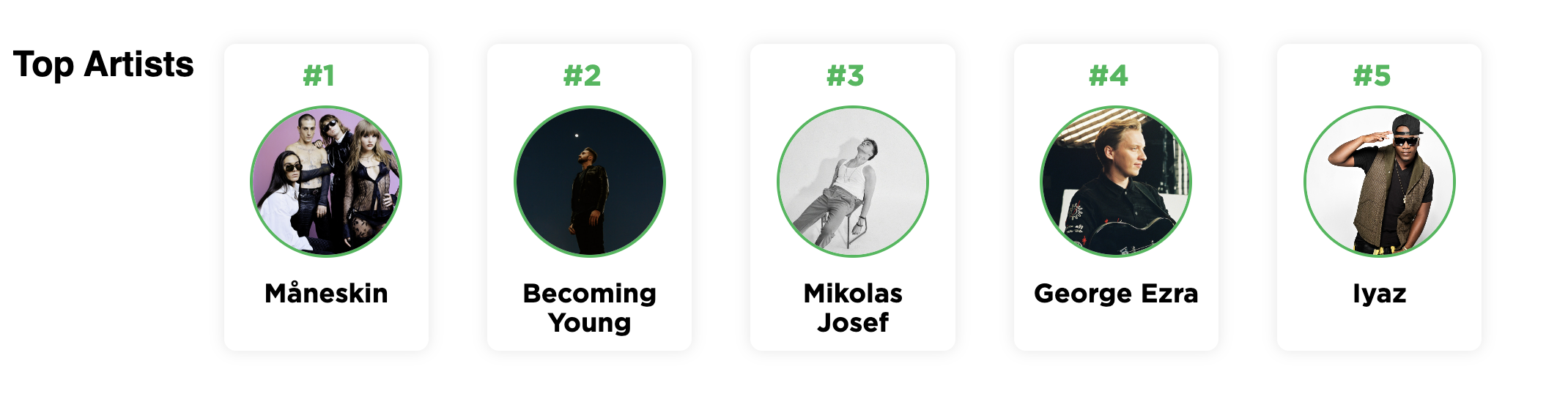
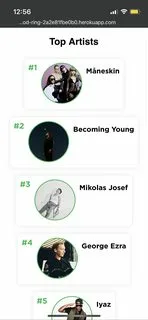
Current Outcome: Currently, from laptop it seems to be working exactly as I wanted it to (although the title "Top Artists" is on the left rather than on top, for some reason). However, from mobile the cards seem to have all different widths.
Supporting material
This is what it currently looks like from laptop:
This is what it currently looks like from mobile:
Code
This is what I have in my <style></style>
.top-artists {
    text-align: center;
    margin-top: 30px;
    display: flex;
    flex-wrap: wrap;
    justify-content: center;
}

.artist-card {
    display: inline-block;
    margin: 20px;
    padding: 10px;
    background-color: #fff;
    border-radius: 8px;
    box-shadow: 0px 0px 10px rgba(0, 0, 0, 0.1);
    transition: transform 0.2s;
    flex: 1;
}

.artist-card:hover {
    transform: scale(1.05);
}

.artist-image img {
    width: 100px;
    height: 100px;
    border-radius: 50%;
    object-fit: cover;
    border: 2px solid #1DB954;
}

.artist-info h3 {
    margin: 10px 0;
    font-size: 16px;
    font-weight: bold;
    color: #333;
}

.artist-rank {
    font-size: 20px;
    font-family: 'Gotham', sans-serif;
    color: #1DB954;
    margin-right: 10px;
    font-weight: bold;
    margin-bottom: 10px;
}

.artist-name {
    font-size: 18px;
    font-family: 'Gotham', sans-serif;
    color: #000;
    margin-top: 10px;
    font-weight: bold;
}

.top-artists-container {
    text-align: center;
}

@media (max-width: 500px) {
    .top-artists {
        display: flex;
        flex-direction: column;
        align-items: center;
    }
    .artist-card {
        margin: 10px 0;
        display: flex;
        justify-content: space-evenly;
        flex: 1;
    }
    .artist-image {
        flex: 0 0 100px;
        margin-right: 10px;
    }
    .artist-name {
        flex-grow: 1;
        font-size: 18px;
        font-family: 'Gotham', sans-serif;
        color: #000;
        font-weight: bold;
    }
}
and this is how I am creating the cards:
<div class="top-artists-container">
    <div class="top-artists" style="margin-bottom: 30px;">
        <h2 class="section-title">Top Artists</h2>
        {% for artist in top_artists %}
        <div class="artist-card">
            <!-- Get the artist image URL from the dictionary using the artist's name as the key -->
            {% set artist_image_url = top_artists_images_by_name.get(artist) %}
            <div class="artist-rank">#{{ loop.index }}</div>
            <div class="artist-image">
                <!-- Use the artist_image_url obtained from the dictionary -->
                <img src="{{ artist_image_url }}" alt="Artist Image">
            </div>
            <div class="artist-name">{{ artist }}</div>
        </div>
        {% endfor %}
    </div>
</div>
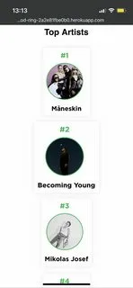
Trying suggestions from the comments
I tried changing display: flex; inside @media with display: block; as suggested by connexo. The output is not quite what I wanted, here’s the screenshot:
3
Answers
For using flex you need to add flex-basis:auto and flex:1 together to achieve the full width. Flex:1 is just the portion of an element against other children and does not specifies the basis.
Or You may add width:100% to the current code to force fill 100%;
You should fit the
widthat 100% on your cards on your specific@media. Like so:just do this to parent container.
Learn more about it here https://developer.mozilla.org/en-US/docs/Web/CSS/repeat