 Question posted in


I’ve got this page, that has a JavaScript script that changes the text of an H1 and a p.
const slide_data = {
1: {
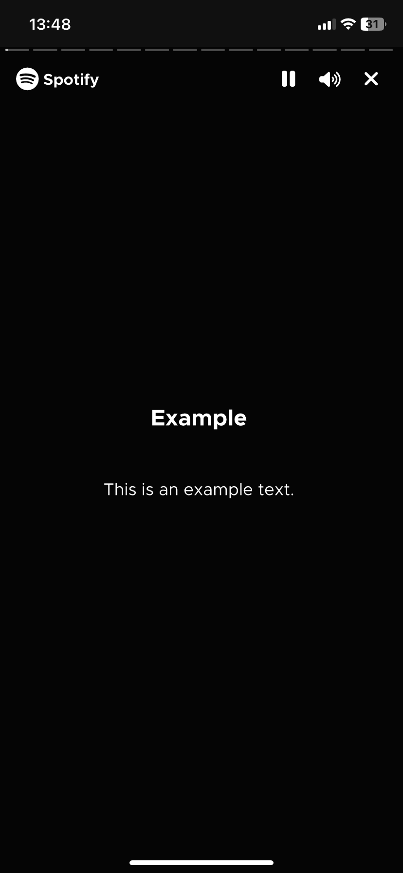
text: "Example",
sub: "This is an example text.",
time: 10
},
2: {
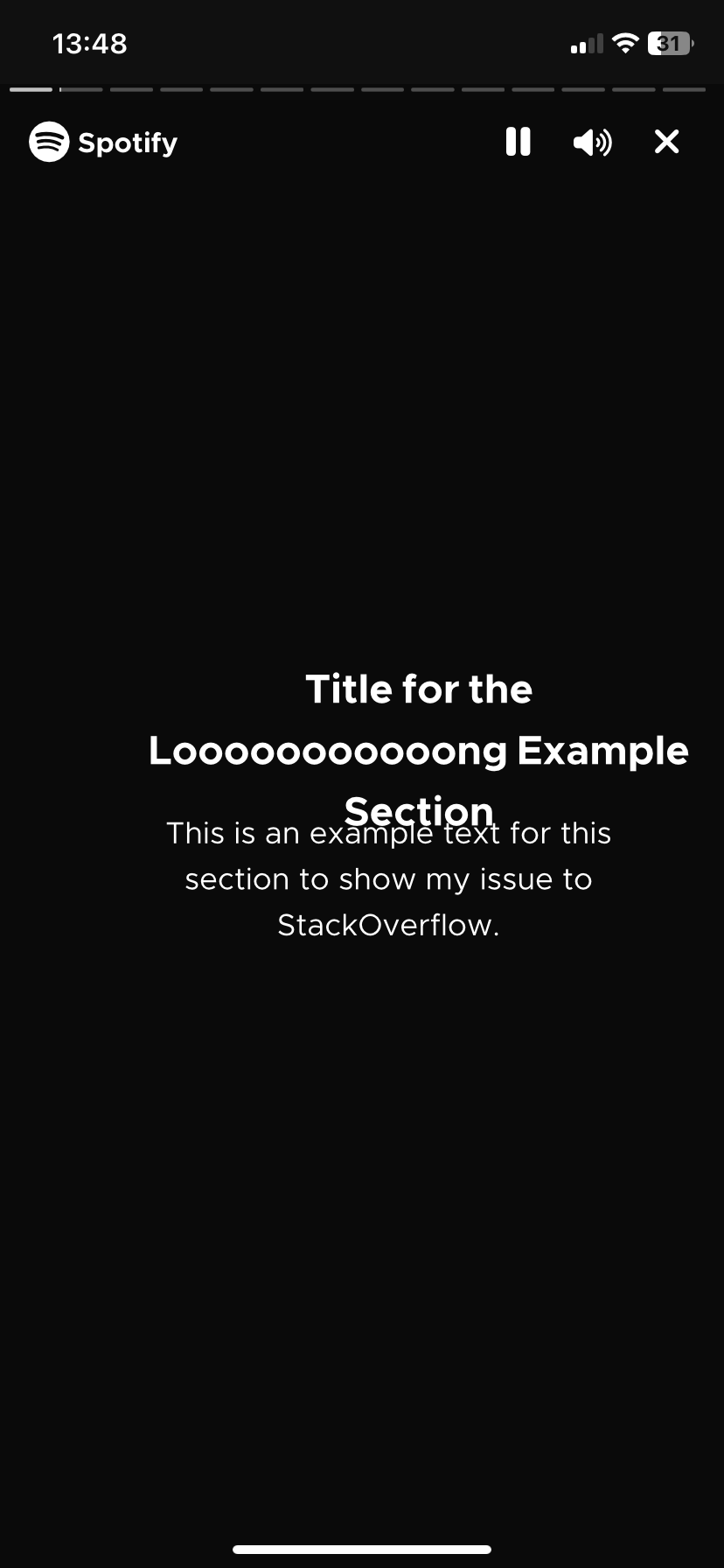
text: "Title for the Looooooooooong Example Section",
sub: "This is an example text for this section to show my issue to StackOverflow.",
time: 10
}
3: {
text: "4",
time: 10
}
}
var slide_change = 1;
let currentSleep;
async function slides() {
var header = document.querySelector('#header');
var sub = document.querySelector('#subtitle');
for (i = 1; i <= Object.keys(slide_data).length; i = i + slide_change) {
var slide = slide_data[i]
slide_change = 1
main.style.fontSize = "4rem";
main.style.color = "white";
header.innerHTML = slide.text;
if (slide.sub != null) {
sub.innerHTML = slide.sub;
} else {
sub.innerHTML = ""
}
bar = document.querySelector(`#bar_${i}`);
currentSleep = new Sleep();
await currentSleep.start(slide.time * 1000, bar, bar.maxWidth)
}
}
EDIT: Uploaded a full example on this Codepen
It works as a mock of the Spotify Wrapped. When the time is over or if you tap on the side of the screen, the text changes to match the next section of the Wrapped. It looks good in desktop Google Chrome (even with a vertical aspect ratio), but testing on my iOS phone, where all browsers use Apple’s WebKit, the text appears uncentered, and sometimes part of it outside of the screen when is changed; as if the text’s justification wasn’t updated propertly.
It seems that rotating the screen of my phone to horizontal and then turning it again as it was fixes the issue, but that is not the expected behaviour.
I’ve also tried this on macOS’s Safari, that also uses the same technology. The seen behaviour is the same as on my phone. If I resize the window it automatically fixes (until the next section, that bugs out again).
Based on this, I’ll guess that this is an issue related with WebKit, as trying this on desktop Google Chrome behaves as expected.
To show the issue, I’ve made two sections: one with a short title and text, and a long one.
The first section is shown normally, but when we move on to the second one we can see that it’s a little bit off to the right side and margins are ignored
2
Answers
Here i attached auto-prefixer site link [https://autoprefixer.github.io/] you can paste all your css code and and generate the css code with all browser support -webkit prefixers, try this way
I had a long play with your codepen, which is some nice work,
I have to say! You’re having a few bugs left, but it’s already
working quite well 🙂
I started off by enabling the SASS CSS preprocessor to make the CSS
easier to maintain and read.
I’ve added some SASS variables and replicated them to CSS variables
so that you can easily debug and manipulate them directly in the
browser inspector, in order to find your colours in live without
having to recompile the SCSS to CSS.
Just for the demo, I set a colour for the navigation items and
another color for the text content.
About your problem
I personally think that as your
<main>tag is usingdisplay: flex,then use it to stack your
<h2>and<h3>tags and center them.So I did these modifications:
Added
flex-direction: columnto your<main>tag.Removed the
position: absoluteon all childs and only do it onyour
<div class="shape-*">items, which I presume will be set uplater.
Removed your CSS transforms to move your titles. Use the flexbox of
the parent and play with margins to position them in the middle with
the correct spacing.
Removed your inline CSS code on the
<main>tag, done by JS. Thisshould stay only in the CSS.
I personally prefer using the
emunit for fonts, but%is thesame, just by a factor of 100. I set the font size to the
<h2>and
<h3>tags with this unit, so that it inherits from thedescendants, leaving you the possibility to change all the font
size in your containers.
I didn’t really understand the scale operations and the fixed width
of the container, which is bigger than a mobile phone screen. As I
didn’t want to change all your code, I just moved them up to SASS
variables at the top. I would personally make the container grow or
shrink with the screen width, with a min and max width. Maybe some
adjustments with some media queries if needed.
If you make it elastic, you could make the font size use the
vwunit below a certain screen width with a media query. This will make
the text always fit in your container, for different mobile phones.
You can see this example I did once, as a proof of concept with
@containerqueries instead of@mediaqueries:https://codepen.io/patacra/pen/Babbejo
My proposition, using flexbox instead of position absolute and
transforms: https://codepen.io/patacra/pen/LYvQzxW