


i create my layout with flexbox and now i would like show table. But when a table has a lot of records, it doesn’t add a scroll bar, it overflows the page. Does anyone know what to do about this? I have looked variously on the net and found this problem, however, nowhere have I found a completely reliable solution… For simplicity, I’ve simplified the example. Thank you
<div>
  <div style="display: flex;">
    <!-- Layout -->
    <div style="display: flex;">
      <!-- Layout -->
      <div style="display: flex;">
        <!-- Layout -->
        <div>
          <table>
            <tr>
              <th>Name</th>
              <th>Age</th>
              <th>City</th>
              <th>Note</th>
            </tr>
            <tr>
              <td>Pepík zdenda z Brna</td>
              <td>245</td>
              <td>Sat Oct 10 1998 00:00:00 GMT+0200 (Central European Summer Time)</td>
              <td>Moc dlouha poznamka, ktera je fakt nesnesitelně dlouha</td>
            </tr>
          </table>
        </div>
      </div>
    </div>
  </div>
</div>
Result:
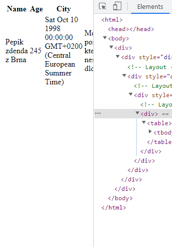
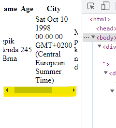
What i want:
Thank you very much
Edit:
What i have:

What i want:

2
Answers
u can see in the code I have added more columns and it is working.
Try add
overflow-x: scroll;and remember include<meta name="viewport" content="width=device-width, initial-scale=1.0">in head.