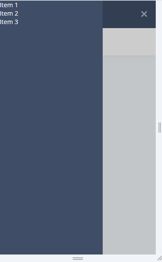
I am trying to figure out why my overlay (in the @media (min-width: 768px)) is not under my navbar, altho my z-index should indicate that it sets under it.
and outside the @media (when in small screen) it’s working just perfectly and it’s indeed under navbar-items.
I have tried tinkering around with z-index alot but i can seem to get it to go under the navbar and keep the navbar the top div to show.
.navbar {
  width: 100%;
  height: 70px;
  background-color: #3f4d67;
  padding: 0 20px;
  color: #fff;
}

.navbar-items {
  position: fixed;
  top: 0;
  left: -100%;
  width: 264px;
  height: 100vh;
  background-color: #3f4d67;
  color: #fff;
  transition: left 0.4s ease-in-out;
  z-index: 1000;
}

.navbar-items.open {
  transform: translateY(0);
  left: 0;
}

.overlay {
  position: fixed;
  top: 0;
  left: 0;
  width: 100%;
  height: 100%;
  background: rgba(0, 0, 0, 0.2);
  display: none;
  z-index: 10;
  pointer-events: none;
}

.overlay.open {
  display: block;
  pointer-events: all;
}
.logo-navicon {
  display: flex;
  flex-direction: row;
  justify-content: space-between;
  height: 70px;
  align-items: center;
}
.logo-img {
  width: 35px;
  height: 35px;
}
.logo-container {
  display: flex;
  align-items: center;

  width: 100%;
}
.nav-icon {
  width: 20px; /* Adjust the width */
  height: 15px; /* Adjust the height */
  position: relative;
  transform: rotate(0deg);
  transition: 0.5s ease-in-out;
  cursor: pointer;
}
.big-screen-nav-icon {
  display: none;
}
.nav-icon span {
  display: block;
  position: absolute;
  height: 3px; /* Adjust the height */
  width: 100%;
  background: #a9b7d0;
  border-radius: 3px; /* Adjust the border radius */
  opacity: 1;
  left: 0;
  transform: rotate(0deg);
  transition: 0.25s ease-in-out;
}

.nav-icon span:nth-child(1) {
  top: 0px;
}

.nav-icon span:nth-child(2),
.nav-icon span:nth-child(3) {
  top: 5px; /* Adjust the top position */
}

.nav-icon span:nth-child(3) {
  top: 10px; /* Adjust the top position */
}

.nav-icon.open span:nth-child(1) {
  top: 5px; /* Adjust the top position */
  transform: rotate(135deg);
}

.nav-icon.open span:nth-child(2) {
  opacity: 0;
  left: -20px; /* Adjust the left position */
}

.nav-icon.open span:nth-child(3) {
  top: 5px; /* Adjust the top position */
  transform: rotate(-135deg);
}
@media (min-width: 768px) {
  .navbar {
    position: fixed;
    left: 0;
    top: 0;
    bottom: 0;
    width: 264px; /* Adjust the width as needed */
    background-color: #3f4d67; /* Example background color */
    z-index: 1000; /* Ensure the navbar is on top of other content */
    height: 100vh;
    transition: width 0.4s ease;
    box-shadow: 1px 0 20px 0 #3f4d67;
  }
  .navbar-items {
    position: initial;
    width: 100%;
    height: initial;
    background-color: #3f4d67;
    color: #fff;
    transition: left 0.4s ease-in-out;
    display: block;
  }

  .small-screen-nav-icon {
    display: none;
  }
  .big-screen-nav-icon {
    display: block;
  }
  .navbar.collapsed {
    width: 80px;
  }
  .navbar.collapsed:hover {
    width: 264px;
  }
  .navbar.collapsed:hover .overlay {
    display: block;
  }
}

 Question posted in


2
Answers
Make sure the overlay is a sibling element of the navbar and has a lower z-index value. Here’s how to set up the HTML and CSS structure:
With this structure, the overlay will always be a sibling of the navbar, ensuring that it appears below the navbar.
Adding to the answer by @soheil izadi, the reason your
position: fixeddidn’t work is because you have used thetransformproperty in the navbar. Position fixed elements would be aligned with respect to the body or nearest parent element with the transform propertyYou can read more about this on https://achrafkassioui.com/blog/position-fixed-and-CSS-transforms/