


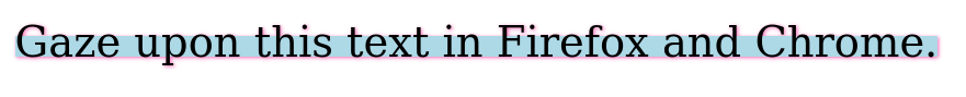
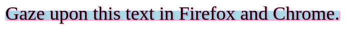
This HTML/CSS renders differently in Firefox versus Chrome — the layering of the text-decoration and the text-shadow are swapped.
.foo {
    font-size:2em;
    text-decoration:underline LightBlue 1ex;
    text-decoration-skip-ink:none;
    text-underline-offset:-1ex;
    text-shadow: 1px 1px 3px HotPink;
}
<spann class="foo">
   Gaze upon this text in Firefox and Chrome.
</span>
Here are screenshots:
Firefox
Chrome
What’s going on here? Is one browser implementing the standard incorrectly? Can the CSS be written to ensure consistency without detecting the browser and styling in cases?
2
Answers
The core of the issue lies in how each browser layers
text-decoration(like underline) andtext-shadow. In your case, Firefox puts the text decoration on top of the shadow, while Chrome does the opposite. This isn’t necessarily a case of one browser being "wrong" and the other "right" (talking generally, but in this specific case this seems to be an actual bug in Chrome), but rather a reflection of the fact that the CSS specifications may leave room for interpretation, or that certain aspects may not be explicitly defined, leading to differences in implementation.To ensure consistency across browsers without resorting to browser detection and conditional styling (which is generally not recommended due to maintenance issues and the ever-evolving nature of browser updates), you can try alternative approaches:
Overlay Technique: Use additional elements or pseudo-elements (
::beforeor::after) to manually create the underline effect. This gives you more control over the layering.JavaScript-based Solution: Use JavaScript to detect the rendering and apply styles accordingly. However, this can be complex and may not be worth the effort for a purely cosmetic issue.
Simplification: Simplify the design to avoid such discrepancies. This might involve removing either the
text-shadowor thetext-decorationto maintain a consistent look across browsers.Here is a sample implementation of the first approach, which is consistent on both browsers:
From the Text-decoration Level 3 specification:
That is, the text shadow must be painted before the underline, and so the underline will cover the text shadow. So Firefox’s rendering is the correct one.
This is recorded as Chromium Bug Issue 713376: Text shadow should paint behind all text decorations and text.