skip to Main Content

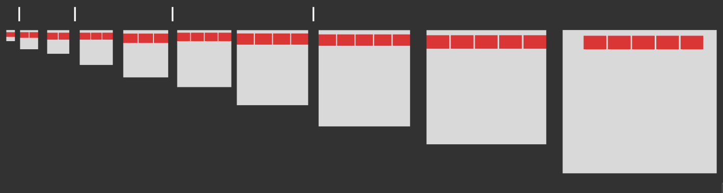
I’d like to be able to display up to 5 images on the same line, depending on the browser width.

Depending on the browser size, I can display more or fewer images, from a single image on mobile to a maximum of 5 on desktop.

The images are resized according to the browser size and are displayed or hidden according to some breakpoints.

Image resizing and displaying

Does anyone have any ideas on how to do this?

2

Answers


  1. The quickest way is to utilize a responsive front-end framework like Bootstrap.
    The example below took about 10 minutes to put together. If you just want to borrow from them, you can run the snippet and click "full page" then inspect the elements to see the styles applied.

    <link href="https://cdn.jsdelivr.net/npm/[email protected]/dist/css/bootstrap.min.css" rel="stylesheet" integrity="sha384-9ndCyUaIbzAi2FUVXJi0CjmCapSmO7SnpJef0486qhLnuZ2cdeRhO02iuK6FUUVM" crossorigin="anonymous">
    
    <div class="container py-5">
      <div class="row justify-content-center">
        <div class="col-6 col-sm-4 col-md-3 col-lg-2">
          <img class="img-fluid" src="https://placehold.co/600x400">
        </div>
        <div class="col-6 col-sm-4 col-md-3 col-lg-2">
          <img class="img-fluid" src="https://placehold.co/600x400">
        </div>
        <div class="d-none d-sm-block col-4 col-md-3 col-lg-2">
          <img class="img-fluid" src="https://placehold.co/600x400">
        </div>
        <div class="d-none d-md-block col-3 col-lg-2">
          <img class="img-fluid" src="https://placehold.co/600x400">
        </div>
        <div class="d-none d-lg-block col-2">
          <img class="img-fluid" src="https://placehold.co/600x400">
        </div>
      </div>
    </div>
    Login or Signup to reply.
  2. There’re several way to accomplish what you want but, basically, you’ll have to use CSS media queries to do it:

    * {
      box-sizing: border-box;
      margin: 0;
      padding: 0;
    }
    
    #container {
      display: flex;
      gap: 1rem;
    }
    
    img { 
      width: 100%;
      display: none;
    }
    
    @media (min-width: 200px) {
      #image1 { display: initial; }
    }
    
    @media (min-width: 400px) {
      #image2 { display: initial; }
    }
    
    @media (min-width: 600px) {
      #image3 { display: initial; }
    }
    
    @media (min-width: 800px) {
      #image4 { display: initial; }
    }
    
    @media (min-width: 1000px) {
      #image5 { display: initial; }
    }


    <div id="container">
      <img id="image1" src="https://picsum.photos/300">
      <img id="image2" src="https://picsum.photos/300">
      <img id="image3" src="https://picsum.photos/300">
      <img id="image4" src="https://picsum.photos/300">
      <img id="image5" src="https://picsum.photos/300">
    </div>
    

    See it on Codepen

    Login or Signup to reply.
Please signup or login to give your own answer.
Back To Top
Search