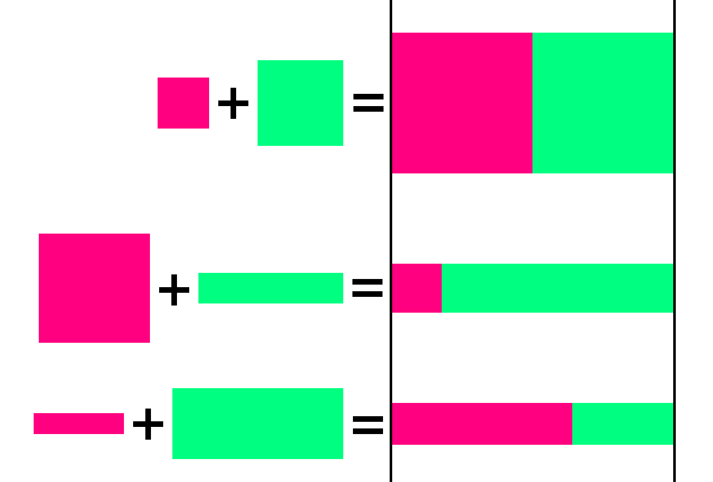
I would like to use CSS to display two images next to each other with a few constraints:
- Both images must be the same height.
- The combined width of both images must be equal to the total width of the container.
- The aspect ratio of both images must be maintained.
Unfortunately, the image and container dimensions are not known beforehand. Here are some example combinations of images, along with the expected output:


3
Answers
you can use
display:flex;andheight: auto;:Maybe this will help?
you can use j-Query too:
#image1height ==162px#image2height ==266pxI don’t think this is exactly possible just with CSS, but the closest thing you want is this:
Maybe the aspect ratio of the images is not maintained, but
object-fit: covermakes the images not stretched and fill the space (Actual font size of all texts inside images is same)This can be done if you know in advance (or later, dynamically using JavaScript) the natural (original) width/height of your images.
Such is a trivial task if you use modern tooling for frontend development, or a backend that can serve (besides the image tag) the necessary image data in attributes or expose the values). Otherwise you might want to rely (as already mentioned) on JavaScript.
Two examples ahead:
Using CSS
flex, and CSSvar()in where
calc()is used to calculate theflex-growvalue given the--wand--hCSS vars for width and height:Using JavaScript
if for some case you’re unable to know in advance the natural width/height of your images you could still rely on JavaScript in order to calculate the necessary
flexGrowvalue, or in other words, assign dynamically the CSS vars--wand--hrespective values using setProperty:Acknowledgment and documentation: