skip to Main Content

I’m attempting to dynamically distribute elements in CSS to fit them within a container regardless of the screen size.

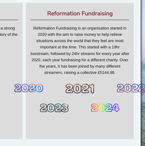
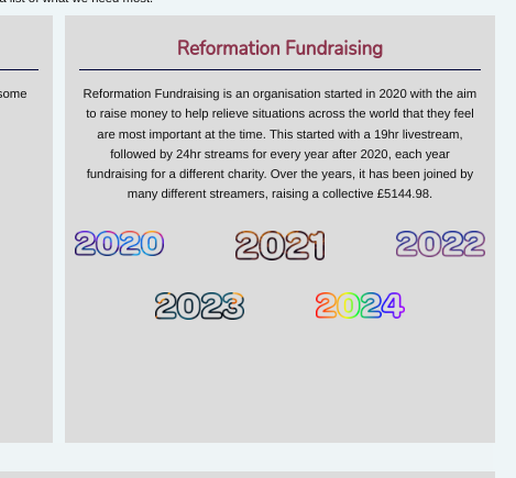
To give you an idea of what I’m trying to achieve, this is what I currently have on one device, versus another device with a larger screen size

Smaller screen device screenshot with elements hanging out of the container

Larger screen device screenshot with elements fitting nicely within the container

My expected functionality for this is that the code would see how many items it can fit across the space, spacing them evenly and centralising them within the container, then move to the next line and repeat the operation, fitting as many as it can and centralising. I believe this would distribute them effectively to fit the space, and seems like something relatively simple but I just can’t find what I’m looking for online.

Currently I’m using two container classes, one with three elements and one with two elements, and a fixed width between each element, but obviously that isn’t adequate to solve the problem because sometimes the elements hang outside of the box, this is the CSS that:

.container3 {
    display: grid;
    grid-template-columns: auto auto auto;
    grid-gap: 5rem;
    align-self: center;
}

.container2 {
    display: grid;
    grid-template-columns: auto auto;
    grid-gap: 5rem;
    align-self: center;
}

I recognise that I’m a novice with CSS, HTML, JavaScript, and website design in general, coming from a background in Python, but I’m hoping to learn a little more to get this to work, so ELI5 is much appreciated 🙂
If it is of any help to solving the problem, the website is powered by MediaWiki as it is a wiki site, so I’m not sure if that changes much.

3

Answers


  1. something like this? with flex-wrap: wrap and justify-content:center should achieve that

    .container {
      width: 800px;
      background: gray;
    }
    
    .year {
      color: purple;
      font-size: 72px;
      width: 250px; // arbitrary width, can be %, padding etc, depending on your need
    }
    
    .years {
      display: flex;
      flex-wrap: wrap;
      align-items: center;
      justify-content: center;
    }
    <div class="container">
      Lorem ipsum dolor sit amet, consectetur adipiscing elit. Sed vitae diam eros. Ut tempus consequat ex et pellentesque. Fusce nec metus eu turpis sodales volutpat sit amet sed justo. Suspendisse libero urna, tristique vel lacus sit amet, egestas consectetur dui. Sed lacinia a odio vitae tempus. Praesent lacus ipsum, ultrices vitae nunc eu, gravida finibus lacus. Aliquam erat volutpat. Praesent euismod maximus urna non pulvinar. Curabitur fringilla metus sed scelerisque lobortis. Nullam volutpat ultrices mi. Phasellus in tincidunt dui, at pretium arcu. Donec sapien ante, ultricies sit amet orci sit amet, consectetur vehicula sapien. Phasellus consectetur purus ac arcu cursus, et dictum enim semper.
    
    Cras feugiat aliquet odio a pretium. Quisque hendrerit odio augue, at pharetra leo aliquet vel. Suspendisse id magna vitae ipsum condimentum scelerisque vestibulum vel augue. Fusce condimentum nec risus eu cursus. Nam faucibus eros dictum tristique vulputate. Nulla quis pellentesque quam. Phasellus ut accumsan odio. Phasellus vitae tincidunt metus. Sed et ex non metus sollicitudin dapibus vitae eget erat. Duis dignissim erat at ligula viverra tincidunt. Morbi eget mauris elit. Curabitur imperdiet erat sit amet aliquam dapibus. Curabitur quis placerat ante, quis ornare leo. Sed fringilla, metus ac fringilla faucibus, sem urna scelerisque tortor, eu gravida mauris sem a odio. Pellentesque ac sem a erat rutrum rhoncus eget ut est.
    
    Nullam non nulla sit amet lectus scelerisque pharetra. Fusce sed mi tempor, ultricies nunc vel, molestie justo. Curabitur mauris ex, rutrum at laoreet in, suscipit quis ex. Aliquam suscipit finibus orci sit amet accumsan. In eget lorem viverra justo viverra egestas. Aliquam semper massa eget vulputate sodales. Maecenas ut leo orci. Vivamus sagittis, augue sit amet pellentesque venenatis, nulla ex porttitor lorem, eu interdum nisi lacus cursus mauris. Quisque eleifend risus a ante tincidunt aliquam. Pellentesque eget mi sed nibh molestie commodo non eget metus. Integer ut mi eu enim aliquet vulputate. Curabitur vulputate eu lorem sed sagittis. Nulla facilisi. Sed molestie vulputate auctor. Praesent semper venenatis rutrum.
    
    
      <div class="years">
        <div class="year">2020</div>
        <div class="year">2021</div>
        <div class="year">2022</div>
        <div class="year">2023</div>
        <div class="year">2024</div>
    
    </div>
    Login or Signup to reply.
  2. You should consider using % values or fr units instead of rem units so the grid gap is relative to the container width (instead of being dependent on the font size of the root element, which leads to the fixed gap size and overflow you’re seeing). You could also adjust the font size similarly.

    Login or Signup to reply.
  3. I think what you are looking for is the flex-wrap property of CSS

    See the below example and you can implement it in your code.

    .container {
      display: flex;
      flex-wrap: wrap;
      justify-content: center;
      align-items: center;
      width: 100%;
      background-color: beige;
    }
    
    .box {
      width: 8rem;
      height: 4rem;
      margin: 1rem;
      background-color: skyblue;
    }
    <div class="container">
      <div class="box"></div>
      <div class="box"></div>
      <div class="box"></div>
      <div class="box"></div>
      <div class="box"></div>
    </div>
    Login or Signup to reply.
Please signup or login to give your own answer.
Back To Top
Search