skip to Main Content

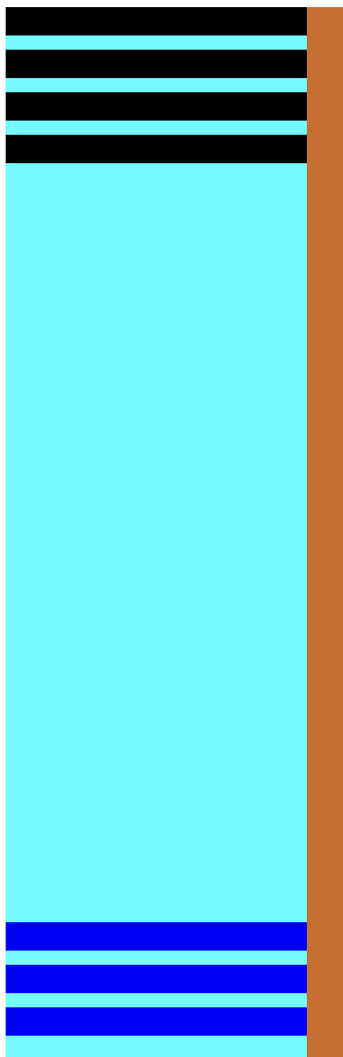
is there a possibility to get it with css as shown on the picture ?
first = black
second = blue
the HTML structure is like this (and must not be changed)

<body>
    <div class="wrapper">
        <div class="sidebar">
            <div class="container">
                <div class="first"></div>
                <div class="first"></div>
                <div class="first"></div>
                <div class="first"></div>
                <div class="second"></div>
                <div class="second"></div>
                <div class="second"></div>
            </div>
        </div>
        <div class="content">
        </div>    
    </div>
</body>

enter image description here

I have already tried a few things, for example with postion absolute, but the blue div containers are only on top of each other

2

Answers


  1. You can use flexbox but your container has to have a height and you need a spacer element.

    .container {
      height: 100vh;
      display: flex;
      flex-direction: column;
      gap: 20px;
      background: blue;
    }
    .container div {
      height: 40px;
      background: red;
    }
    
    .container .spacer {
      flex: 1;
      background: none;
    }
    <div class="container">
      <div class="first"></div>
      <div class="first"></div>
      
      <div class="spacer"></div>
    
      <div class="second"></div>
      <div class="second"></div>
    </div>
    Login or Signup to reply.
  2. Not sure if this will work for you. I tried to use a grid separate first and second menu you wanted then position them on absolute take a look at the sample CSS if this wont work let me know.

    .sidebar {
      height: 100vh;
      background-color: #02ffff;
      max-width: 300px;
      }
    
    .container {
      display: grid; 
      }
    
    .first-set {
      display: grid;
      grid-gap: 5px;
      color: white;
      height: auto;
      position: absolute;
      top: 10px;
      width: 100%;
      max-width: 300px;
      }
    
    .first {
      background-color: black;
      
      }
      
    .second-set {
      display: grid;
      grid-gap: 5px;
      color: white;
      position: absolute;
      bottom: 10px;
      width: 100%;
      max-width: 300px;
      }
    
    .second {  
      background-color: blue;
      max-width: 100%;
      }
    <body>
        <div class="wrapper">
            <div class="sidebar">
                <div class="container">
                 <div class="first-set">
                    <div class="first">1</div>
                    <div class="first">2</div>
                    <div class="first">3</div>
                    <div class="first">4</div>
                  </div>
                  <div class="second-set">
                    <div class="second">5</div>
                    <div class="second">6</div>
                    <div class="second">7</div>
                  </div>
                </div>
            </div>
            <div class="content">
            </div>    
        </div>
    </body>
    Login or Signup to reply.
Please signup or login to give your own answer.
Back To Top
Search