skip to Main Content

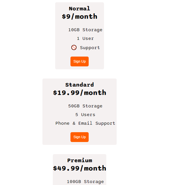
I tried to create a 3 div container with max-width 400px; after I changed the direction to flex-direction: column; I lost the width of my container.

(After changing the flex-direction to column my containers are not in the same order)

enter image description here

as shown in the image, the flex row will make the boxes allocated correctly and if I switched to column, the containers are not taking the defined max-width 400px;.

body {
  font-family: "Sono", sans-serif;
}

.pricing-container {
  display: flex;
  gap: 2rem;
  justify-content: center;
  flex-wrap: wrap;
  align-items: center;
}

.pricing-plan {
  padding-top: 10px;
  background: rgb(245, 241, 241);
  flex: 1;
  text-align: center;
  max-width: 300px;
  border-radius:5px ;
}

.plan-title {
  font-size: 20px;
  font-weight: 1000;
}

.plan-price {
  font-size: 25px;
  font-weight:800;
}

ul {
  list-style-type: none;
}

li {
  padding: 5px;
}

.plan-button {
  margin-bottom: 10px;
  background-color: rgb(255, 94, 0);
  border-radius: 5px;
  padding: 10px;
  font-size: 11px;
  color: white;
  border: 0px white;
}

@media (max-width: 1000px) {
  .pricing-container {
    flex-direction: column;
  }
}
<!DOCTYPE html>
<html>
  <head>
    <title>Flexbox Pricing Table</title>
    <link rel="preconnect" href="https://fonts.googleapis.com" />
    <link rel="preconnect" href="https://fonts.gstatic.com" crossorigin />
    <link
      href="https://fonts.googleapis.com/css2?family=Sono:wght@400;700&display=swap"
      rel="stylesheet"
    />
  </head>

  <body>
    <div class="pricing-container">
      <div class="pricing-plan">
        <div class="plan-title">Normal</div>
        <div class="plan-price">$9/month</div>
        <ul class="plan-features">
          <li>10GB Storage</li>
          <li> 1 User</li>
          <li>🚫 Support</li>
        </ul>
        <button class="plan-button">Sign Up</button>
      </div>
      <div class="pricing-plan">
        <div class="plan-title">Standard</div>
        <div class="plan-price">$19.99/month</div>
        <ul class="plan-features">
          <li>50GB Storage</li>
          <li>5 Users</li>
          <li> Phone &amp; Email Support</li>
        </ul>
        <button class="plan-button">Sign Up</button>
      </div>
      <div class="pricing-plan">
        <div class="plan-title">Premium</div>
        <div class="plan-price">$49.99/month</div>
        <ul class="plan-features">
          <li> 100GB Storage</li>
          <li> 10 Users</li>
          <li> 24/7 Support</li>
        </ul>
        <button class="plan-button">Sign Up</button>
      </div>
    </div>
  </body>
</html>

2

Answers


  1. Try something like this:

    .container { max-width: 400px; }

    Login or Signup to reply.
  2. You can add the following CSS:

    .pricing-container > div {
      width: 100%;
    }
    

    This will stretch the width of all flex items to 100% of the parent container if that is less than 300px wide or – if the parent is wider than 300px, make them 300px wide, as you defined with max-width: 300px;

    body {
      font-family: "Sono", sans-serif;
    }
    
    .pricing-container {
      display: flex;
      gap: 2rem;
      justify-content: center;
      flex-wrap: wrap;
      align-items: center;
    }
    .pricing-container > div {
      width: 100%;
    }
    .pricing-plan {
      padding-top: 10px;
      background: rgb(245, 241, 241);
      flex: 1;
      text-align: center;
      max-width: 300px;
      border-radius: 5px;
    }
    
    .plan-title {
      font-size: 20px;
      font-weight: 1000;
    }
    
    .plan-price {
      font-size: 25px;
      font-weight: 800;
    }
    
    ul {
      list-style-type: none;
    }
    
    li {
      padding: 5px;
    }
    
    .plan-button {
      margin-bottom: 10px;
      background-color: rgb(255, 94, 0);
      border-radius: 5px;
      padding: 10px;
      font-size: 11px;
      color: white;
      border: 0px white;
    }
    
    @media (max-width: 1000px) {
      .pricing-container {
        flex-direction: column;
      }
    }
    <!DOCTYPE html>
    <html>
    
    <head>
      <title>Flexbox Pricing Table</title>
      <link rel="preconnect" href="https://fonts.googleapis.com" />
      <link rel="preconnect" href="https://fonts.gstatic.com" crossorigin />
      <link href="https://fonts.googleapis.com/css2?family=Sono:wght@400;700&display=swap" rel="stylesheet" />
    </head>
    
    <body>
      <div class="pricing-container">
        <div class="pricing-plan">
          <div class="plan-title">Normal</div>
          <div class="plan-price">$9/month</div>
          <ul class="plan-features">
            <li>10GB Storage</li>
            <li> 1 User</li>
            <li>🚫 Support</li>
          </ul>
          <button class="plan-button">Sign Up</button>
        </div>
        <div class="pricing-plan">
          <div class="plan-title">Standard</div>
          <div class="plan-price">$19.99/month</div>
          <ul class="plan-features">
            <li>50GB Storage</li>
            <li>5 Users</li>
            <li> Phone &amp; Email Support</li>
          </ul>
          <button class="plan-button">Sign Up</button>
        </div>
        <div class="pricing-plan">
          <div class="plan-title">Premium</div>
          <div class="plan-price">$49.99/month</div>
          <ul class="plan-features">
            <li> 100GB Storage</li>
            <li> 10 Users</li>
            <li> 24/7 Support</li>
          </ul>
          <button class="plan-button">Sign Up</button>
        </div>
      </div>
    </body>
    
    </html>
    Login or Signup to reply.
Please signup or login to give your own answer.
Back To Top
Search