


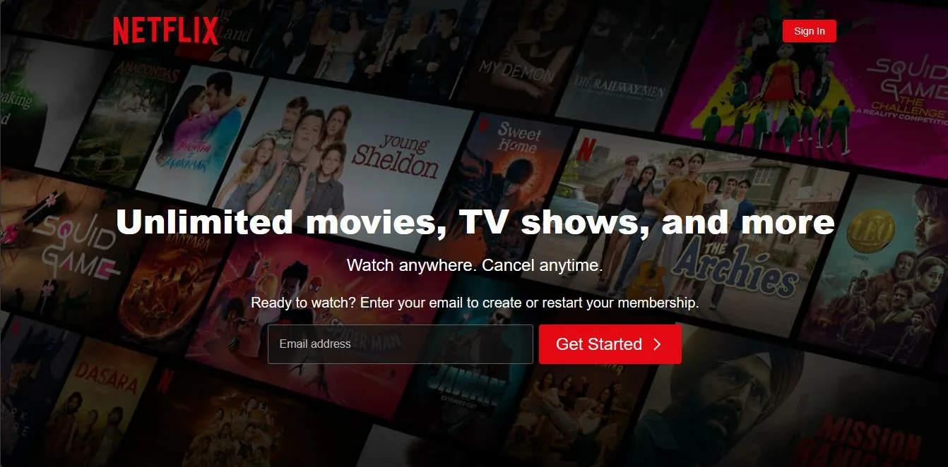
I am trying to clone netflix website but got stuck at copying the background image in Netflix. It has a white part at the middle of image which is done using some kind of css and I want to copy it but couldn’t do it.
For dark parts on the image i added a div with bg-color black which works fine but then for the white part in the middle i tried adding another div with bg-color white but it didn’t work. The original one The one i tried
 <!DOCTYPE html>
    <html lang="en">
    <head>
    <meta charset="UTF-8">
    <meta name="viewport" content="width=device-width, initial-scale=1.0">
    <title>Netflix Nepal - Watch TV Shows Online, Watch Movies Online </title>
    </head>
    <link rel="stylesheet" href="style.css">
    <body>
    <nav>
    <div class="navbar">
    <span><img src="assets/img/logo.svg" alt=""></span>
    <button>Sign In</button>
   </div>
        </nav>
    <main>
        <div class="bg-image">
            <div class="bg-box1"><div class="bg-box2"></div></div>

        </div>

    </main>

    <footer>

    </footer>
    </body>
    </html>
* {
    margin: 0;
    padding: 0;
    }

    .navbar{
    width: 75vw;
    margin:  20px auto 0 auto;
    display: flex;
    align-items: center;
    justify-content: space-between;
    position: relative;
    z-index: 10;
    padding-top: 1px;
    }

    .navbar span img{
    padding-right: 15px;
    width: 150px;
    }

    .navbar button{
    color: white;
    text-decoration: none;
    border: none;
    padding: 8px 17px;
    border-radius: 5px;
    background-color: rgba(229, 9, 20, 0.938);
    font-size: 14px;
    }

    main{
    position: relative;
    overflow: clip;
    top: -67px;
    }

    .bg-image{
    background-image: url("assets/img/background.jpg");
    height: 102vh;
    max-width: 100vw;
    background-repeat: no-repeat;
    background-origin:border-box;
    background-size: cover;
    background-position: bottom ;
    position: relative;
    top: -25px;
    transform: scale(1.25);
    }

    .bg-box1{
    height: 101vh;
    width: 100%;
    background-color: black;
    opacity: 0.7;
    position: absolute;
    display: flex;
    align-items: center;
    z-index: 101;
}
2
Answers
I have corrected your code as follows:
Explain
Added
justify-content: center;to.bg-box1: This helps center the content within the black section more accurately.Added and adjusted the
.bg-box2section: This section contains the white middle part, which has been rounded and has a gradient to create a decreasing blur effect from the inside out usingradial-gradientandborder-radius.Modified the
mainsection: Addedoverflow: hidden;to reduce the appearance of a scroll bar when the content exceeds the screen limit.You can customize the opacity and white area width as you like
I think it will be more easier if you use gradient like this:
background: linear-gradient( to top, rgba(0,0,0,1) 0%, rgba(255,255,255,0) 100%);Checkout this pen: Codepen Pen
i used gradient in right , you can control right, left, top and bottom