I have a web page that displays an image.
I would like the image to expand to its container (minus some margin and padding) while keeping its aspect ratio, but also the img tag to not be bigger than the image.
Here is an example :
<div class="h-full w-full rounded-md border p-4 flex justify-center items-center">
    <img class="object-fit" :src="image" aspect-ratio="auto">
</div>
with this as style :
.object-fit {
  object-fit: contain;
  max-width: 100%;
  max-height: 100%;
  height:100%;
  width:100%;
  display:block;
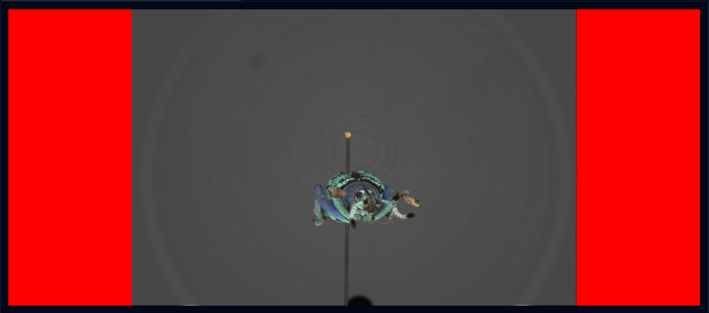
  background-color: red;
}
FYI : the red background color is there just to show the size of the img tag
I’d like the same result but without the red background, because I need the exact position of my clicks on the image.
So I need the img tag to be as big as possible but still contour the image without whitespace.
And this without cropping the image (object-fit: cover, wouldn’t work for me)
Do you have a solution ?


2
Answers
Well I managed to find a solution.
My problem was that with this condition :
img {width:100%; max-width:100%; max-height:100%;}If the image hits the vertical limit of the div first, the img element would still expand horizontally (the background we see in the image). And the same thing happens the other way around.
So my solution is to select
width:100%orheight:100%depending the image size and the div sizeworking on Vue, I put two listeners (one if the size of the image change, the other if the window is resized) and they call the same function.
If we take this image where the blue rectangles are the container and the red rectangle are the images
On the case on the left one, we'd need to set :
width:100%; height:autoand on the right one :height:100; width:auto.Feel free to send a message to see how I did it but I used Vue3Js and piniaStore for this so I don't think it would be useful
I don’t know if I understand your goal correctly, but adding flex-grow:1 to the .object-fit class will result in an image that fits the parent container while maintaining the proportions.