skip to Main Content

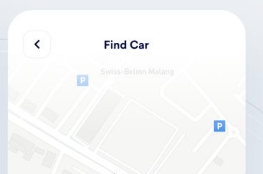
I would like to reproduce the navbar in the below picture using html and CSS, but I can’t wrap my head around that fade that turns white into transparent.

enter image description here

I’ve searched the internet with no success.
For now this is my attempt:
background: linear-gradient(to bottom, #ffffff 50%, rgba(255,255,255,0.5) 100%);, but it isn’t really working.

body,
html {
  margin: 0;
  padding: 0;
  height: 100%;
  font-family: Arial, sans-serif;
}

.map {
  height: 100vh;
  width: 100vw;
  background: url("https://i.imgur.com/p7rm49V.png") no-repeat fixed center;
  background-size: cover;
  position: relative;
}

.navbar-container {
  height: 4rem;
  display: grid;
  grid-template-columns: repeat(3, 1fr);
  grid-template-rows: 1fr;
  gap: 15px 15px;
  grid-template-areas: "back-button-area brand-title-area empty-cell";
  background: linear-gradient(to bottom, #ffffff 50%, rgba(255, 255, 255, 0.5) 100%);
}

.back-button-area {
  grid-area: back-button-area;
  justify-self: start;
  align-self: center;
  padding-left: 20px;
}

.brand-title-area {
  grid-area: brand-title-area;
  justify-self: center;
  align-self: center;
}

.empty-cell {
  grid-area: empty-cell;
}

.back-button {
  background-color: #fff;
  border: 1px solid #d5d9d9;
  border-radius: 12px;
  box-shadow: rgba(213, 217, 217, .5) 0 2px 5px 0;
  color: #0f1111;
  cursor: pointer;
  font-family: "Amazon Ember", sans-serif;
  font-size: 13px;
  padding: 10px 15px;
  position: relative;
  text-align: center;
  text-decoration: none;
  user-select: none;
  -webkit-user-select: none;
  touch-action: manipulation;
  vertical-align: middle;
  width: 100px;
}

.back-button:hover {
  background-color: #f7fafa;
}
<body>
  <div class="navbar-container">
    <div class="back-button-area">
      <span class="back-button">❮</span>
    </div>
    <div class="brand-title-area">Find Bike</div>
    <div class="empty-cell"></div>
  </div>

  <div class="map"></div>
</body>

4

Answers


  1. With your code, the .map div starts below the navbar – in the regular document flow. Since the background behind the navbar in this situation is white (by default), you don’t see the transparency effect of your gradient. Add position: absolute and width: 100% to the navbar to move the .map div under (= partly behind) the navbar:

    body, html {
      margin: 0;
      padding: 0;
      height: 100%;
      font-family: Arial, sans-serif;
    }
    .map {
      height: 100vh;
      width: 100vw;
      background: url("https://i.imgur.com/p7rm49V.png") no-repeat fixed center;
      background-size: cover;
      position: relative;
    }
    
    .navbar-container {
      height: 4rem;
      width: 100%;
      position: absolute;
      z-index: 1;
      display: grid; 
      grid-template-columns: repeat(3, 1fr); 
      grid-template-rows: 1fr; 
      gap: 15px 15px; 
      grid-template-areas: 
        "back-button-area brand-title-area empty-cell"; 
      background-image: linear-gradient(to bottom, #ffffff 50%, rgba(255,255,255,0.5) 100%);
    }
    .back-button-area { grid-area: back-button-area;
      justify-self: start; 
      align-self: center; 
      padding-left: 20px;
    }
    .brand-title-area { grid-area: brand-title-area; 
      justify-self: center; 
      align-self: center; 
    }
    .empty-cell { grid-area: empty-cell; }
    
    
    .back-button {
      background-color: #fff;
      border: 1px solid #d5d9d9;
      border-radius: 12px;
      box-shadow: rgba(213, 217, 217, .5) 0 2px 5px 0;
      color: #0f1111;
      cursor: pointer;
      font-family: "Amazon Ember",sans-serif;
      font-size: 13px;
      padding: 10px 15px;
      position: relative;
      text-align: center;
      text-decoration: none;
      user-select: none;
      -webkit-user-select: none;
      touch-action: manipulation;
      vertical-align: middle;
      width: 100px;
    }
    .back-button:hover {background-color: #f7fafa;}
    <body>
      <div class="navbar-container">
        <div class="back-button-area">
          <span class="back-button">&#x276E;</span>
        </div>
        <div class="brand-title-area">Find Bike</div>
        <div class="empty-cell"></div>
      </div>
    
      <div class="map"></div>
    </body>
    Login or Signup to reply.
  2. You’d have to make your bar position absolute so it lays over the map. As it was the map is pushed below it.

    body,
    html {
      margin: 0;
      padding: 0;
      height: 100%;
      font-family: Arial, sans-serif;
    }
    
    .map {
      height: 100vh;
      width: 100vw;
      background: url("https://i.imgur.com/p7rm49V.png") no-repeat fixed center;
      background-size: cover;
      position: relative;
    }
    
    .navbar-container {
      height: 4rem;
      display: grid;
      grid-template-columns: repeat(3, 1fr);
      grid-template-rows: 1fr;
      gap: 15px 15px;
      grid-template-areas: "back-button-area brand-title-area empty-cell";
      background: linear-gradient(to bottom, #fff, #fff 50%, rgba(0, 0, 0, 0));
      position: fixed;
      width: 100%;
      z-index: 9;
    }
    
    .back-button-area {
      grid-area: back-button-area;
      justify-self: start;
      align-self: center;
      padding-left: 20px;
    }
    
    .brand-title-area {
      grid-area: brand-title-area;
      justify-self: center;
      align-self: center;
    }
    
    .empty-cell {
      grid-area: empty-cell;
    }
    
    .back-button {
      background-color: #fff;
      border: 1px solid #d5d9d9;
      border-radius: 12px;
      box-shadow: rgba(213, 217, 217, .5) 0 2px 5px 0;
      color: #0f1111;
      cursor: pointer;
      font-family: "Amazon Ember", sans-serif;
      font-size: 13px;
      padding: 10px 15px;
      position: relative;
      text-align: center;
      text-decoration: none;
      user-select: none;
      -webkit-user-select: none;
      touch-action: manipulation;
      vertical-align: middle;
      width: 100px;
    }
    
    .back-button:hover {
      background-color: #f7fafa;
    }
    <body>
      <div class="navbar-container">
        <div class="back-button-area">
          <span class="back-button">&#x276E;</span>
        </div>
        <div class="brand-title-area">Find Bike</div>
        <div class="empty-cell"></div>
      </div>
    
      <div class="map"></div>
    </body>
    Login or Signup to reply.
  3. I’d recommend this code and image.

    <body class="map">
      <div class="navbar-container">
        <div class="back-button-area">
          <span class="back-button">&#x276E;</span>
        </div>
        <div class="brand-title-area">Find Bike</div>
        <div class="empty-cell"></div>
      </div>
    
      <div class="#"></div>
    </body>
    

    and

    body, html {
      margin: 0;
      padding: 0;
      height: 100%;
      font-family: Arial, sans-serif;
    }
    .map {
      height: 100vh;
      width: 100vw;
      background: url("https://i.imgur.com/p7rm49V.png") no-repeat fixed center;
      background-size: cover;
      position: relative;
    }
    
    .navbar-container {
      height: 4rem;
      display: grid; 
      grid-template-columns: repeat(3, 1fr); 
      grid-template-rows: 1fr; 
      gap: 15px 15px; 
      grid-template-areas: 
        "back-button-area brand-title-area empty-cell"; 
      background: linear-gradient(to bottom, #ffffff 0%, rgba(255,255,255,0.5) 30%);
    }
    .back-button-area { grid-area: back-button-area;
      justify-self: start; 
      align-self: center; 
      padding-left: 20px;
    }
    .brand-title-area { grid-area: brand-title-area; 
      justify-self: center; 
      align-self: center; 
    }
    .empty-cell { grid-area: empty-cell; }
    
    
    .back-button {
      background-color: #fff;
      border: 1px solid #d5d9d9;
      border-radius: 12px;
      box-shadow: rgba(213, 217, 217, .5) 0 2px 5px 0;
      color: #0f1111;
      cursor: pointer;
      font-family: "Amazon Ember",sans-serif;
      font-size: 13px;
      padding: 10px 15px;
      position: relative;
      text-align: center;
      text-decoration: none;
      user-select: none;
      -webkit-user-select: none;
      touch-action: manipulation;
      vertical-align: middle;
      width: 100px;
    }
    .back-button:hover {background-color: #f7fafa;}
    

    enter image description here

    Login or Signup to reply.
  4. Please try adding the code below along with your .navbar-container class CSS.

    position: fixed;
     top: 0;
     left: 0;
     z-index: 100;
     width: 100%;
    

    So, the final CSS of .navbar-container class will look like this,

    .navbar-container {
       position: fixed;
      top: 0;
      left: 0;
      z-index: 100;
      width: 100%;
      height: 4rem;
      display: grid; 
      grid-template-columns: repeat(3, 1fr); 
      grid-template-rows: 1fr; 
      gap: 15px 15px; 
      grid-template-areas: 
        "back-button-area brand-title-area empty-cell"; 
      background: linear-gradient(to bottom, #ffffff 50%, rgba(255,255,255,0.5) 100%);
    }
    

    Tried your code pan and it looks like this with the above CSS https://prnt.sc/swguSQMAIcNM.

    Hope this helps.

    Login or Signup to reply.
Please signup or login to give your own answer.
Back To Top
Search