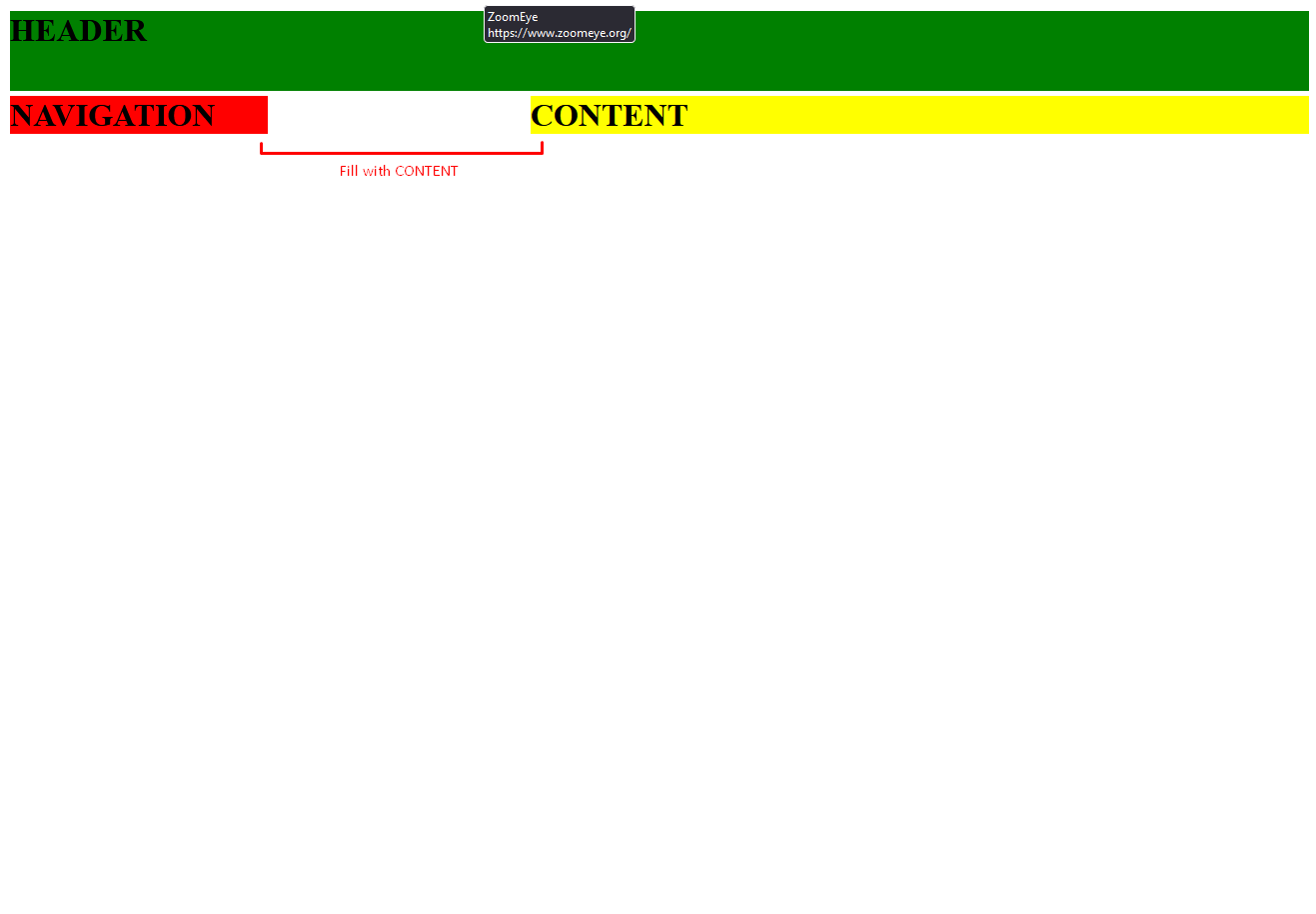
I have a 3 column, 2 row grid, where I want the element gridContent to span the empty space of contentSide when I set that elements width of 50%.
Above you can see where I have put a line I want gridContent filling. Currently, my CSS code looks like the following:
* {
  margin: 0;
  padding: 0;
  box-sizing: border-box;
}

.gridContainer {
  display: grid;
  grid-template-columns: repeat(3, auto);
  grid-template-rows: repeat(2, auto);
  gap: 5px;
  margin: .75rem;
}

.contentHead {
  grid-column: 1 / 4;
  background-color: green;
  height: 5rem;
}

.contentSide {
  grid-column: 1 / 1;
  grid-row: 2 / 3;
  background-color: red;
  width: 50%;
}

.contentBody {
  grid-column: 2 / 4;
  background-color: yellow;
}
<div class="gridContainer">
<div class="contentHead">
<h1>HEADER</h1>
</div>
<div class="contentSide">
<h1>NAVIGATION</h1>
</div>
<div class="contentBody">
<h1>CONTENT</h1>
</div>
</div>Setting the grid-template-rows to auto does not seem to work…
Does anyone know how I could fill this empty void with contentBody utilizing grid?


2
Answers
Try
grid-template-columns: repeat(3, 1fr);Using
frunits will give you fractions of the space available, which seems closer to what you’re looking for.Just make a bit more columns, and apply
padding-leftfor.content-body: