


I have an image where the height should be constrained so the container height is a maximum of 400px. The image should maintain its natural aspect ratio.
Critically, I cannot use object-fit because I want to provide the image a border-radius.
I am looking for a no-JS solution that works in all modern browsers. I have found a quite simple solution using CSS grid, but it only works in Firefox.
// Solution should not use Javascript.
// Below is simply to rotate images for testing.

const heights = [100, 200, 300, 400, 1000, 2000]
const widths = [200, 350, 1200]

let wIndex = 0, hIndex = 0;

setInterval(() => {
  hIndex = (hIndex + 1) % heights.length;
  wIndex = (wIndex + 1) % widths.length;

  const h = heights[hIndex];
  const w = widths[wIndex];

  document.querySelector("img").src = `https://placehold.co/${w}x${h}`;
}, 1_000)
.container {
display: flex;
flex-direction: column;
width: 400px;
max-height: 400px; /* I want to constrain entire container to 400px tall */
border: 3px solid rebeccapurple;
}
img {
/* Because I want to round corners of image, cannot use object-fit */
border-radius: 16px;
}
/* ------ FIREFOX SOLUTION BELOW -------
*
* The below only works in Firefox
*/
.img-container {
display: grid;
min-height: 0;
}
img {
margin: auto;
height: 100%;
max-width: 100%;
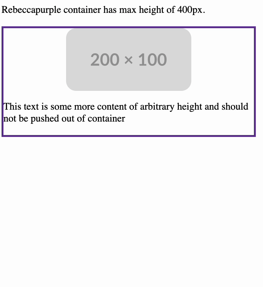
}<p>Rebeccapurple container has max height of 400px.</p>
<div class="container">
<div class="img-container">
<img>
</div>
<p>This text is some more content of arbitrary height and should not be pushed out of container</p>
</div>Please see the below demonstration of the result that I am looking for (in firefox):
2
Answers
You can achieve this using a combination of flexbox and absolute positioning. Here’s a simple HTML and CSS setup:
This solution ensures that the image maintains its aspect ratio, has rounded corners, and works in all modern browsers.
The percentage height of the image is missing a reference. Adding
grid-template-rows: 100%;should fix it