skip to Main Content

I have already several days looking for a solution CSS or component for making an image resizable (height and width) and over the image, elements keeping the position over the same X and Y coordinates of the image.

A simple code what I tried:

.img-container {
  position: relative;
  width: 100%;
  height: 100vh;
  background-color: antiquewhite;
}

.aspect-ratio-img {
  width: 100%;
  height: 100%;
  object-fit: contain;
}

.overlay {
  position: absolute;
  top: 30%;
  left: 30%;
}
<div class="img-container">
  <img src="img.jpg" class="aspect-ratio-img" alt="Your Image">
  <div class="overlay">Element</div>
  </img>
</div>

Result:
enter image description here

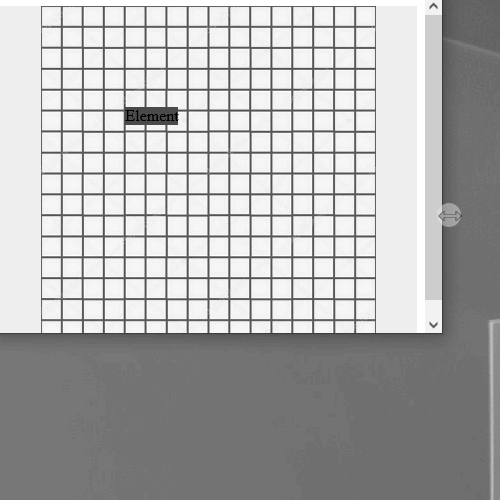
But this is wrong. In the example, the "element" text should have been kept over the same column and row of the grid. But as I show in the image it maintains the Top and Left relative to the browser edge and not based on the position of the image

What would like to have is something like next gif:
enter image description here

  1. Background image maintains proportions and resize horizontally and vertically with the browser window
  2. Foreground elements keep the position in the same X,Y coordinates of the background image.And also resizes (like using transform)

If I find the solution, I will post it here.

2

Answers


  1. Chosen as BEST ANSWER

    I did a component with a slot which all you place there will be resized. I'm not using JQuery, but I use the library vue3-resize, you can also implement it without this library due to the VUE3 observer feature

        <script setup lang="ts">
        import { ref, onMounted } from 'vue'
        import 'vue3-resize/dist/vue3-resize.css'
        
        const bodyMapContainer = ref(null)
        const scalableContainer = ref(null)
        const scale = ref(0)
        
        onMounted(() => {
          doResize(bodyMapContainer.value.offsetWidth, bodyMapContainer.value.offsetHeight)
        })
        
        const handleResize = ({ width, height }) => {
          doResize(width, height)
        }
        
        const doResize = (width: number, height: number) => {
          const innerWidth = scalableContainer.value.offsetWidth
          const innerHeight = scalableContainer.value.offsetHeight
        
          scale.value = Math.min(width / innerWidth, height / innerHeight)
        }
        </script>
        
        <template>
          <div ref="bodyMapContainer" class="body-map-container">
            <resize-observer @notify="handleResize" />
            <div
              ref="scalableContainer"
              class="scalable-container"
              :style="{ transform: 'translate(-50%, -50%) ' + 'scale(' + scale + ')' }"
            >
              <slot></slot>
            </div>
          </div>
        </template>
        <style>
        .body-map-container {
          position: relative;
          width: 100%;
          box-sizing: border-box;
          margin: 0 auto;
          left: 0%;
        }
        .scalable-container {
          width: 1000px;
          height: 750px;
          padding: 5px;
          text-align: center;
          position: absolute;
          left: 50%;
          top: 50%;
          transform: translate(-50%, -50%);
          transform-origin: center center;
        }
        </style>
    

    Use:

            <ViewBoxPanel>
            ... place here everything you want
            <ViewBoxPanel>
    ``
    

  2. This is pretty easy with grid – you can style the grid any way you like but here I "super centered" it and used an area name to put both elements at the same grid quadrant then used negative margins to move the text a bit.

    I changed the layout to put the div outside the image to further illustrate placement of that element vs "flow" where it would normally be below.

    Keep in mind for this example the image will scale a bit but that is just style which can be set with size, aspect ratio etc.

    NOTE: if you truly want a "grid" you can set the background of the container then set rows/columns on the grid of the size you wish then place the text in any grid cell you wish.

    body {
      margin: 0;
      padding: 0;
      font-size: 16px;
      box-sizing: border-box;
    }
    
    .img-container {
      background-color: #0000ff20;
      margin: 2em;
    }
    
    .grid-container {
      display: grid;
      grid-template-columns: 1fr;
      grid-template-rows: 100vh;
      grid-template-areas: "herewego";
      place-items: start;
    }
    
    .grid-block {
      grid-area: herewego;
      border: 1px solid;
      width: 100%;
      height: 100%;
    }
    
    .my-image-block {
      border-color: #00FF00;
    }
    
    .overlay {
      background-color: transparent;
      color: red;
      font-size: 3em;
      padding-top: 1.125em;
      padding-left: 3.125em;
      border-color: #FF0000;
    }
    <div class="img-container grid-container">
      <div class="my-image-block grid-block">
        <svg width="100%" height="100%" xmlns="http://www.w3.org/2000/svg">
          <defs>
            <pattern id="smallGrid" width="8" height="8" patternUnits="userSpaceOnUse"><path d="M 8 0 L 0 0 0 8" fill="none" stroke="gray" stroke-width="0.5"/></pattern>
            <pattern id="grid" width="80" height="80" patternUnits="userSpaceOnUse">
              <rect width="80" height="80" fill="url(#smallGrid)"/>
              <path d="M 80 0 L 0 0 0 80" fill="none" stroke="gray" stroke-width="1"/>
            </pattern>
          </defs>
          <rect width="100%" height="100%" fill="url(#grid)" />
      </svg>
      </div>
      <div class="overlay grid-block">Element</div>
    </div>
    Login or Signup to reply.
Please signup or login to give your own answer.
Back To Top
Search