


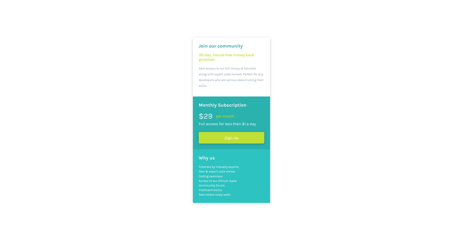
I’ve got one problem. My HTML looks currently like this:
HTML
<!DOCTYPE html>
<html lang="en">
<head>
<meta charset="UTF-8">
<meta name="viewport" content="width=device-width, initial-scale=1.0">
<link rel="icon" type="image/png" sizes="32x32" href="./assets/images/favicon-32x32.png">
<link rel="stylesheet" href="styles.css">
<link rel="preconnect" href="https://fonts.googleapis.com">
<link rel="preconnect" href="https://fonts.gstatic.com" crossorigin>
<link href="https://fonts.googleapis.com/css2?family=Karla:wght@400;700&display=swap" rel="stylesheet">
<title>Test</title>
</head>
<body>
<main>
<section class="area-1">
<h2 class="h1">Join our community</h2>
<p class="subh">30-day, hassle-free money back gurantee</span></p>
<p class="p1">Gain access to our full library of tutorials along with expert code reviews.
Perfect for any developers who are serious about honing their skills.</p>
</section>
<section class="area-2">
<h2 class="h2">Monthly Subscription</h2>
<div class="para-grid">
<p class="p2">$29</p>
<p class="p2-1">per month</p>
</div>
<p class="p2-2">Full access for less than $1 a day</p>
<div class="button">
<p>Sign Up</p>
</div>
</section>
<section class="area-3">
<h2 class="h3">Why us</h2>
<p class="p3">Tutorials by industry experts</p>
<p class="p3">Peer & expert code review</p>
<p class="p3">Coding exercises</p>
<p class="p3">Access to our GitHub repos</p>
<p class="p3">Community forum</p>
<p class="p3">Flashcard decks</p>
<p class="p3">New videos every week</p>
</section>
</main>
</body>
</html>
And now I made my main into a flex-item by writing down my body with:
body {
    display: flex;
    justify-content: center;
    align-items: center;
    padding: 2rem;
    min-height: 100vh;
}
and now my main is in the middle horizontally & vertically but I’ve got one problem. I want to make my main part to be rounded with border-radius: 10px which should make my flex-item look like this in the corners
Example
but it does not work if I do it. Here is a current code of my CSS & an example how it looks as image
CSS
* {
    box-sizing: border-box;
    margin: 0;
}

:root {
    /* COLORS FOR THE AREAS */
    --color-area1: hsl(204, 43%, 93%);
    --color-area2: hsl(179, 62%, 43%);
    --color-area3: hsl(179, 63%, 47%);
    --color-button: hsl(71, 73%, 54%);
    /* COLORS FOR THE TEXT */
    --color-h1: hsl(179, 62%, 43%);
    --color-subh: hsl(71, 85%, 48%);
    --color-p1: hsl(218, 22%, 67%);
}

html {
    font-family: 'Karla', sans-serif;
}

body {
    display: flex;
    justify-content: center;
    align-items: center;
    padding: 2rem;
    min-height: 100vh;
}

main {
    max-width: 20rem;
    box-shadow: 0 3px 10px rgb(0 0 0 / 0.2);
    border-radius: 10px;
}

/* styling the areas*/

section {
    padding: 1.5rem;
}

.area-2 {
    background: var(--color-area2);
}

.area-3 {
    background: var(--color-area3);
}
Somehow only my upper corner of my main is rounded but somehow I have to give my area-3 an extra border-radius that the bottom side of my main is as well rounded. Does someone know why it is like that? because normally my flex-item main should be responsive and as width & height as the children’s inside my parent main
Maybe it is because of flex-box? I am clueless why it happens.
2
Answers
Your main element’s background isn’t extending to cover the whole rounded area due to the
paddingapplied to the section elements. To achieve the desired rounded effect for the entire main element, you should apply theborder-radiusproperty directly to the main element and set itsoverflowproperty tohidden.Here’s my JSFiddle showing the behavior you are looking for
You can add border-radius to upper part of
.area-1and bottom part of.area-3separately.border-radius: 10px 10px 0 0;(Add this code to .area-1 class)
border-radius: 0 0 10px 10px;(Add this code to .area-3 class)